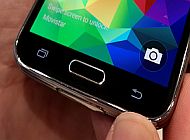
The mobile industry has called out Samsung on many things, but one of the most recurring criticisms leveled at the Korean manufacturer's smartphones and tablets – especially by the tech-savvy and geekier folks – is their continued use of the hardware home button. Every manufacturer except Samsung has embraced them at one time or the other (Sony has put them on every phone for about a year now, LG has done so on its latest flagships, and HTC will be using them on its next One flagship) – people had been hoping against hope that Samsung would finally “see sense” and do the same, but it was not to be. So the question is: why has Samsung remained adamant in their stance to use a hardware home button, apart from the fact that the Galaxy S5 needs it for the fingerprint scanning functionality?
To answer that question, drawing parallels with Apple, Samsung's largest (and perhaps only true) rival, is necessary. Say what you will about the Cupertino giant, but something the company has always understood is the mind of the average consumer, the consumer that just needs a device that works and is not fond of change. Apple took years to implement multitasking so they could implement it well and not cause sudden battery drains on the millions of iPhones it has sold, iOS' much needed visual refresh took an equal amount of time, and, most of all, Apple has stuck with the one-button philosophy it embraced when it started out with the iPhone.
What's the takeaway? Well, it's that Apple has been intelligent enough to know that they have millions of consumers that would be instantly alienated if it would begin introducing major changes too often. Sure, it has put off those that want their mobile devices to come up with something new and exciting frequently, but such folks, at the end of the day, are a tiny minority when compared to the standard smartphone (or let's just say phone) user, a minority Apple simply does not care about.
It's the same position Samsung is in. It's no secret that Samsung's phones and tablets capture a majority of the world-dominating OS that is Android, with the Galaxy S flagships alone having sold more than 200,000,000 units. When you consider the fact that it's actually the mid-range and low-end models that sell most instead of the flagship, you can imagine just how many Galaxy devices are in use in the world today (it's a number that Apple's iPhones can't match, though that's not exactly a good comparison since Apple doesn't focus on the low-end and mid-range market.)

And that, exactly, is what makes ditching the hardware home button and opting for fully capacitive or onscreen buttons a difficult task for Samsung. Millions of Android users, for whom Samsung's version of Android is Android, are used to having a hardware home button in the middle and two capacitive keys on each side. When they upgrade to a new Galaxy phone (or tablet), they expect the new device to have the same setup – you could argue that just swapping out the hardware button for a capacitive key wouldn't be so drastic, but when you're talking about millions of consumers, even such changes can be pretty substantial. The hardware home button is something that makes Samsung's devices stand out from the rest and something a lot of users are familiar with, and if Google hadn't made the recent apps key a requirement in KitKat, Samsung would likely have stuck with the menu key as well.
For Google, it is quite easy to go around making changes to Android, as Nexus phones and tablets, despite their great price-vs-quality ratio, take up just a tiny part of the Android market, and Android in its stock avatar isn't used by any major manufacturer. HTC, a company that has been losing market share at a steady pace, is even worse and has made drastic changes to its navigation button scheme in a span of three years. The 2012 One X went with the standard tradition of a recent apps, home and back key, the 2013 One adopted a rather silly two-button setup with just a home and back key, and now, the upcoming One will be aligning with Google's vision of fully onscreen keys.
For those who've bought HTC's phones, each new flagship has bought a substantial change in the way they use their phone, giving them no sense of consistency despite buying a device from the same company. Consistency is also the reason why Samsung continues to stick to its Android interface, which is, in my opinion, the least attractive of all other manufacturer skins. But like Apple, which took considerable time to adopt a new look for iOS, Samsung simply cannot come up with a new interface all of a sudden, which is perhaps the reason why each iteration of TouchWiz makes changes in a few apps and parts of the OS while keeping everything else the same.
In the end, it's not about whether a change is for the better or for the worse (the reason why this article is lacking any discussion on the pros and cons of the hardware home button/onscreen buttons), it's about how it affects the end-users who expect their phone to work the same way their previous phone did, without having to learn something new every time they upgrade. A focus on simplicity and consistency is what has made people fall in love with the iPhone almost religiously, and, whether the tech-savvy population likes it or not, what has made the word Galaxy a name that's almost synonymous with smartphones globally.
Well, that and the billions Samsung has spent on marketing, but you get the point.
Edit: It seems many in the comments section are of the opinion that I am someone who doesn't like the hardware home button, but that's not the case. Personally, I can make do with either hardware or software buttons (especially now that there's a recent apps key on Samsung phones as well), but the article's intention was not to say whether the hardware home button is good or bad, but to point out why it cannot be removed from Samsung's devices just like that, no matter whether people like it or not.
