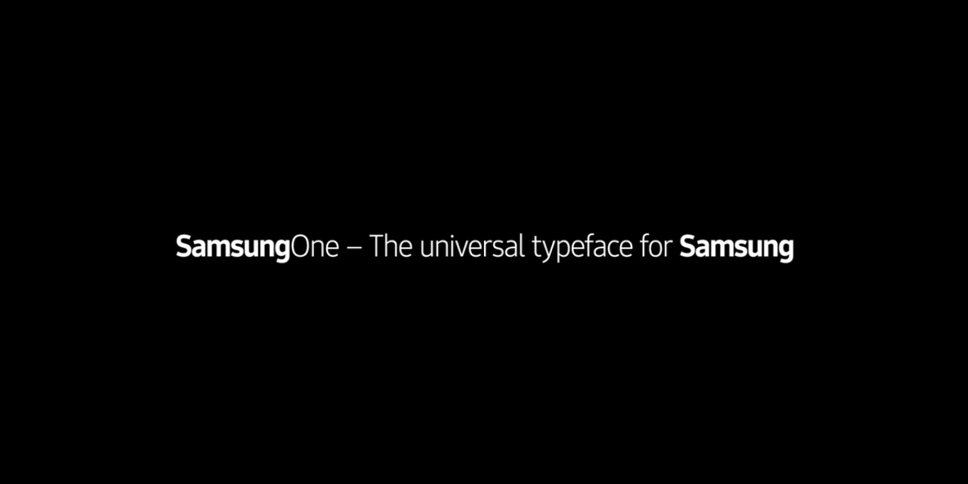
Following in the footsteps of Apple and Google, Samsung has today taken the wraps off its own universal typeface to represent its brand. The font, which has been named SamsungOne, is a family of scripts that covers a total of 26 writing systems, more than 400 languages, and over 25,000 glyphs. It has been optimised to work on a whole host of different devices, including smartphones, TVs, laptops, tablets, microwaves and ovens — so users should feel like they're engaging in a cohesive and universal experience when using the manufacturer's wide range of products.
The main reason for creating the font is, of course, to gain instant recognition from consumers. Samsung wants people all over the world to see the unique typeface on posters, billboards and adverts, then instantly relate it to the brand without a bold logo being present. To achieve this, the company teamed up with design firm Brody Associates and a number of specialists in the typography industry to create five typographic principles and characteristics that leads customers to create relationships between images and firms:
- Humanist: SamsungOne mixes a simple, single-width stroke with more calligraphic details. A squared curve is combined with angled terminal ends to create a font which is very human, flowing and open.
- Distinctive: Dynamic angles that come from how an arc joins a line create a consistent design personality. Prominent dots, distinctive diacritics and the tail on l add legibility as well we provide some of the distinctive design DNA for SamsungOne.
- Universal: Like a global Family, SamsungOne is uniquely localized while speaking some of the same typeface DNA.
- Expert: A crafted hands-on approach to type design and detail where small adjustments to height plus descenders and ascenders ensure balanced forms. A balanced and proportional set of characters aids consistency.
- Legible/Scalable: Letterforms are specifically designed to work functionally at small sizes, and dynamically at large sizes. Characters are open and spacious aiding readability. Specific details are added to ensure legibility at text sizes.
I have to say, I'm pretty impressed with the design of SamsungOne. What do you think of it? Be sure to let us know in the comments section below.
