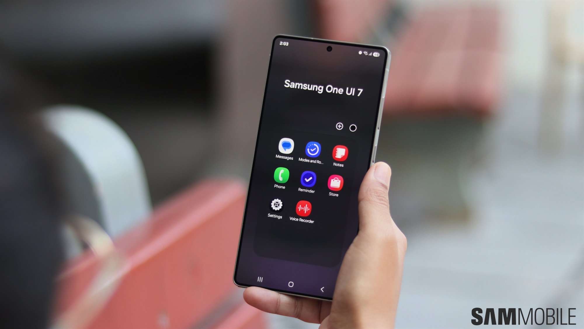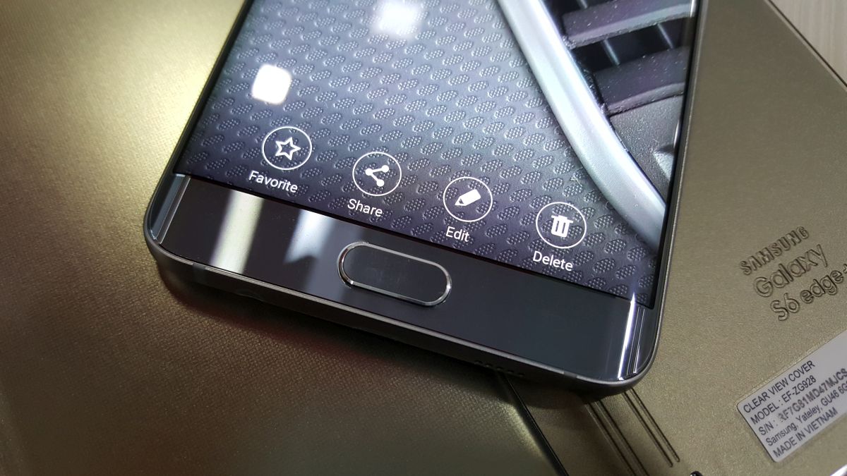
What is that change? It's Samsung's move to using full text for actionable buttons inside apps and the general interface over text-less icons. For advanced users and techies, it's not hard to figure out what an icon in the interface might mean, but the general populace often sits about trying different options out just to see what they do. Take, for example, the copy and paste icons on Android. Us techies can easily understand that the “two squares next to each other” icon stands for the copying text function, but the average joe, for whom computing isn't as easy as 1-2-3, that icon isn't exactly simple.
Even Android's share icon suffers from the same issue. Again, it's not that hard to see that an icon which shows two branches going out of a single dot means we can make an image or file available to other people, but it's not as easy to comprehend for the general smartphone using population as it often requires them to spend a second or two pondering over what to press.
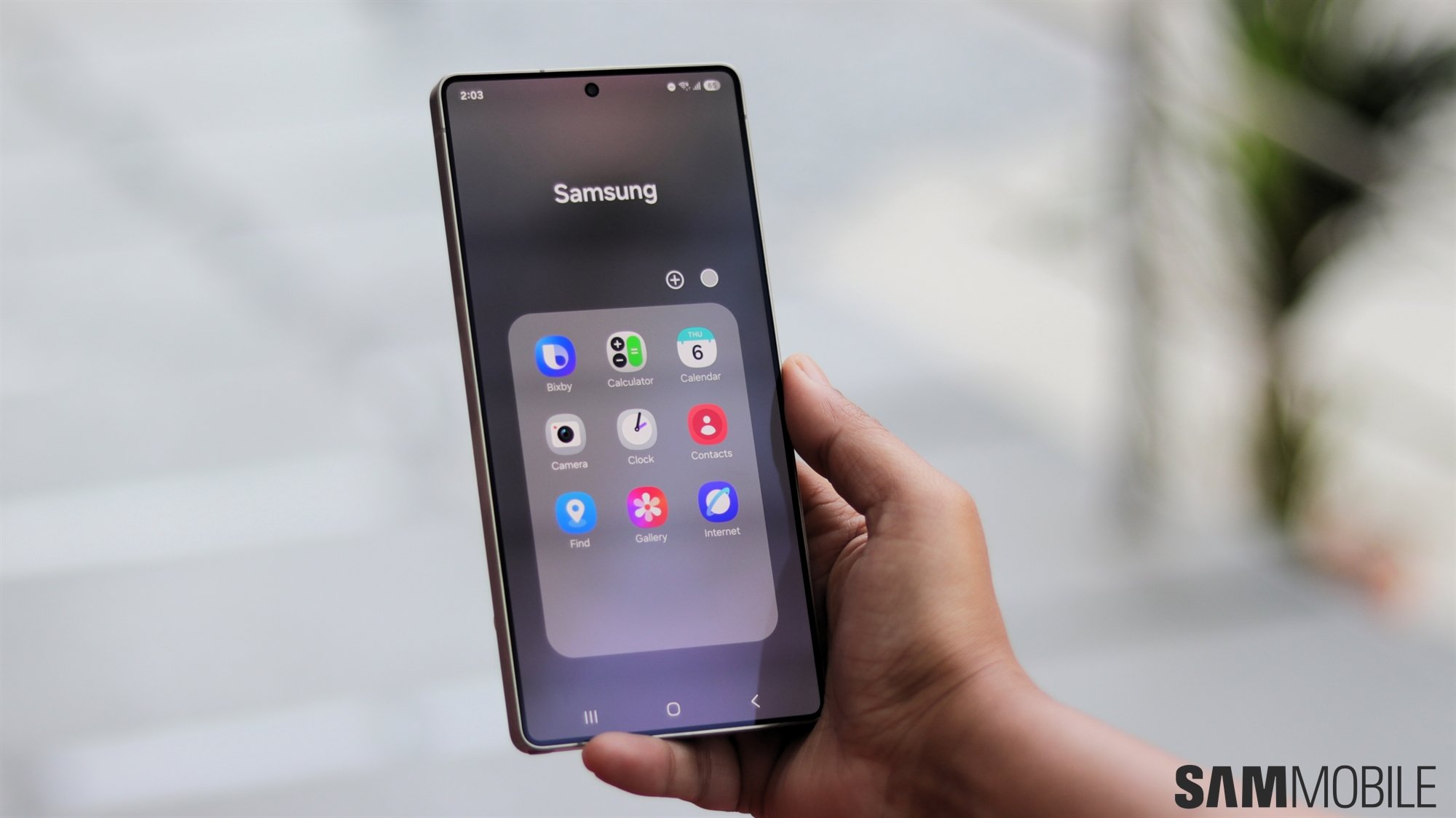
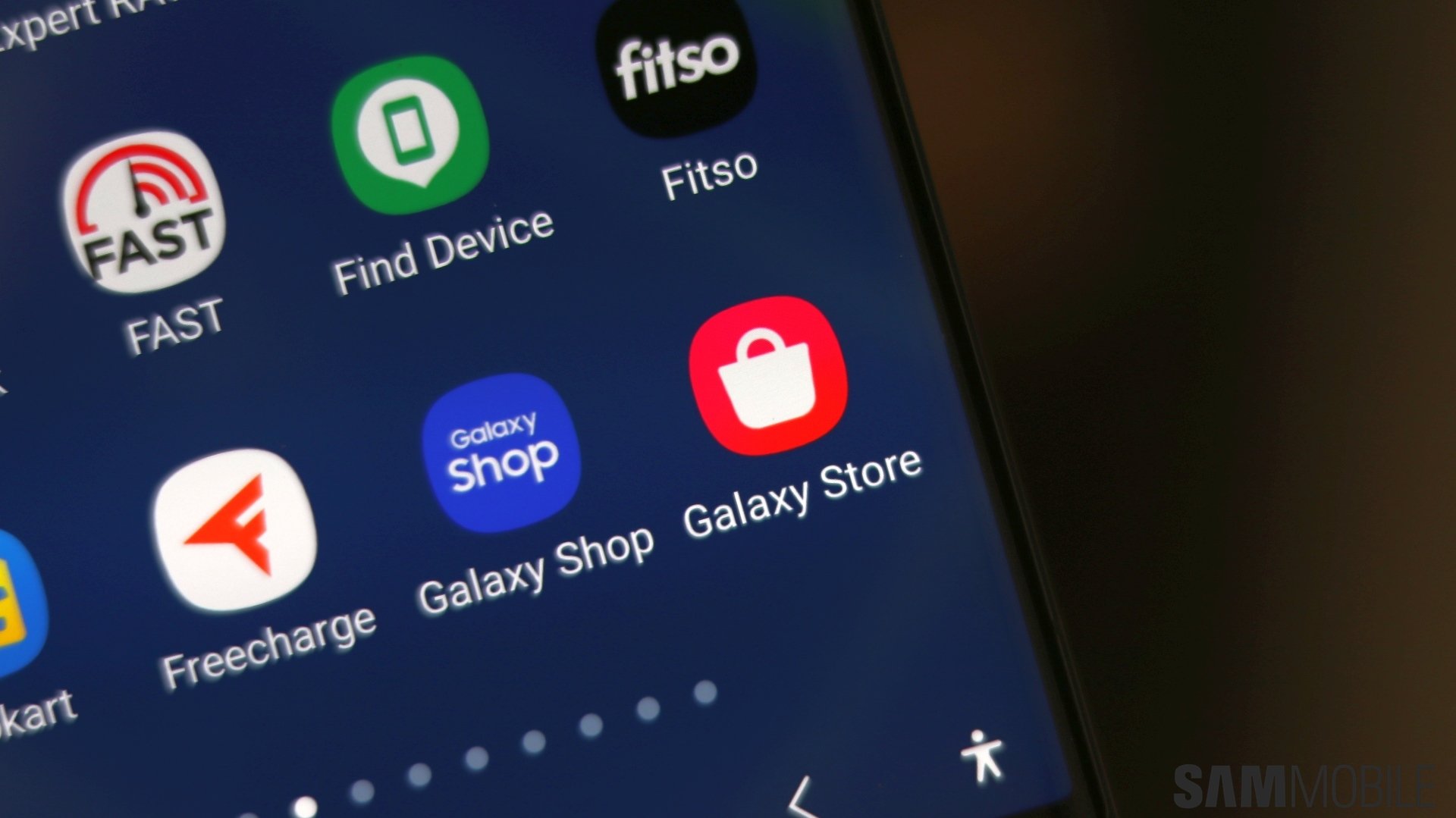
Using text for these actions is as simple as it can get if you want to make it easier for your users to understand what button does what, and Samsung rightfully swapped out all those non-user-friendly Android icons for plain text. You still have those icons all across the interface, but barring the camera app, you'll see an icon's description right below it. It's something other companies should be copying shamelessly, and we can only hope software makers begin to simplify their user interfaces through similarly minor changes.
