Samsung is reportedly developing One UI 2.5 for the upcoming Galaxy Note 20 and, presumably, the Galaxy Fold 2. Once these flagships will be out, One UI 2.5 (or some of its features) will subsequently be ported over to other existing devices including the Galaxy S20 series and, most likely, the Galaxy Note 10.
Very little is known about what features One UI 2.5 will bring to the table, but at least according to a Samsung Korea forum moderator, it will add Google's UI navigation gestures to third-party launchers. And without knowing much about One UI 2.5, it's the perfect time to be thinking about what we'd like to see in the upcoming release.
Improvements to the Camera app
The Camera app in One UI 2.1 is in a very good place. It's nearly perfect, but as the old saying goes, ‘there's always room for improvement.'
One of the annoyances with the current Camera app is that it always defaults to a narrow angle when switching between the front and rear-facing cameras. To a degree, this issue is mitigated by Smart selfie angle, but it would be a lot more convenient if the selfie and main camera modes would remember the user's preferred setting even when switching back and forth between them.
Another addition to the Camera app we'd like to see in One UI 2.5 is the ability to capture burst shots while recording a quick video. These two features work in similar ways but they can't be combined, as explained in our guide.
Finally, at least on flagship smartphones, Samsung needs to give us the option to choose which of the rear camera lenses we want to use in Pro mode. Right now, you can only use the main camera for Pro mode photos and videos, and that be extremely limiting.
Improved Bixby Routines
Bixby Routines offers a fairly complete experience out of the box in One UI 2.1. Users have numerous If conditions to pick from, and Samsung even added a Game is being played condition with a recent update.
Although we wouldn't scoff at additional If conditions and That actions, the ability to use existing routines as conditions would be a great addition to Bixby Routines in One UI 2.5. In other words, Samsung should give us the option to create new routines based around an existing routine and whether or not it's enabled or disabled.
To give you a practical example, I use a routine dubbed ‘Spotify My Headphones.' It detects when headphones are plugged into the phone, and it automatically starts playing Spotify. However, the Spotify routine will always take priority, even when plugging in the headphones while watching a YouTube video. The video will always be paused and Spotify will start playing in the background. Therefore, it would be great to have an option for a routine like ‘Spotify My Headphones' to be put on hold whenever another, say, ‘YouTube is playing' routine is active.
This would give Bixby Routines much greater complexity and it might be difficult to pull off from a developer's point of view, but it would be a great next step for Routines in One UI 2.5.
More Good Lock module features added to One UI 2.5 itself
Good Lock is a great avenue for Samsung to experiment with new customization features in One UI before deciding whether or not they're worth the trouble. But Good Lock is not available everywhere. And although the arrival of One UI 2.5 is highly unlikely to change this, we think the upcoming UI version should implement more features from Good Lock modules as part of the out-of-the-box user experience.
Modules (or at least parts of them) like Edge Touch, Sound Assistant, and Home Up don't seem experimental enough to be left out of the core One UI experience. In fact, they seem relatively complete and quite useful.
Evidently, people will have different views on what features would or wouldn't fit in One UI 2.5, and we do agree that the UI should not be overcrowded with Good Lock modules by default. However, some of the features found in these modules are true and tested enough to become mainstream.
Upgraded face unlock features
Samsung's biometric security measures are not necessarily lacking in options, even though they are oftentimes slow. Nevertheless, one characteristic we think Samsung should consider adding to One UI 2.5 is the option to enable face recognition while wearing a medical face mask. Indeed, this became an apparent need in the wake of the COVID-19 pandemic, so it's probably – and hopefully – not going to be very useful in the long run. But right now, this feature seems to be almost a necessity for Galaxy smartphone owners who rely on face recognition to unlock their phones.
A proper iris scanner is not going to happen with One UI 2.5 alone, or at all, given the current bezelless design trend. But perhaps Samsung could work its machine learning magic in One UI 2.5 to enable face unlock while the user is wearing a medical face mask.
A smarter alarm clock
Have you ever woken up too far ahead of your alarm, only for the alarm to awkwardly start ringing even though you were fully awake? If so, you're well aware that the alarm clock lacks any sense of context. Here's what we think would be the perfect addition to a so-called smart alarm clock.
One UI 2.5 should give the alarm clock the ability to detect when the phone is lifted from your night stand after a long period of stand by (sleep). When such movement is detected – similar to when you lift the phone and receive a haptic nudge letting you know you've missed a call or message – the alarm clock should pop up on the screen and give users the option to dismiss the upcoming alarm ahead of time. And if no actions are taken, the alarm should remain active and proceed according to the normal schedule.
A Dismiss option already exists and shows up in the notification panel when an upcoming alarm is drawing near, but it's not automated. It's not movement-based but rather time-based. It doesn't account for those situations when you may have woken up earlier than usual. We'd like One UI 2.5 to beef up the alarm clock with smarter features, and a contextual dismiss option would be our first step to achieve this.
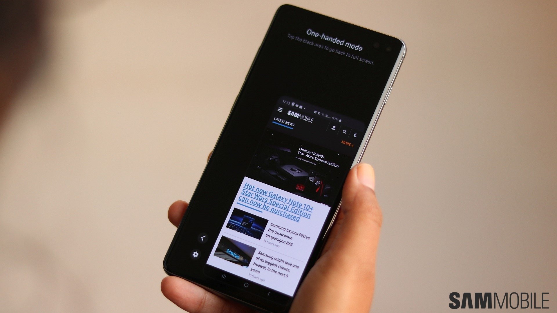
A ‘centered' option for One-handed mode
One-handed mode works fairly well and it's a great addition to Galaxy smartphones equipped with large displays. Once you set it up, you can enable One-handed mode in One UI 1.5 by swiping up diagonally from the corner of your screen, or by tapping the home button 3 times. Accessibility was further improved with One UI 2.0, as One-handed mode can be enabled either by swiping down on the home button or by double-tapping it.
When using One-handed mode, the entire UI is shown in a minimized window near one of the lower corners of the screen. You can move this window to the left or right corners, but there's no option to center it.
The issue with One-handed mode is that you still have to deal with the same physical dimensions of your phone, so it's not exactly like you'd be using a smaller device. Depending on the size of your phone, it may be more or less difficult to reach some areas of the screen even in One-handed mode. We feel like a ‘centered' option would make all of the display elements easier to reach with one hand.
An option to set a wallpaper's brightness manually
Dark Mode in One UI 2.0 darkens the wallpaper, but it doesn't always make enough of a difference. We think it would be useful if One UI 2.5 would add an option to set a wallpaper's brightness parameters manually, similar to how it works in some third-party apps.
This feature would work best with images that may be more cluttered – such as iFixit's X-Ray / hardware wallpapers – or with wallpapers that have a higher variance in brightness across the board.
The return of home screen parallax effects
This is perhaps the most subjective addition to this One UI 2.5 features wishlist. One UI 2.0 removed the home screen / wallpaper parallax / motion effect, and although this may have brought slight performance improvements, some of us would still like to see the parallax effect making a return in One UI 2.5.
From the perspective of performance, it's probably best if this visual feature is disabled by default. However, an option to enable it would be welcomed by some of us who enjoy the eye candy. And while we're at it, additional options to make the parallax effect more or less pronounced wouldn't hurt either.
Even fewer unnecessary apps/bloatware
Samsung did a fantastic job stripping its UX from bloatware when it switched from TouchWiz to One UI, but there are still a few apps that don't make a lot of sense – particularly in devices with an S Pen, which the Galaxy Note 20 will be. This is not so much of an issue as it is a minor annoyance. Nevertheless, there are a few apps such as Coloring and Write on calendar that seem unnecessary. They usually act as simple shortcuts to functions inside an existing app, and generally speaking, they're more confusing than useful. We're hoping One UI 2.5 will get rid of some of these arguably unnecessary apps/shortcuts.
Are there any features you'd like to see in One UI 2.5? Have you given it any thought? Feel free to let us know in the comment section below.
