Google's next major Android OS update predictably called ‘Android 12‘ is under development, and the first preview builds have already been released for app developers and enthusiasts. These early builds give Google an opportunity to test the new OS with the help of the community, and they allow app developers to prepare for the big update's rollout ahead of time.
As for us Samsung fans, Google's Android developer previews can sometimes hold clues as to what future One UI builds will look like, though this dynamic may have changed with the release of the Android 12 developer previews.
This is due to the fact that Android 12 appears to have gained a lot of inspiration from Samsung's One UI and even the old TouchWiz UI that preceded it. In more than one way, Google's Android 12 is following One UI's example rather than setting an example of its own. But as the old adage says, imitation is the sincerest form of flattery, so Google is well aware that Samsung must be doing something right.
The latest Android 12 developer preview reveals a handful of features that are new to Google's OS but have been a part of Samsung's mobile software experience for a fairly long time. One feature is so old that Samsung is not even using it anymore, though perhaps it should.
Without further ado, here are some of the Android 12 features that bear a striking resemblance to One UI.
An overhauled user interface with rounded corners
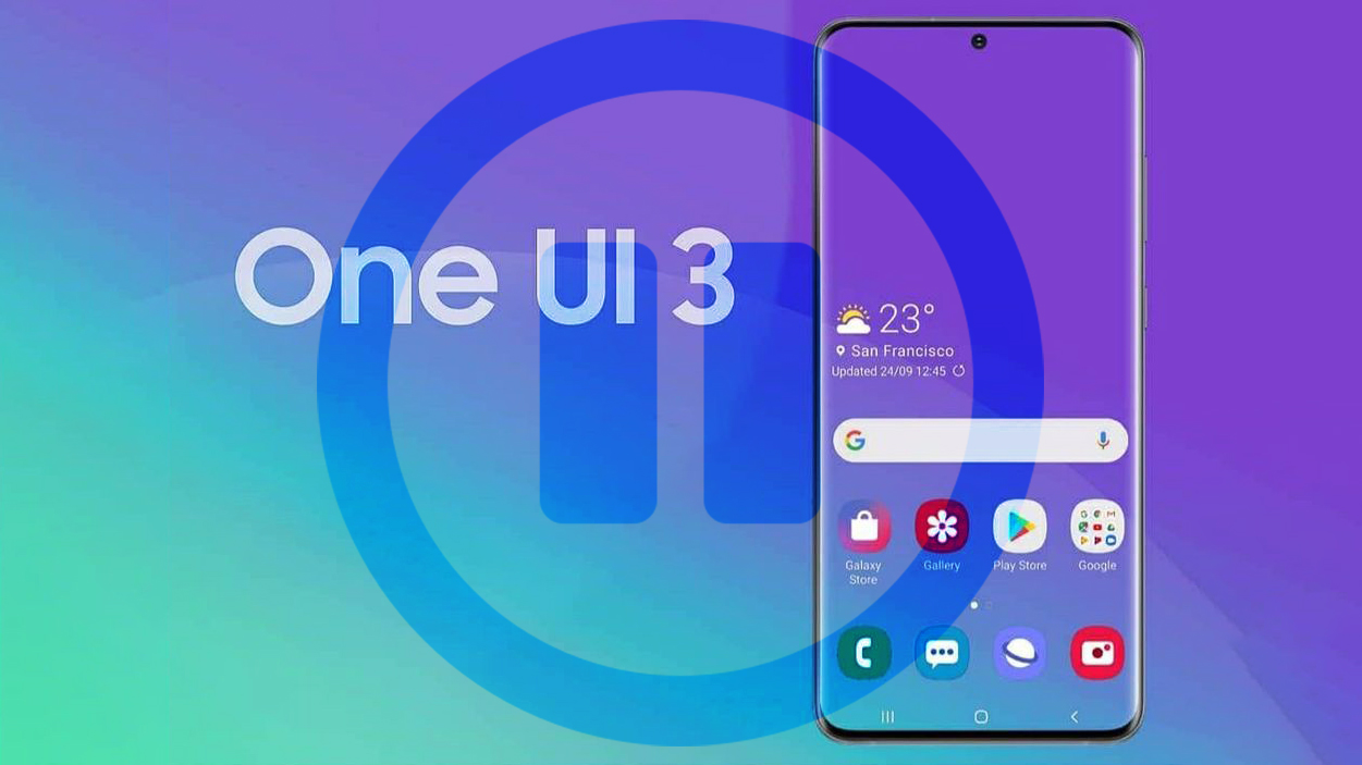
One UI has been defined by its rounded corners ever since it was conceived a few years ago, and Samsung kept improving the formula with each iteration. In time, this design element became more consistent across the entire UI, and One UI 3 pushed this concept even further.
Google appears to have fallen in love with Samsung's idea to the point where rounded corners have become a big part of Android 12. The new OS adopts a new and evolved design language that was undeniably inspired by Samsung's One UI.
Overhauled Settings app with a focus on readability
One of Samsung's biggest concerns when developing One UI 3.1 was to implement design changes that enhance readability and ease of access. The Settings app got redesigned with better spacing between different UI elements, and although it kept its identity, all these small changes added up to a menu that's easier to navigate.
Android 12 is seemingly borrowing a page from One UI 3.1 in this regard too. Google's Settings app got redesigned in Android 12, and while it's not a carbon copy of the Settings app in One UI, it certainly follows similar design principles that make the menus easier to read and navigate.
More One UI-inspired elements
Diving deeper inside the Settings app for Android 12 reveals even more design elements that were quite clearly borrowed from Samsung's One UI. Particularly, the Battery monitoring screen in Android 12 now has a linear progress bar showing battery percentages, as opposed to a giant battery-shaped icon that empties as the battery gets depleted.
Similarly, the Storage menu in Android 11 has a circular progress bar that shows how much on-board storage is available, whereas Android 12 replaces it with a linear progress bar à la One UI.
A new widget selection menu with a dedicated search bar
Sometimes the simplest of features are taken for granted. Many Galaxy smartphone owners might not be aware of this, but the search bar that's visible at the top of the widget selection screen is a Samsung / One UI-specific feature as opposed to being a part of Android OS.
Android 11 does not have a dedicated search field for the widget selection screen, but this will change with the release of Android 12. It's a simple addition but it is one that was obviously inspired by Samsung's way of thinking.
One-handed mode comes to Android, but it's not really taking after One UI
One-handed mode is yet another one of those features that came to be as a result of Samsung's efforts to make One UI — and earlier versions of its software — easier to read and navigate. It makes one-handed navigation a whole lot more convenient by shrinking the entire screen area and placing it closer to the user's thumbs.
This feature doesn't exist in Android 11 but the Android 12 developer previews show that one-handed mode is finally coming to Google's OS. However, while Google may have decided to make one-handed operation possible in Android because Samsung's already done it, the search engine giant is seemingly borrowing a page from Apple's book instead.
This means that one-handed mode in the Android 12 developer previews doesn't shrink the entire screen area to maintain the original aspect ratio like One UI does. Instead, it works similarly to Reachability in iOS, wherein only the top edge of the screen area is dragged down for, well, easier reachability. It's not ideal and we prefer One UI's implementation.
TouchWiz Smart Rotation is coming to Android 12. Wait… What?!
Do you remember that old TouchWiz feature called Smart Rotation? It's no longer available in One UI but it used to be one of the more unique factettes of TouchWiz.
In essence, Smart Rotation leveraged the Galaxy smartphone's selfie camera to rotate the screen between portrait and landscape modes according to the user's face orientation rather than the internal acetometer and gyroscope.
Smart Rotation is no longer a Samsung feature. It was a part of TouchWiz but it's absent in One UI. Google, on the other hand, is now bringing a similar feature to Android 12 called Face-based Auto Rotation, years after Samsung decided to abandon the concept in its own software.
Needless to say, it would be quite odd if Android 12 will eventually convince Samsung to reintroduce this feature in future versions of One UI, though it would probably be a welcomed addition by many.
At the end of the day, Android 12 is still in development and some of these One UI-inspired features may change by the time the first public release will be ready. But so far, it certainly looks like Google has become a bigger fan of Samsung's One UI.


