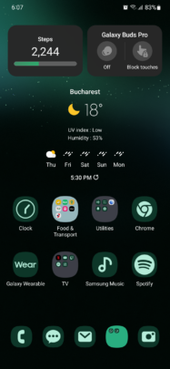
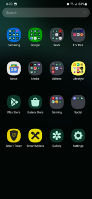
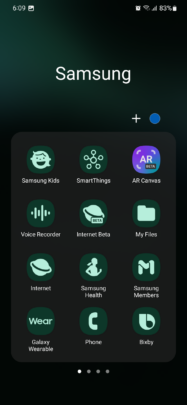
The most recent versions of One UI allow users to color-match their app icons to the UI palette. The way it works is self-explanatory. When enabled, this feature generates a more color-consistent UI across the board. At least, in theory.
It's a nice feature to have in One UI, and since many users asked for it, Samsung obliged. But personally, I much prefer the default app icon color scheme in One UI, and I'd go as far as saying that the icon color-matching feature might be overrated.
Rest assured. I'm not advocating for its removal from One UI. But I'm also not among those who would recommend using it.
Trading ease of use for a monochromatic UI doesn't seem like a good deal
In theory, having color-matched icons sounds like a good idea. In practice, I found that it brings more problems than it solves.
I identify the location of app icons on my Galaxy phone and tablet by shape, color, and memory. And I found that removing one of these elements, i.e., color, by using color-matched icons across One UI makes identifying app icons more difficult. I found this feature detrimental to the user experience and stopped using it after a relatively short while.
Granted, I'm willing to accept that each person's brain is wired differently. To some, removing the color element from icons might make them easier to identify, even though I find that difficult to believe. I'd be more willing to bet that most people who have used color-matched icons have, at one point, “lost” an icon from sight, only to realize later that it was right in front of them — almost like a case of inattentional blindness.
But even if I'm in the minority and monochromatic icons somehow improve the user experience in practical ways, the problem of inconsistency remains. Unfortunately, numerous app icons won't respect the color palette, resulting in a mishmash of monochromatic icons and colored ones. Which ultimately, I feel, adds to the problem described earlier.
I think that many One UI users will eventually switch back to the default colored app icons once they get over the excitement of trying out a new feature. And they'll probably find the user experience more comfortable on the eyes, despite (or thanks to) the fact that One UI has many colorful app icons. I could be wrong, and color-matched icons might be more than a gimmick, but personally, I'm not willing to give them another chance anytime soon.
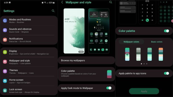
But if you want to try the color palette-matched icons in One UI for yourself, you can enable this feature by opening the Settings app, accessing “Wallpaper and style,” tapping “Color palette,” and turning on the “Apply palette to app icons” toggle.

