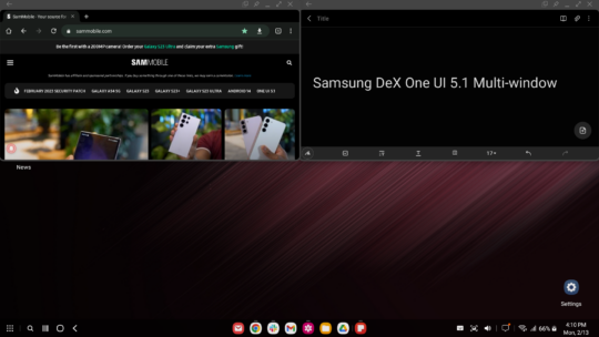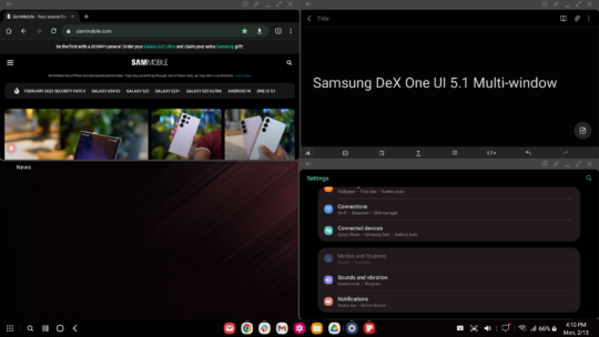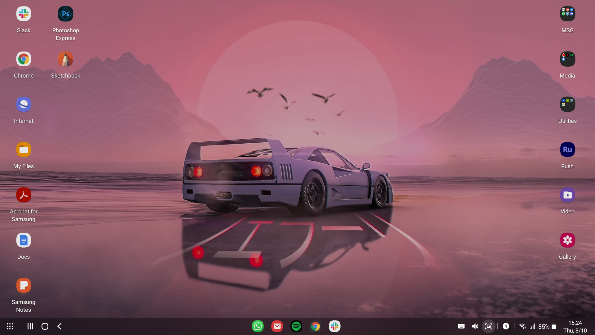
Through One UI 5.1, Samsung added a couple of new things to DeX to make the experience more convenient for productivity users. More specifically, these new addition concern split-screen view — or multi-window — and window-snapping. I tested Samsung DeX and these new One UI 5.1 goodies on my Galaxy S22+ for a few hours today, and the first impressions are positive.
A quick report on Samsung DeX performance in One UI 5.1
The previous One UI 5.0 update felt like a breeze of fresh air in regard to Samsung DeX optimization, compared to One UI 4.1. The system became considerably snappier and more responsive, and at least on a first impression, it looks like Samsung maintained course with the release of One UI 5.1.
From my limited testing of DeX in One UI 5.1 on the Galaxy S22+, I got the impression that the UI is even more responsive than it was in One UI 5.0, if only marginally.
Perhaps the difference in performance is not big enough to easily quantify. But needless to say, the new update doesn't seem to have worsened DeX, either. I was a little worried that One UI 5.1 might mar the positive experience I had with DeX after One UI 5.0, but that hasn't happened. If things change, we'll let you know.
So, how are the new multi-window features?
Now we're getting into the more exciting bits added to Samsung DeX through the One UI 5.1 update: corner window snapping and the ability to resize split-view windows simultaneously.
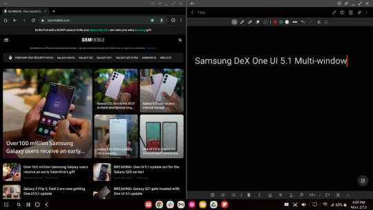
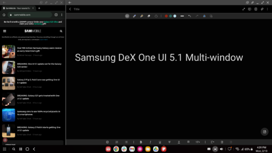
Split-view resizing feels a bit hit-and-miss. It's a worthy addition, but it may need a bit more tweaking before it works flawlessly. The feature works as intended when window-snapping an app to the left or right edge of the screen and selecting a second app from the pop-up to fill the other half of the screen. Doing so creates a sort of split-screen “pair” of apps that can be easily resized by dragging the middle tag.
However, you can no longer resize both windows simultaneously once you minimize one of the apps and bring it back up. That action breaks the “app pair,” if you will. The same is true if you window-snap the first app and don't select a second app from the pop-up selection window but instead decide to window-snap a second app manually to the other half of the screen. In this case, no split-view “app pair” is created. So, there is some inconsistency in how this new Samsung DeX feature functions. Here is a screen recording demonstration.
Similarly, corner window-snapping works fine, allowing you to snap four apps to each of your screen's corners with relative ease. Just shy of the five foreground app limit imposed by DeX when not using an official DeX Station or one of the few third-party HDMI hubs that support twenty foreground apps.
However, there is no app selection pop-up upon window-snapping an app to the corner of the screen like you'd get when snapping to the left or right edge. You'll have to do it all manually. Conversely, there is no way to resize multiple corner-snapped windows simultaneously, which adds to that slight feeling of inconsistency.
Samsung DeX in One UI 5.1: Early conclusion
As expected from an incremental One UI update, version 5.1 doesn't add too much to DeX. Nevertheless, performance doesn't seem to have degraded in the slightest, and the multi-window additions are definitely worth it, even though they may need a bit more polishing before they feel like seamless UI features that work without hiccups or inconsistencies.
With little experience in One UI 5.1, the update feels like a good foundation for pushing Samsung DeX multi-window to the next level, but Samsung may need to build a bit more on top of this new foundation before it can call it a job well done.
[modelinfo model=”SM-S916B”]
