The Google Play Store got a slight makeover earlier this week, and in case you may have noticed something out of place but couldn't quite put your finger on it, fret not. Your instincts haven't deceived you. Something is not the same as it used to be, but if you haven't spent a lot of time on the Play Store and don't know its layout and color scheme by heart, you may have missed it.
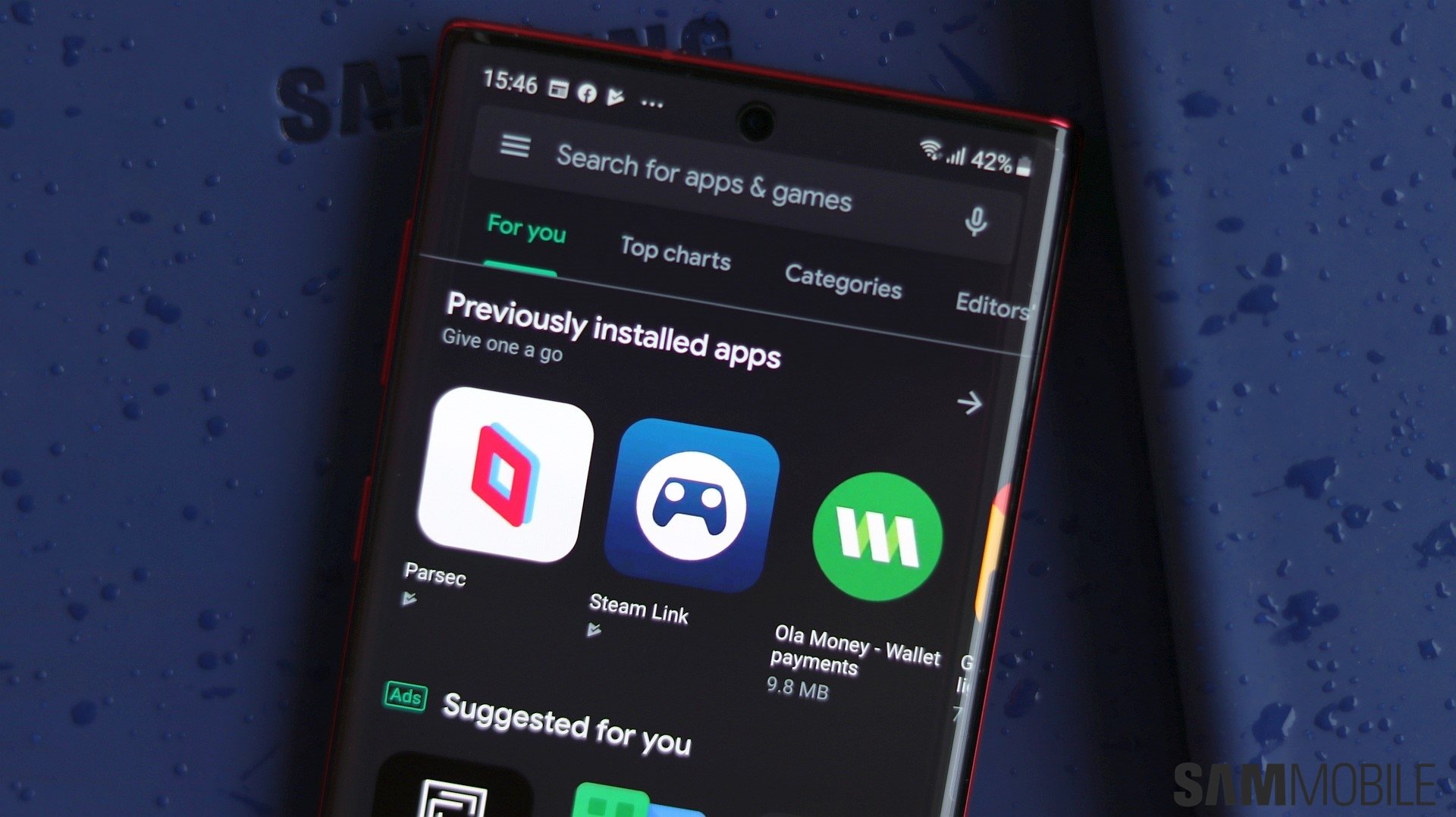
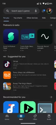
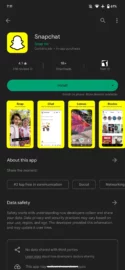
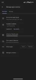
Cue “I'm Blue” by Eiffel 65! Or not. Either way, the Play Store just got bluer, literally. As you may or may not be aware, Google's Play Store previously used Material You Dynamic Color rules for UI elements such as the top tabs, bottom bar, and the search field. Other UI elements, like the “Manage apps & device” update page, the “Install” button, and even company names (under app names), were always rendered in green.
But this week, the Android app store experienced a shift in design. After a server-side update, the Play Store no longer abides by Dynamic Color rules, even partially, and instead, it uses the color blue where there used to be green accents and Dynamic Colors. Everything's blue now. (via 9to5Google)
This might be a temporary change
Although it may seem disappointing for the Play Store to abandon Material You Dynamic Color rules, this change might be temporary.
Remember that not every UI element was affected by Dynamic Color. Some were simply green, and there's speculation that Google may have turned off Dynamic Colors for the Play Store UI only for the moment.
The company might be preparing to deploy a more all-encompassing Dynamic Color update for the Play Store — one that would bring custom colors to more UI elements.
And in preparation for this rumored release, some Android users speculate that Google had to temporarily turn off the few Dynamic Color bits and pieces that were there already. As to why Google also chose to change the accent color from green to blue, that's anybody's guess.
