WhatsApp, the world's most popular instant messaging app, has received dozens of new features over the past few years. The app also received minor design improvements to adhere to the Material design language developed by Google. Now, WhatsApp plans to bring a massive redesign to make its Android app look cleaner and more futuristic.
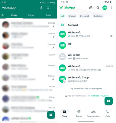
A new report from WABetaInfo reveals that WhatsApp is internally testing a new version (2.23.13.16) of its Android app. It incorporates Material Design 3 UI elements and layout. The green-colored top bar we've seen in WhatsApp's Android client for years will be replaced by a white-colored top bar with the WhatsApp logo, camera icon, search, user profile picture, and the three-dot button for the overflow menu.

The four primary tabs—Communities, Chats, Status, and Calls—are switching from the top to the bottom. They will have their own icons and icon labels, but it is unclear if you can switch between them by swiping sideways. Filters (All, Unread, Personal, and Business) at the top let you quickly look at relevant chat threads. The whole design of the app's home screen looks way more modern than it is now.
Some of these UI elements, including the bottom tab bar and chat filters, have appeared in previous beta versions of the app. However, they've not made it to the stable version of the app yet for most users. The modern new design is still being tested but could reach more users worldwide over the next few months.
After bringing support for using the same WhatsApp account on multiple devices, the company is also working on allowing the same app to support multiple accounts on the same phone. This negates the need for proprietary features like Samsung's Dual Messenger.


