Apple's iPhone 15 launch yesterday was interesting, to say the least. The biggest changes is that the company is finally giving up on its proprietary charging port and will now ship the new iPhones with a USB-C port.
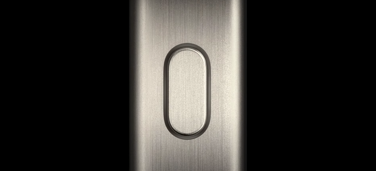
The company also made a hardware change by replacing the vintage ring/vibrate switch with a new Action Button. This button can be used to launch an app, fire up the torch, enable accessibility options, and more. Seeing it just gave me Samsung's Bixby key vibes circa 2017. Allow me to explain.
iPhones have had a physical ring/vibrate switch since the first one was launched in 2007. If you got a call and wanted to silence the phone, you could just flip the switch. This tiny design element has been changed almost 16 years after it was first introduced.
Apple has replaced it on the iPhone 15 Pro series with the Action Button. It's in exactly the same place as the switch has always been so loyal iPhone users won't need to retrain their muscle memory. By default, the Action Button will switch the device between ring and vibrate modes. However, users can choose what they want to use this button for from the settings app. The Action Button can be remapped to opening a note, launching the camera, starting a voice memo recording, enabling the flashlight, and more. Users can even set custom shortcuts for Apple's smart home ecosystem.
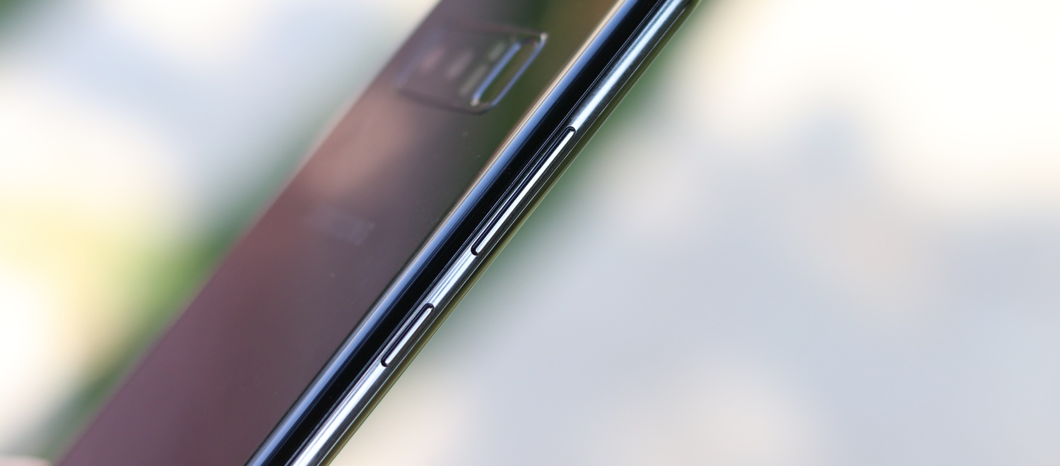
Seeing the Action Button being introduced during Apple's event yesterday brought back memories of Samsung's Bixby key. The Galaxy S8, launched in 2017, was the first device to come with a dedicated key for Samsung's smart assistant. Samsung was really pushing Bixby at that time and it felt that a dedicated key would get people to use it. On the contrary, it just ended up irritating users.
Initially, Samsung wouldn't allow users to remap the Bixby key. It could only be used for the assistant and nothing else. Eventually, third-party apps arrived that let users remap the button, but Samsung quickly shut them down. However, users continued to ask Samsung to make the dedicated key more useful, because it was just a waste of space otherwise.
That finally changed when Samsung launched the Galaxy S10 series in 2019. It allowed users to remap the Bixby key on the Galaxy S10 to open any app. With one minor change, the separate key was no longer a useless addition on the device. Users could choose to launch one app each with a single or double-press of the button. This functionality was later expanded to older devices as well.
Samsung would go on to ditch the Bixby key entirely with the Galaxy Note 10 later that year. The company likely realized that Bixby hadn't taken the trajectory that it had hoped to see so there was no reason to ship an extra button on the millions of units it was selling every year.
It's a bit ironic that Apple, a company that hasn't really been a fan of buttons on phones, has adopted an idea that Samsung has already abandoned. The Action Button's functionality is a bit incomplete, too. It's only a single-function button. Users can't map actions to a long press or multi-tap. I suspect that in true Apple fashion, this functionality has been withheld and will be offered in future iterations. Again, ironic though, that Apple would take inspiration from something Samsung did but not do it properly.
Then again, imitation is the sincerest form of flattery, so Samsung should be pleased that it's inspiring Apple to switch up its smartphone design, something that no longer seems to be a priority for the Cupertino company. Let's just hope that this doesn't give Samsung any ideas of bringing back the Bixby key. I quite like the less is more approach that Samsung now has with buttons.
