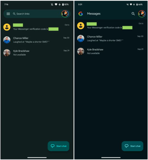
In the last couple of years, Google has been updating many of its Android apps with a redesigned user interface that gets rid of the navigation drawer, also called the hamburger menu, as it conflicts with the full-screen gestures that have replaced standard on-screen navigation buttons on smartphones these days (though Samsung still sticks to the buttons by default).
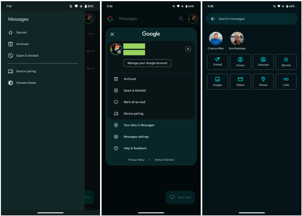
In the redesigned interface, instead of hitting the three horizontal lines at the top left of the app or swiping in from the left side of the screen to access additional options, users have to tap their profile picture at the top right. The new interface is already present in some Google apps, such as Maps and Play Store, and it is now making its way to the Google Messages app.
Google Messages interface modernized with new update
Google has been testing this change in the Messages app for some time, and with the app's latest update, Google is making it official for everyone. All of Google Messages' features, menus, and additional options are now accessible by tapping the profile picture/icon. You will also need to tap the profile picture if you want to switch between different Google accounts, or you can do it by swiping up or down on your profile picture.
The search screen has been redesigned to show a grid of categories/filters, like unread and starred messages, links, images, and videos, that you can individually select to narrow down your search results. Above those categories, you get to see a list of recent contacts that can be scrolled through horizontally.
If you use the Google Messages app (if you purchased a new Galaxy phone in the last two years, chances are it's your default messaging app), you should be able to download the latest update through the Play Store, though it may take a few days to become available for your device as Google tends to roll out app updates in phases.
Screenshots courtesy of 9to5Google


