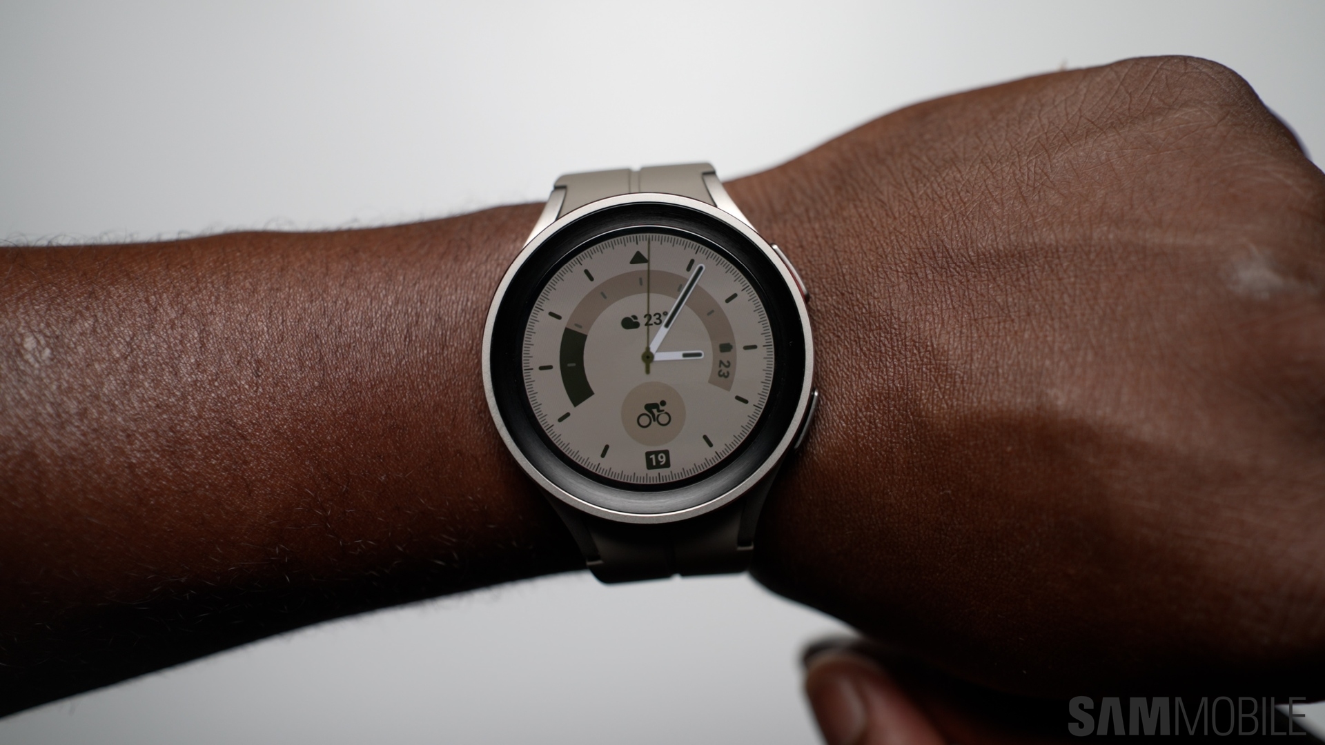
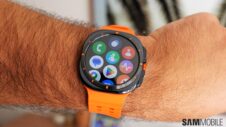
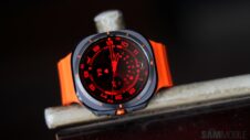
Samsung Galaxy Watches running One UI Watch 5 offer a variety of watch faces and Tiles. Watch faces, as we detailed this week, are the main component of the smartwatch UI, akin to a smartphone's home screen. And watch face complications are similar to home screen app shortcuts.
The watch face tells the time and, depending on which complications you're using, offers additional information at a glance about the weather, your fitness goals, health tracking, and more.
And Tiles, well, they're unique to smartwatches, but you could say they're full-screen interactive widgets that enable a more streamlined experience than standard app shortcuts. They, too, offer information at a glance about a wide variety of things, from the weather outside to your stress level.
Story continues after the Galaxy Watch 6 review video
The Galaxy Watch UI revolves heavily around watch faces and tiles. And although everyone's free to use whichever combination of watch faces, complications, and Tiles they want, this freedom of choice can lead to unwanted clutter sometimes.
Telling anyone which watch faces and Tiles they should use on their Galaxy Watch goes against the freedom of choice One UI Watch offers. Whichever watch faces and Tiles you use is entirely up to you, your needs, and your tastes.
Nevertheless, we believe in a design philosophy that may help you declutter your smartwatch UI and streamline your experience, no matter which watch faces and Tiles you prefer.
Declutter the Galaxy Watch UI through the right combination of watch faces and Tiles
When it comes to UI design, the old adages “sometimes, less is more” and “too many cooks spoil the broth” are often true.
An example of this is when you have too many choices of how you can reach a particular tool or feature. It may seem counter-intuitive, but having more than one way to access the same feature, tool, or UI element can make it more difficult for users to build muscle memory or remember how to get to said feature quickly. Too many choices can create clutter.
Therefore, one downside of having so many combinations of watch faces, watch face complications, and Tiles in One UI Watch 5 is that users can end up with a cluttered UI that impedes navigating through the smartwatch's features.
To avoid this, here's our tip for finding the perfect combination between watch faces, watch face complications, and Tiles:
- Avoid using watch face complications that share the same function as your Tiles!
Like Tiles, watch face complications can be tapped to reveal more information. What you might not know is that they reveal the exact same information a Tile would.
Example: Tapping on the stress meter complication has the same effect as tapping on the stress meter Tile. Tapping the “Feels Like” complication opens the same screen you can access through the “Weather” Tile.
To avoid cluttering your Galaxy Watch UI, you should try to avoid using watch face complications and Tiles that share the same functionality.
Think of it this way: if you're using a Weather widget on your smartphone home screen, which, when tapped, opens the Weather app, you wouldn't want to place the Weather app shortcut right below it, because that would be redundant and add clutter.
Similarly, if watch face complications are the equivalent of home screen app shortcuts, and if Tiles are sort of like home screen widgets, you may want to avoid watch face complications and Tile combinations that are redundant.
