Apple has always been vocal about its design philosophy. Such has been its reality distortion field regarding design that its fans would be at daggers drawn against anyone who suggested that Apple products didn't have the best designs in the industry. Truth be told, Apple isn't one to make major design changes frequently. The company tends to introduce major changes once in a while and then spends the next several generations making minor changes to that design, effectively milking it for all its worth.
The iPhone is the perfect example of this strategy but we've also seen the company use it for other products such as the Apple Watch. The company went in a slightly different direction for its smartwatch design. It opted for a boxy silhouette and made the rotating crown the centerpiece of its watch design. This was Apple's way of bringing the crown, a longstanding fixture on regular watches, to the modern age by making it a button and navigation age. Apple thus blended classic watch design with modernity.
Apple has cast such a long shadow on this type of smartwatch design that you wouldn't find many iterations of the same idea from other smartwatch manufacturers. They shunned any implementation of the crown and chose to opt for other means of navigation and input, lest they appear to be ripping off the Apple Watch's design. Again, it wasn't something that Apple came up on its own.
This wasn't the breakthrough in design that it was made out to be. Apple just took something that had always been a part of a conventional watch and made it its own. Someone had to go ahead and break this aura that the implementation of a rotating crown on a smartwatch was so uniquely Apple that even going against it would be a big mistake. Long known for its penchant to stick it to Apple, it seems that Samsung has taken up this mission.
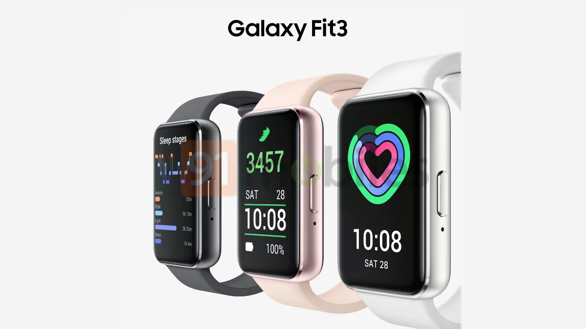
Renders of the Galaxy Fit 3 have leaked online recently, showcasing a design that can be best described as an effort to dumb down the Apple Watch's design. Keep in mind that the Galaxy Fit 3 isn't a full-fledged smartwatch. It's one of the cheapest activity tracking wearables that Samsung makes. It's not a high-end product and Samsung doesn't market it as such.
However, the impression that this new design of the Galaxy Fit 3 is giving is that Samsung is downplaying the appeal that so many attach to the Apple Watch's design. Perhaps the idea is to show that it's not even suitable enough for Samsung's cheapest activity tracker, let alone its more serious wearables from the Galaxy Watch series. Samsung's Galaxy Watch smartwatches have maintained a unique design identity with their circular displays. They're the farthest in the design department compared to its rival's smartwatch.
Be that as it may, perhaps the Galaxy Fit 3 is Samsung's way of showing that nothing is too sacred in the tech industry, and that it can break the long shadow that Apple has cast with the crown on smartwatches. Hopefully, this would give other OEMs the confidence to take a similar disruptive approach and take more bold decisions that they wouldn't have otherwise taken, should they be perceived to be copying Apple.


