One of the most striking changes in One UI 6.0 is the revamped quick toggle panel. It's different visually and functionally compared to previous versions of One UI, and it is the first sign that Samsung might be moving away from one of its core design principles upon which it built its proprietary mobile interface: one-hand usability.
Today, we're taking a closer look at the redesigned quick toggle panel in Samsung's One UI 6.0 update. What does it look like? What's new? Is it better than the old panel? And was the compromise to one-hand usability worth it?
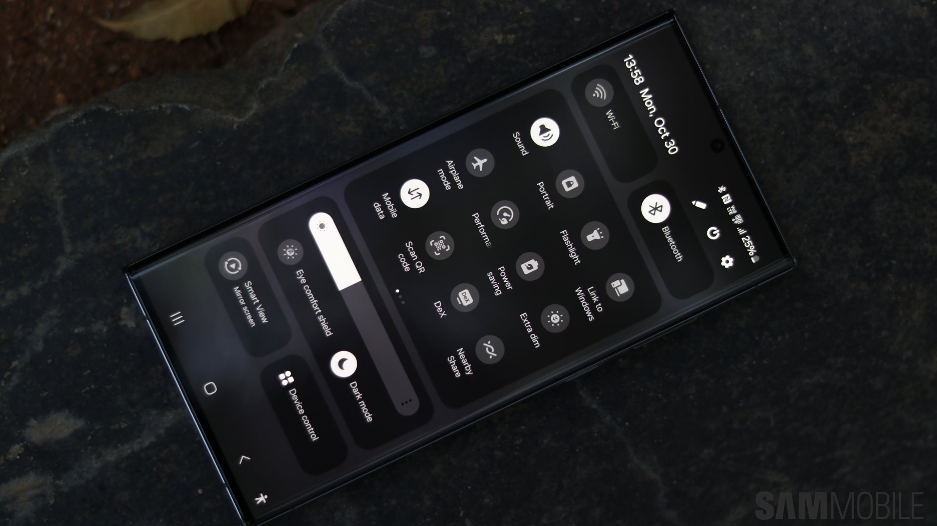
One UI 6.0 new quick toggle panel
The new quick toggle panel seems to have thrown the core principle of one-hand usability out the window, and judging by this metric alone, it certainly is a step in the wrong direction. But let's give it the benefit of the doubt and accept that Samsung's core design philosophies for One UI from years ago may have changed for the better.
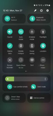
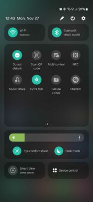
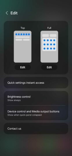
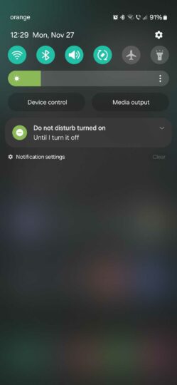
So, here's what the new quick panel in One UI 6.0 looks like. It still offers a scrollable list of quick toggles, but in addition to that, it has a couple of areas dedicated to specific quick toggles, such as connectivity and display settings.
Love it or hate it, the new quick panel organizes things better but moves the quick toggles closer to the upper edge of the screen, which goes against the core principle of one-hand usability.
Then again, it's debatable whether those core design principles were still applied to the fullest before One UI 6.0 even went live.
Beyond the obvious redesign, there are a couple of other things about this new quick pane that show a lot of potential and attention to detail.
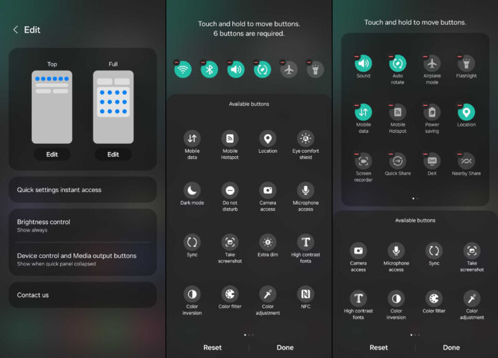
First, users can now define which quick toggles should be shown in both the notification and the expanded quick toggle area, not just the latter.
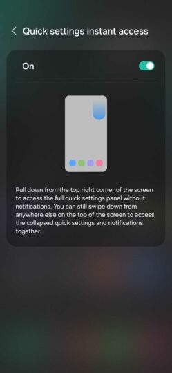
Second, One UI 6.0 users now have a new option to open the quick toggle area with one simple gesture: a swipe down from the right side of the status bar. It's an alternative to the existing two-finger swipe and one-finger double-swipe methods.
Galaxy device users running One UI 6.0 can enable this feature by tapping the pencil icon in the quick toggle panel, accessing “Quick settings instant access,” and tapping the toggle ON.
Other things worth knowing about the new quick toggle panel in One UI 6.0:
- The quick toggles in the dedicated connectivity and display areas can't be replaced or removed.
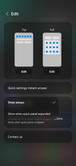
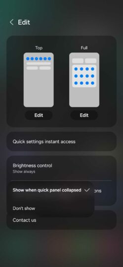
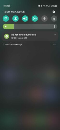
- The “Device control” and “Media output” buttons can only be hidden in the notification panel, not the quick toggle panel.
Is the new quick panel redesign an improvement? In some ways, it is. It keeps things more neatly organized, and the few extra features can be useful. But it doesn't care much for one-handed usability, so make of that what you will.
If one-handed usability matters to you greatly, you might disagree with these quick panel changes. But if that's the case, you might want to start using the dedicated one-handed mode in One UI more often.
For a preview of more One UI 6.0 features, check out our hands-on video below and stay tuned as we dive deeper and explore some of the most notable changes in the latest update in greater detail.
So far, devices including the Galaxy S21, S22, Galaxy S23, Galaxy Z Flip 5 and Z Fold 5, Galaxy Tab S8 and S9, Galaxy A14, A34, and A54 have received the Android 14-based One UI 6.0 update. According to a Samsung roadmap for Germany, the update should go live for even more Galaxy devices before the end of the year.


![[Video] Discover all the advanced features on your Galaxy phone or tablet!](https://www.sammobile.com/wp-content/uploads/2024/07/Samsung-One-UI-advanced-features-226x127.jpeg)
