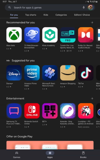
The Material You redesign, which was a part of the Android 12 OS, has already been applied to almost all Google apps on Android. Now as per 9To5Google, the Material You makeover for the Play Store is live for tablets and Chromebooks. But this is not the real makeover that the Play Store will get on tablets and Chromebooks.
Notably, at the I/O event, Google announced that there will be a major Play Store redesign arriving for large-screen devices. However, that isn't ready at the moment to be rolled out, which is the reason this small but important Play Store design change is rolling out for tablets and Chromebooks. The changes are similar to what we already have with the phone app's Material You design.
When in landscape mode, their bottom bar has been replaced by a navigation drawer, although there is a taller bottom bar available when in portrait orientation. The search bar is now a pill-shaped field with rounded corners, Dynamic Color is now applied across the Play Store. On unsupported devices, blue instead of green accent is used.
Material You redesign isn't evident anywhere else on the Play Store, and you can expect compact navigation rail and main feeds to arrive in the future. The Material You redesign for the Play Store on tablets and Chromebooks is already rolling out widely.
Join SamMobile's Telegram group and subscribe to our YouTube channel to get instant news updates and in-depth reviews of Samsung devices. You can also subscribe to get updates from us on Google News and follow us on Twitter.


