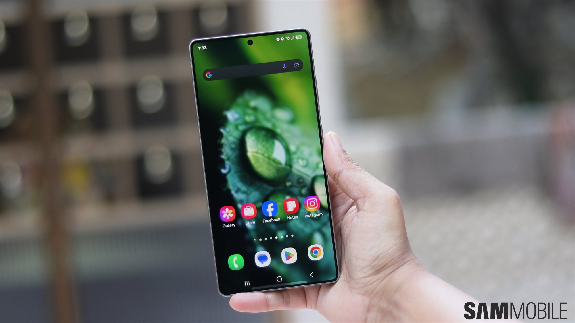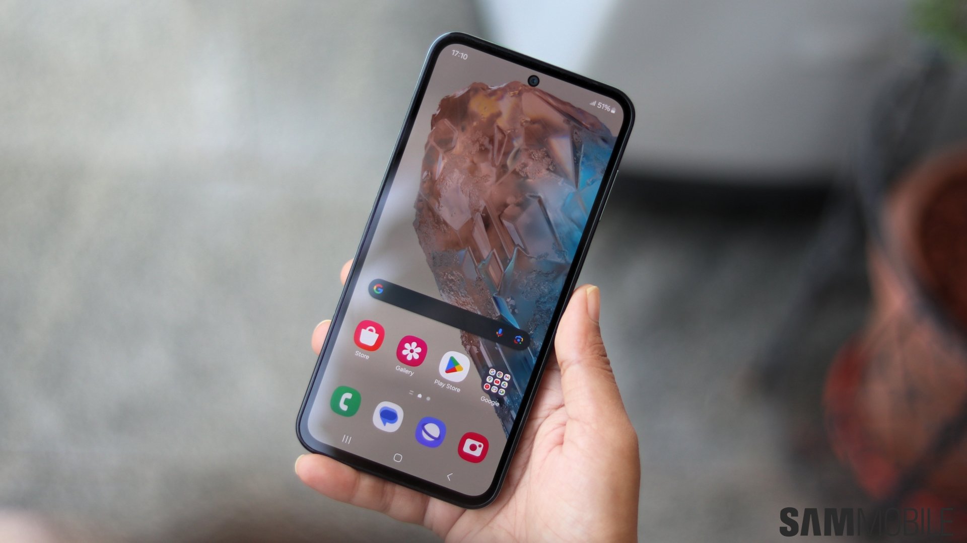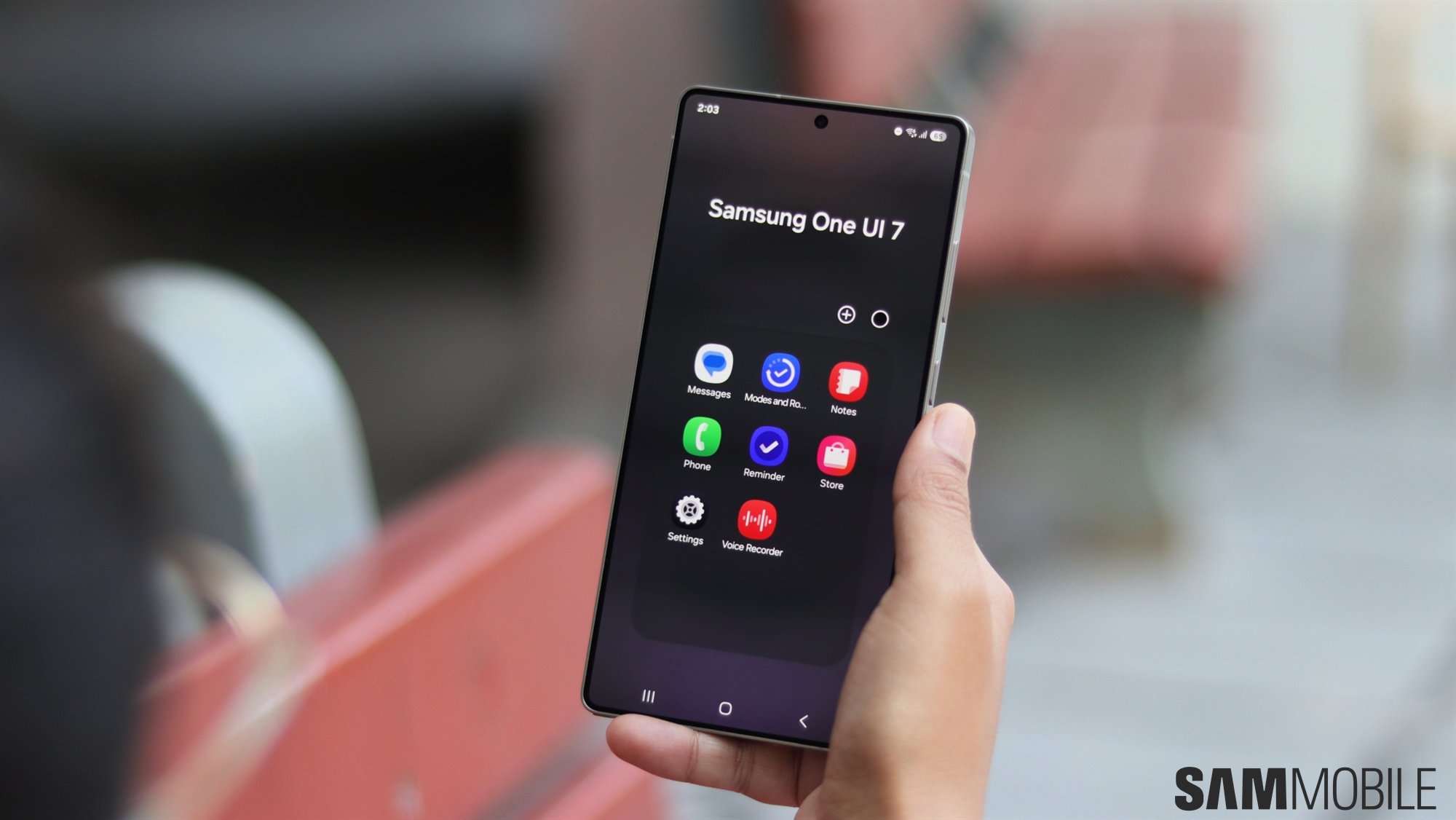
Interestingly, Samsung's strategy might take a different turn later this year. Rumors say the upcoming One UI 7.0 update might be more than a little different. If past updates were small steps toward an improved user experience, One UI 7.0 might be more like a significant leap.
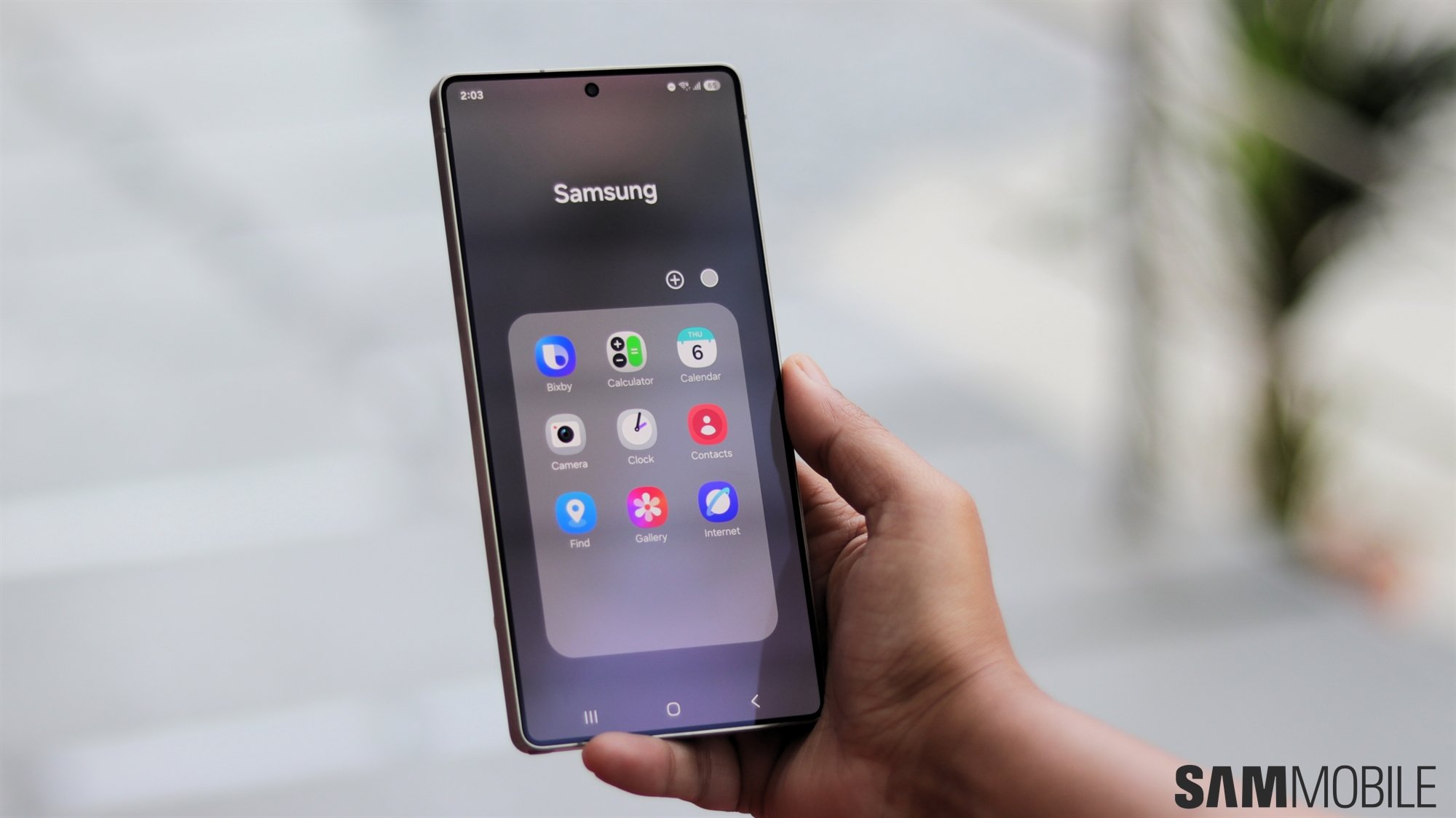
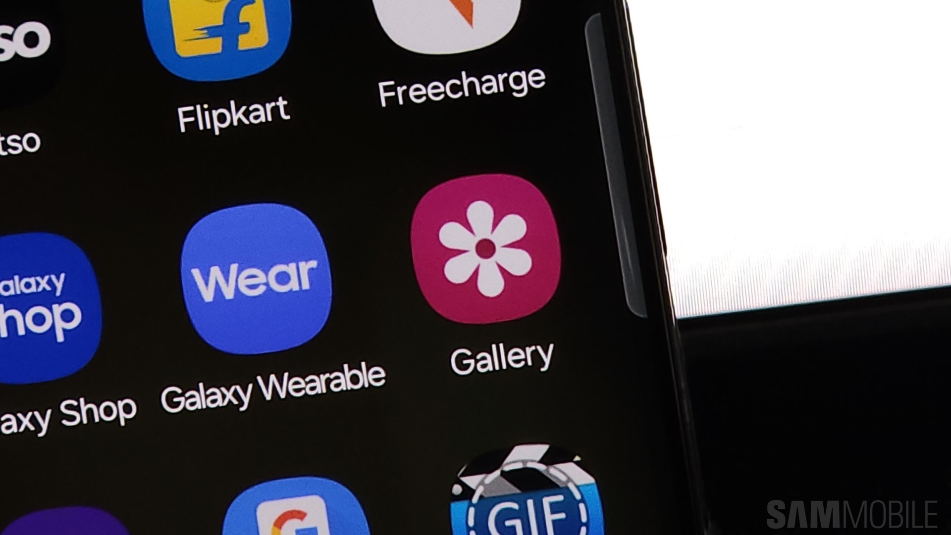
One of the changes rumored to be a part of One UI 7.0 consists of redesigned icons for first-party Samsung apps. These haven't received a lot of — or any — attention in some time, but the upcoming update might address this.
New Samsung Gallery app icon leaks?
The image below, shared today on X by @chunvn8888, may have given us an early preview of what the Gallery app icon looks like in One UI 7.0.
Instead of a plain monochrome Gallery icon, One UI 7.0 might lean toward embracing more colors. Rather than having white petal shapes on a red background, this Gallery icon has a white background, and each petal has a unique color. In a way, it almost looks like a Google app icon.
More after the video
We're guessing the Gallery icon isn't the only one that might go through a drastic redesign, and other monochromatic Samsung app icons, like Email, Notes, Camera, etc., could undergo a similar treatment.
That is, assuming the leak is accurate. It's always possible that what we're seeing doesn't reflect the official plans. It's just as possible that the screenshot shows an early Samsung design that might not make it into the final version of One UI 7.0. Nevertheless, it might hold a clue to where Samsung could be pushing its icon design next.
As for One UI users who might prefer the monochromatic icon design, Samsung's ongoing One UI versions offer the option to apply the UI's general color palette to app icons and make everything look more uniform. We're guessing — or hoping — One UI 7.0 will hold onto this existing option to offer an alternative for people who might not like colorful icons.
