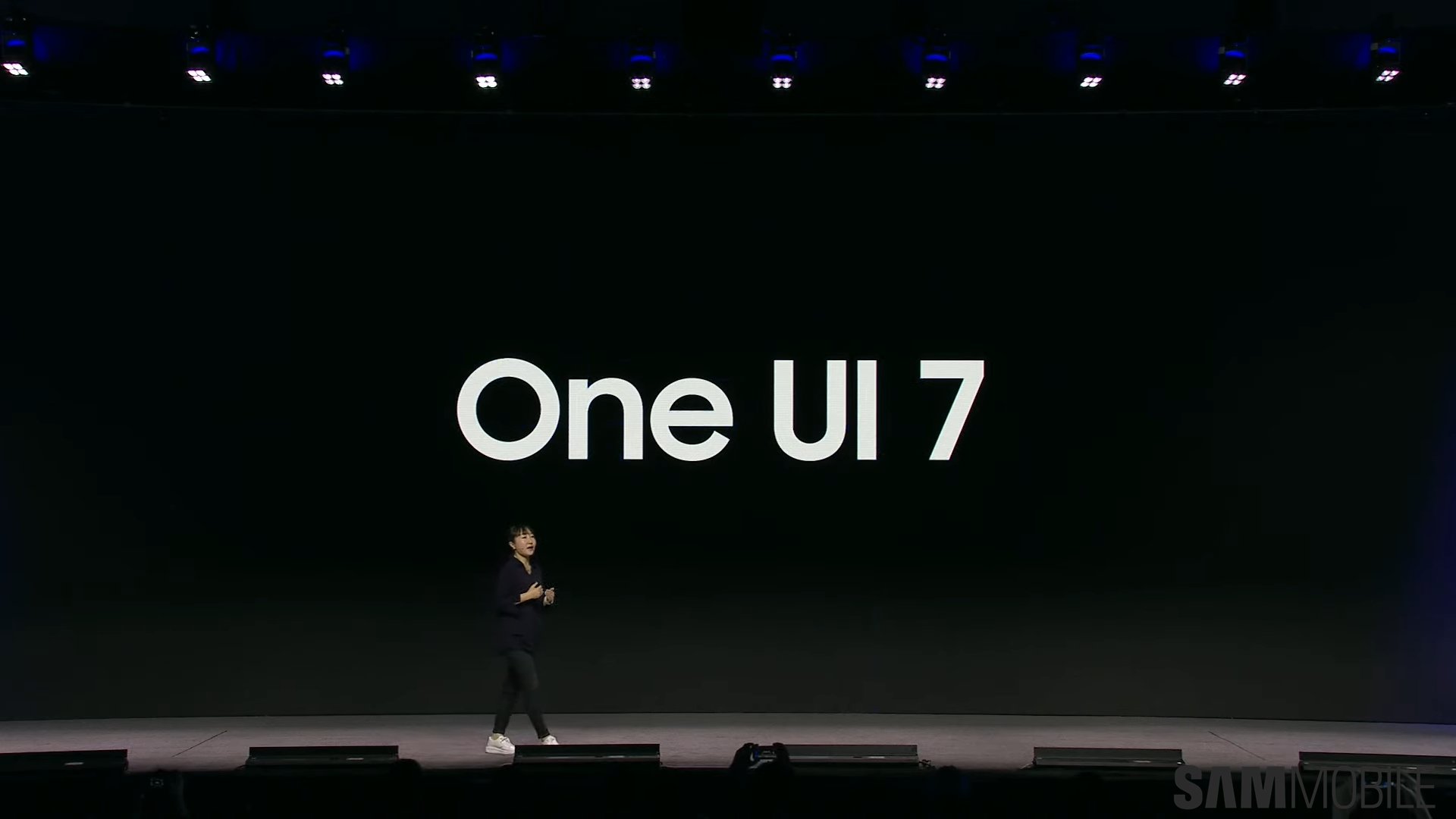
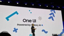
We had our first real glimpse of the upcoming One UI 7.0 update last week at SDC 2024. We even had the chance to record a short hands-on video of a Galaxy S24 Ultra running a developer build of One UI 7.0, but even so, the update's features remain somewhat in question.
That's because, unexpectedly, Samsung won't release the final One UI 7.0 build to the public this year. The beta period should open before the end of 2024, but right now, virtually everything we've seen about One UI 7.0 could change more or less by the time the firmware goes official next year.
But for what it's worth, here's another closer look at the current design of the One UI 7.0 quick panel.
The fan-made render above (via UniverseIce) depicts what the One UI 7 quick panel should look like based on what Samsung showcased on the developer build at SDC24. Once again, things are subject to change, but at the very least, this is the direction in which Samsung appears to be going.
More quick panel sections with extra controls
One of the most notable things about this new quick-toggle panel is that it has more segments. In this One UI 7.0 mockup, the quick-toggle panel accommodates the music playback widget and an audio control widget with a volume slider, similar to the display brightness slider to its left.
More after the video
Samsung appears to want to modernize One UI and bring its proprietary Android skin into a new era. At SDC24, Samsung said its design principles for One UI 7.0 are “Purposeful Simplicity,” “Signature Impression,” and “Emotional Attachment.”
The company intends to achieve visual consistency and simplicity across the board, create signature UI elements, and deliver animations and blur effects that create a positive emotional response.
Samsung will continue to tweak the UX of One UI 7 until it gets as close as possible to achieving that vision. However, whether or not the quick panel design we see above is final remains to be determined.


