Google's last major update to the Google One app on Android was over a year ago. It brought the Material You redesign with Dynamic Color support and also added a dark theme to the app. Users have been waiting for the tablet redesign of Google One since May. While we wait for it, the Android app is receiving a new update.
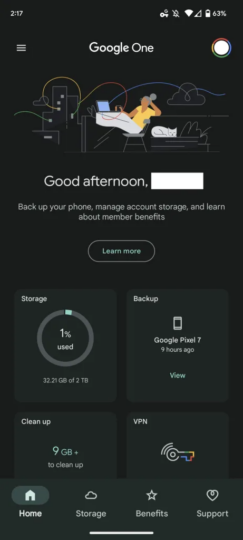
In a server-side update (via 9To5Google), Google has pushed a redesigned homescreen for the Google One app on Android. The new design brings more information about subscriptions on the homescreen so that you get most of the details at a single glance. Sadly, this makeover only applies to the Home tab and brings a graphic and time-of-day greeting up top.
You will come across a backup of your phone, storage management, and member benefits on the home screen of the Google One app. Moreover, when you tap on Learn More, it no longer opens an in-app source but rather opens a web page.
The Google One homescreen redesign is rolling out via a server-side update to Android phones
The biggest change is that the homescreen gets a grid of 2×2 cards that gives you insight into your storage, backup, and a cleanup card that shows how much storage you can reclaim by deleting unwanted files. The Google One VPN now isn't the first thing in the feed, but it is still on the front page. It is followed by a carousel detailing “Extra Google Photos editing features,” “Premium Meet calling,” and VPN. At the bottom, there are two cards showing shortcuts to family sharing and a Manage card that shows how long you have been a Google One member.
Do note that this new Google One homescreen redesign hasn't rolled out widely on all devices. It is rolling out via a server-side update. The update matches one.google.com, the tablet revamp that everyone is waiting for.
