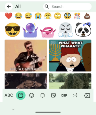
If you use Google's Gboard keyboard app, then the emoji picker would be the most used interface on your phone. Well, the good news is that the Gboard emoji picker is receiving a redesign and getting all cleaned up. While it isn't a complete overhaul, the subtle change is available on the Gboard's emoji feature on the top bar that includes the back button, page name, and the search field.
Speaking of the changes, the ‘All' tab remains unchanged, and it is the ‘Emoji' tab that is receiving most of the changes. The Emoji picker now sits below the top bar and is less stacked. The ‘Search' and ‘Category' features are the first things on the panel.
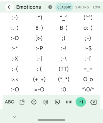
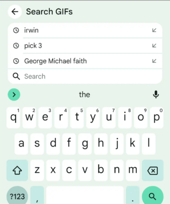
The ‘Stickers' section on the top bar is now less crowded. The GIFs and the Emoticons tab also are in line with the UI, and the search feature gets the same UI treatment. One weird change that has been spotted by one user is that the ABC button is absent from the bottom-left corner. Using this ABC button, you could easily go back to the keyboard, which isn't available now.
It now requires you to return to the letters key by hitting the top-left back button. Your muscle memory might need to get a bit of training using this new shuffle. Google now shows Emoji Kitchen stickers within the emoji picker instead of above it. The Gboard emoji picker redesign is appearing for a lot of beta users.
This new design is yet to roll out to a wider audience via the stable channel. So, if you want to try out this new redesign, you need to be a beta tester for the Gboard app, which you can do from the Play Store.
