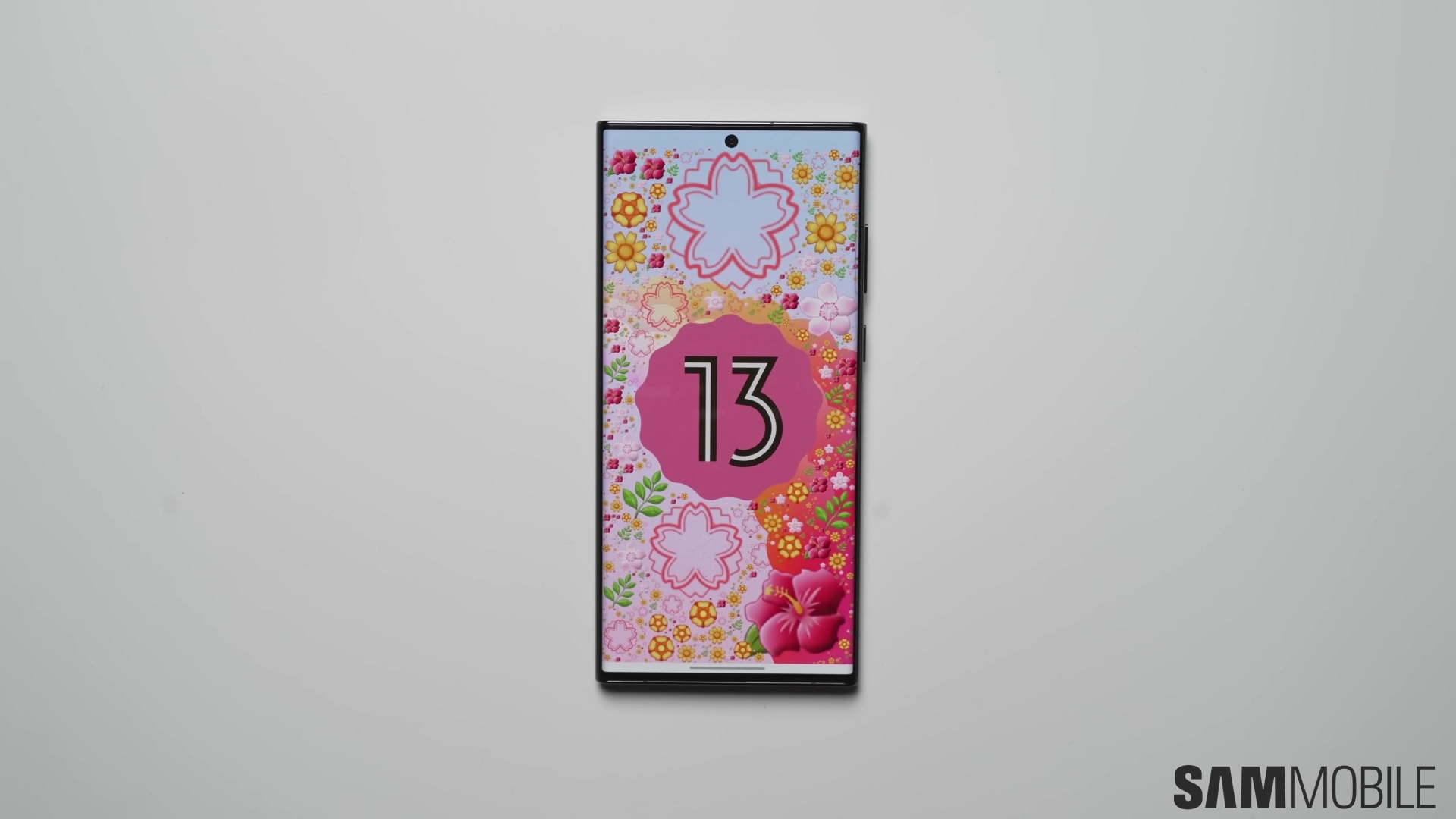
I've been using the Android 13 One UI 5.0 update on my Galaxy S22+ for the past two and a half weeks. So far, I love it! Even though it didn't bring as many visual changes as previous One UI versions, One UI 5.0 is becoming one of my favorite updates in recent memory. It feels highly optimized, and one of the things I can't seem to stop geeking out over is how snappy the UI animations feel. Don't believe me? There's a screen recording down below to back up my claims.
I should point out that I'm using One UI navigation gestures rather than the old nav buttons. Furthermore, I'm using the gesture option for the apps drawer rather than the apps drawer icon. I haven't tried One UI 5.0 with a more traditional nav button configuration, so I can't speak for that. And as a side note, if you're still using nav buttons, I recommend trying out One UI navigation gestures instead. It may take a bit of time to get used to them, but I honestly believe it's all worth it in the end.
One UI never felt as snappy as it does now in One UI 5.0
I can't speak for the One UI 5.0 update for other Galaxy phones, and by now, you're probably aware that quite a few Galaxy phones have received the Android 13-based firmware. I can only speak for the Exynos-powered Galaxy S22+, and I can say that One UI 5.0 truly is a pleasant experience. The UI feels more responsive than ever, and yes, in case you're wondering, I am using the default animation durations (1x).
One UI 5.0 feels like it was born out of a different philosophy than previous versions, and I'm all for it. It seems as though Samsung didn't spend as much time trying to add value to the user experience through wild, out-of-the-box ideas. This time, it narrowed its focus on improving what matters and adding new (sometimes inconspicuous) features where it makes sense. One UI 5.0 has a quality-over-quantity approach, and it's seemingly for the best.
Now, allow me to stop geeking out over how good One UI 5.0 has been on my Galaxy S22+ and give you a short demonstration of how snappy the UI feels when combined with the right gestures. I think it's miles above One UI 4. But see for yourself. Keep in mind that the video below is a screen recording, which means it doesn't show all the frames (it's compressed and not as smooth as experiencing One UI 5.0 first-hand), and the recording process slowed down my phone a tiny bit. Even so, it should get the point across.
By the way, if you want to try out navigation gestures and learn how to enable them, feel free to check out our guide. And if you want to be able to swipe down anywhere on the screen for quick access to the notification area while keeping the “swipe up” gesture reserved for the apps drawer, open the Settings app on your phone, go to “Home Screen,” and enable “Swipe down for notification panel.” You can also hide the apps drawer button from this menu by tapping the “Show apps screen button on Home screen” toggle switch OFF.
For a closer look at more One UI 5.0 features, feel free to check out our other videos below.
