Finally, the Material You redesign is arriving to the Android Auto app. The new design settings are now live with the latest Android Auto beta v8.6. As per the Google News Telegram Channel, the new Android Auto Material You redesign isn't widely available. Moreover, not many will be able to view the changes as the beta channel is currently full.
So, the first thing is that you need to be enrolled in the Android Auto beta program, and second, it seems like this feature is enabled via hidden flags or something rolling out from the server side.
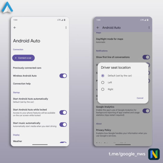
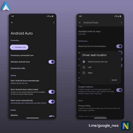
You can see the big, scrollable headers and a round button for the ‘Connect A Car' option. There are new toggles that are a part of Material Design 3, and it also features a new dark mode. You will also notice that the old header image is now gone, and the settings menu is now clean. Overall, the new design provides a more modern experience, similar to what other Google apps offer their users.
All the options are well organized and grouped together to make navigation much easier. While the Android Auto settings menu isn't something that you will visit often, when you did, it looked old and dated. Thanks to the new changes, it looks much cleaner and fresh.
The changes were first reported in the Android Auto beta v8.5, but they are now fully functional in the v8.6 beta. This implies that it could arrive in the next stable update, but there isn't any confirmation about the same. It is nice to see that Google, at last, paid attention to the Android Auto app, which had roughly the same design since 2020.
