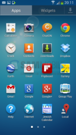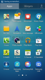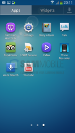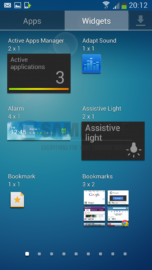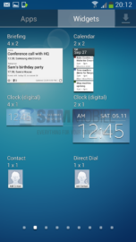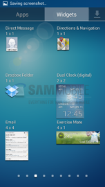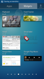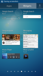
– Home/Menu
– Gallery
– Camera
– Settings
– Easy mode
– Benchmarks
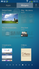
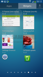
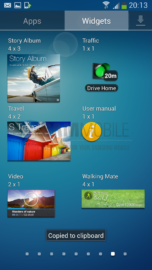
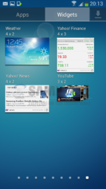
Home/Menu
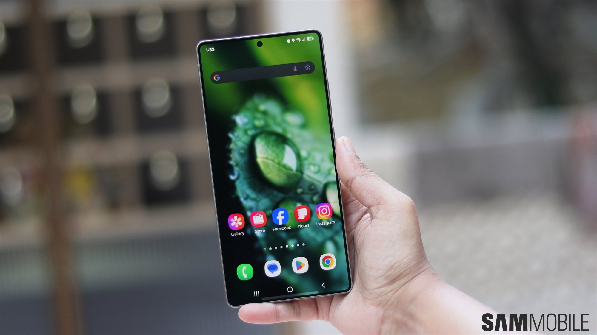
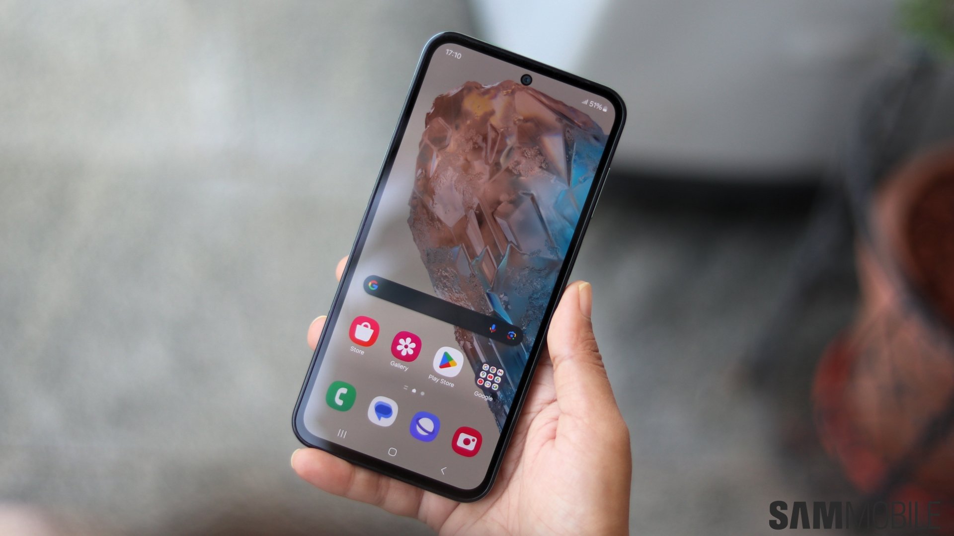
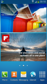
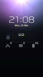
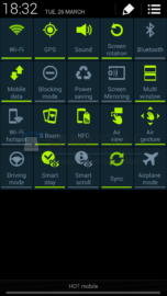
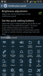
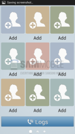
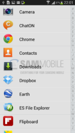
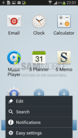
With the Galaxy S4, Samsung has introduced their new TouchWiz Nature UX 2.0 and with the new Nature UX 2.0 they have added a lot of new widgets as well. The TouchWiz launcher functionality is exactly the same as its predecessor but we think this was a very intelligent move by Samsung, as the users who upgrade from their previous Samsung Galaxy smartphone will already be familiar with the User Interface and will find it relatively easy to use. The TouchWiz Nature UX 2.0 is more of an evolution than a revolution but that does not mean you are getting entirely the same thing as you got last year with the Galaxy S III and the Galaxy Note II. Samsung has changed many aspects of its Nature UX to provide an overall new fresh look.
Gallery
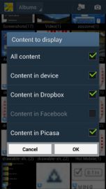
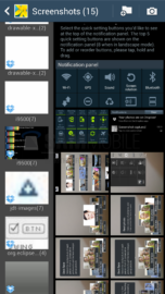
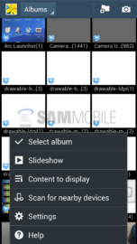
We were a little disappointed by the Gallery's interface as it lacked functionality compared to the Gallery on the Galaxy S III and the Galaxy Note II. There are no options to change preview styles, to Tizen Gallery style etc, like we can on the Galaxy S III and the Galaxy Note II and we really miss this feature. This feature may get implement before the device actually starts shipping. However, we really liked the “Content to display” feature in which we could add or remove the content from displaying in the Gallery, for example: from Facebook, Dropbox etc.
Camera
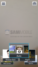
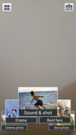
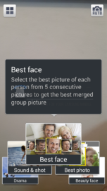
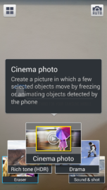
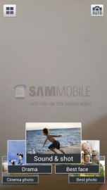
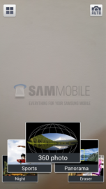
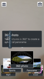
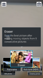
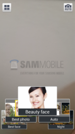
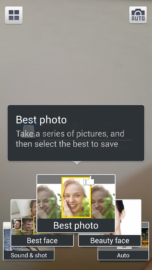
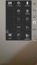
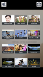
The Camera interface has received a complete overhaul, compared to the predecessors, as Samsung has brought the camera app from the Galaxy Camera to the Galaxy S4 and have added tons and tons of features to it, for example: Dual Camera, Sound & Shot, Drama Shot and Story Album. Each and every feature is very easy to access thanks to its simple and easy-to-use interface. Overall, the Galaxy S4 has one of the best Camera Interfaces we have seen on a mobile device.
Settings
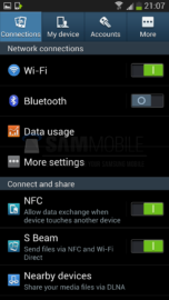
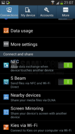
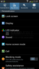
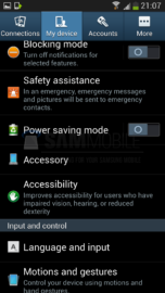
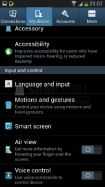
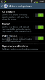
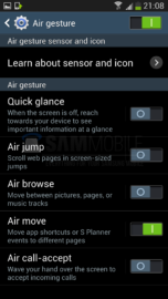
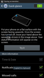
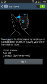
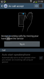
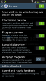
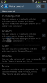
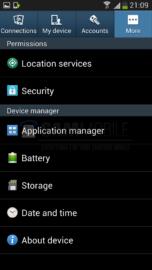
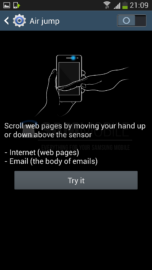
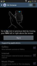
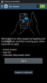
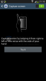
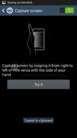
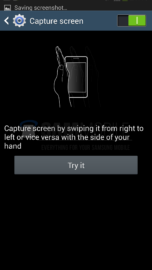
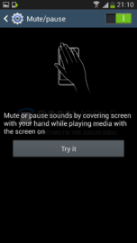
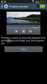
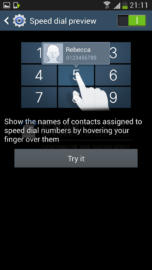
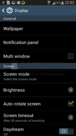
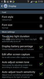
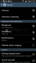
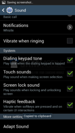
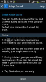
As soon as you open the settings, on the Galaxy S4, you will feel that you are using a completely different operating system instead of Android. This is because Samsung has moved away from Android's design elements and decided to make a tabbed interface, dividing the device's settings under 4 different tabs. Whenever you activate any of the smart features a little demo is also displayed which teaches you how to use that particular feature.
Easy mode
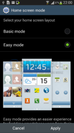
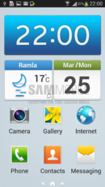
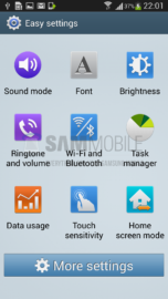
Easy mode is a mode of TouchWiz which makes the whole user interface much much and easier to use. The easy mode removes all the bells and whistles and brings a simple and classic interface. This mode is mainly for those people who think touch interfaces are difficult to use and learn or who just want to use basic functionality. Even the settings menu gets replaced with Easy Settings. Easy mode first made an appearance on the Galaxy S III with the Android 4.1 Jelly Bean update but it didn't worked as good as it does on the Galaxy S4.
Benchmark
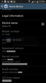
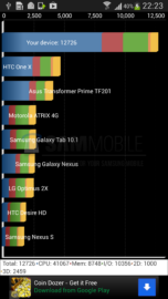
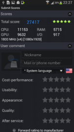
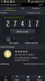
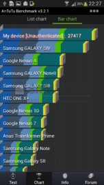
So, as we had the Octa-Core (GT-I9500) variant of the Galaxy S4, we decided to do some benchmarks. We are just BLOWN away from the results we got. The Galaxy S4 crushed every other device, even the HTC One and the Sony XPERIA Z. We used Antutu and Quadrant as our benchmark tools. The device received a score of 27417 on Antutu and 12726 on Quadrant.
Our full review of the Galaxy S4 will come at the end of April, so stay tuned for that!
