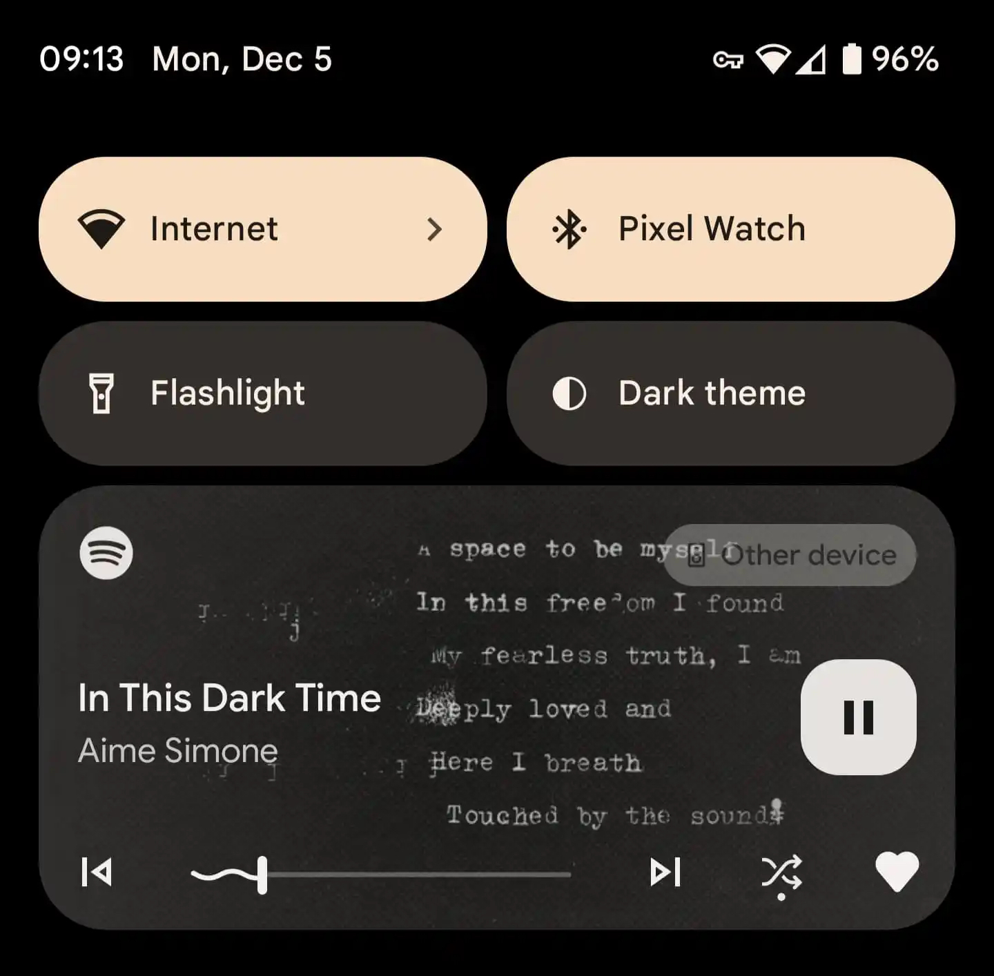
Android 13 introduced redesigned media playback controls in the notification shade. The new media player, apart from showing the album artwork throughout its entirety, has a squiggly progress bar. It also has a new and dynamic placement of media control buttons, which is more user-friendly. However, third-party applications have been very slow to bring support for the new media player. Spotify was one among them but not anymore.
The latest beta version of the Spotify app for Android (version 8.7.92.115) supports Android 13’s media player design (via 9to5Google). If you are not enrolled in Spotify’s beta program for Android, you will have to wait for the stable release of the new version of the app to experience the new media player, as Spotify has stopped accepting new public sign-ups for the beta program through the Play Store.

With the new media player, Spotify now shows a rounded square button to play/pause music. The buttons to go to the previous/next track are placed on either side of the music playback bar. The new media player also allows apps to offer two buttons of their choice, and Spotify has chosen to go with buttons to shuffle and like songs.
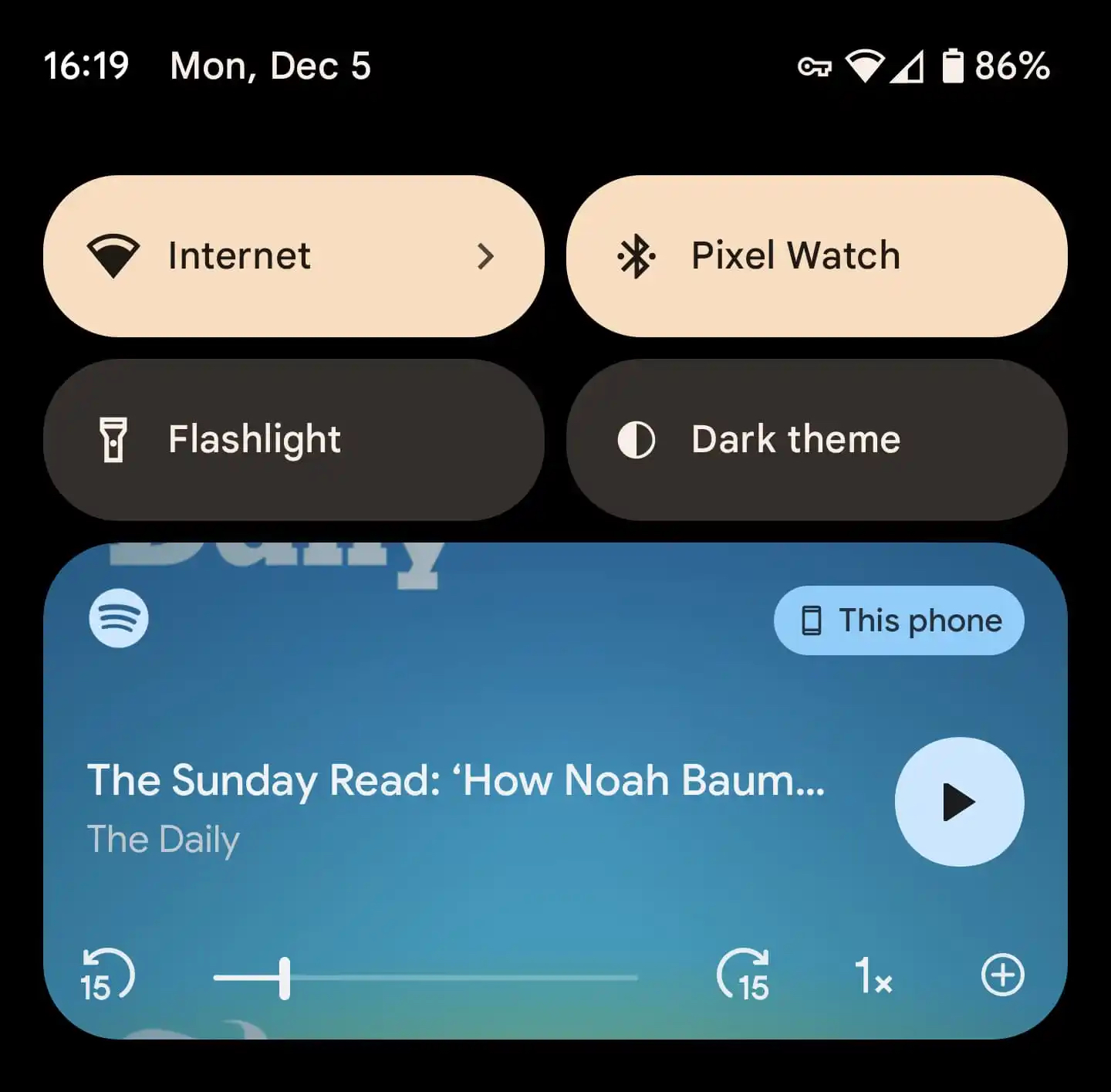
If you are playing a podcast, the previous/next track buttons get replaced with 15-second rewind/forward buttons, and the shuffle and like buttons get replaced with buttons to speed up the playback and add a podcast to your library. Unfortunately, Samsung hasn't integrated Android 13's original squiggly media player progress bar in One UI 5.0, and we are not sure if the company is planning to change its decision anytime soon.
Apart from Spotify, other popular apps that have added support for Android 13’s media player include YouTube, YouTube Music, Google Podcasts, SoundCloud, Shazam, Pocket Casts, Play Books, Chrome, and Recorder. The ones that are yet to add support for the new media player include Apple Music, Tidal, and Pandora.


![[Update] Samsung Keyboard loses Grammarly, Spotify, YouTube extensions](https://www.sammobile.com/wp-content/uploads/2020/04/samsung-keyboard-2-226x127.jpg)


