The Galaxy Note series is Samsung’s own creation, one that gave the world the first phablet. Back in 2011, Samsung created an entirely new market and a lot of people thought these so-called phablets wouldn’t sell. Well, they were wrong, as the first Note sold about 10 million units within eight months. The second Note sold even more with 5 million units in two months, and the Galaxy Note 3 saw 10 million unit sales in the same period. Even Apple is going big these days with the iPhone 6 Plus. Samsung surely did something right, but the big complaint users had was the build quality of its phones.

Samsung always used polycarbonate plastic, but this year that has changed. Samsung released the Galaxy Alpha (read our review here), its most beautiful phone ever. The Galaxy Note 4 brings over the same design philosophy but is unsurprisingly (and unapologetically) bigger and has the staple features of the Note series, and we’ve noted our findings with Samsung’s latest phablet flagship below.
Design
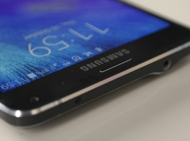
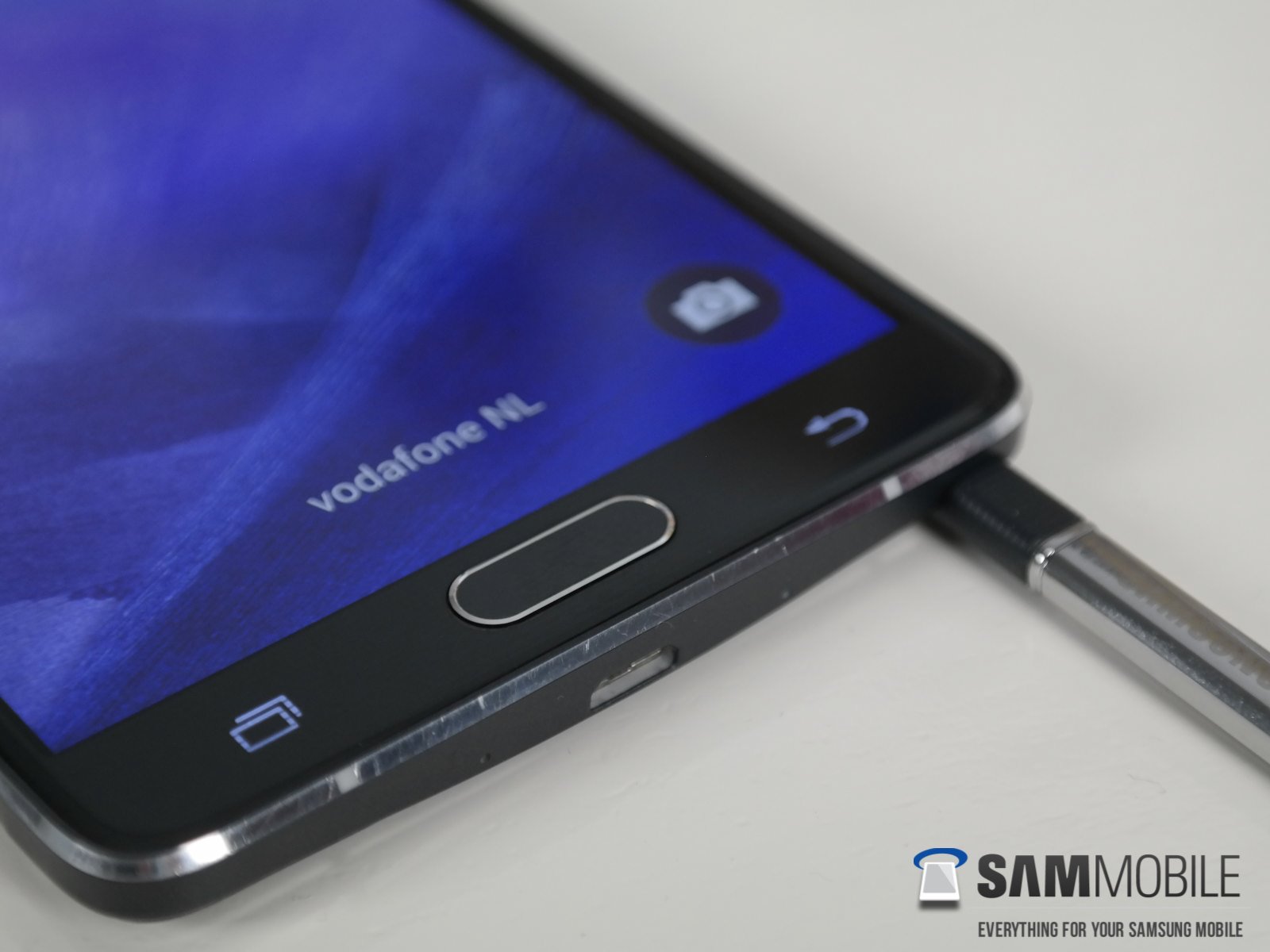
Design is always a hot topic when you talk about Samsung phones. They often lack inspiration, always look the same and are usually made out of plastic. For the first time ever, Samsung is switching to metal for their Android phones to offer a more premium build. Just like the Alpha, the Note 4 is made out of metal on the sides and is beautifully crafted. The edges are just like the Alpha’s – chamfered but ionized in the same color as the phone itself, giving it a very premium look.


At the front, you get a typical Samsung phone – there’s a hardware home button that also houses a fingerprint sensor, and touch buttons for going back and switching apps on each side. The back of the phone has a plastic cover with a soft-touch feeling to it, though it’s not as soft as the Galaxy Alpha’s, which in our eyes has a better feel. It has the same faux leather textured back as the Galaxy Note 3, but the back on the Galaxy Note 4 feels a tad bit better. There’s a protruding 16-megapixel Sony camera on the back (this time with optical image stabilization), and below the camera we find the LED flash and heart rate monitor. Beneath those two we get the typical Samsung logo. If we look further down the back we see the loudspeaker, which we found is wrongly placed and would be better off at the bottom of the device like the Galaxy Alpha (and like the Galaxy Note 3.)

Coming back to the front, we see the speaker grille at the top, with the usual sensors on its right and a 3.7-megapixel camera on the left. The right side of the phone houses the power button, while the volume rockers are on the left. The top of the phone houses the 3.5 mm headphone jack and a microphone for noise cancellation; there’s another microphone at the bottom, alongside the S-Pen port and a microUSB 2.0 port. The chamfered metal edges are interrupted by little plastic stripes for improving antenna reception.

Interface/Software
The interface of the Galaxy Note 4 has been upgraded from the interface seen on the Galaxy S5. It has more white to give it a more appealing look, though it only works partially in our eyes. You do get the feeling that they’ve made something new, but it’s still the same old boring TouchWiz. Everything else has stayed the same as that on the Galaxy S5, only this time the status bar turns into the same color as the app in certain apps. What was striking to us was when we turned on the Note 4 and went into the app drawer, there were two screens: one with all Samsung apps and one with Google apps. We can imagine this can be confusing for the consumer and it adds a lot of bloat to the device, and we’d like to see some solution for this, as there are a plethora of apps which you will probably never use.

Samsung is known for providing a plethora of features on its Galaxy Note devices. This year isn’t any different; they’ve improved the interface and added quite a few features and options, and we’ll discuss the most impressive of those below.
Samsung has upgraded their S Note app once again with a few nifty features. One of those is Photo Note, which lets you make a photo of, for example, text written on a chalkboard and converts it from analog to digital and further lets you edit it by adding additional memos with the S Pen.
Multitasking has been improved as well – you can now swipe from the top corners to the center of the screen in an app to minimize it and get a floating window, just like you would on a desktop OS. If you fully minimize those windows, you will get chat head-like bubbles that don’t take too much space on the screen and allow quick access to those minimized apps. The normal Multi Window feature is present as well – just press and hold the back button and there you can select two apps to run on the screen at once. All these features basically show that Samsung is still king of multitasking, especially on phablets.

S Pen
Since the first generation of the Galaxy Note, it packs an S Pen, a stylus that is a great addition to the device as it makes it stand out of the crowd and results in some awesome multitasking capabilities. This year’s S Pen has once again been improved and can read up to 2,048 pressure points, compared to 1,024 on the Galaxy Note 3. It’s doubled, yes, and you can notice that there is no latency in writing with the stylus whatsoever. It really is writing on a memo.
They have enhanced the functions of the S Pen as well. This time, you can use it like a mouse on a PC. Just hold its button and swipe across the items you want to select so you can easily share and delete them.
A lot of features stayed the same as last year’s Galaxy Note so if you want to have a better look at those features we suggest you read our review here.

Screen
The first Galaxy Note came with a 5.3-inch 1280×800 display and had a pixel density of 285 ppi. The Noe 3 came with a 5.5-inch 1280×720 display which resulted in a lower ppi, but its subpixel arrangement was better so it wasn’t that visible. With the Note 4, Samsung stuck to the 5.7-inch display like Galaxy Note 3, which we think is the sweet spot for a phablet, but has jacked up the resolution to Quad HD (2560×1440), resulting in a pixel density of 515 ppi.
The display on the Galaxy Note 4 is stunning; it’s vivid and colors pop out of the screen. Like we said in our review of the Galaxy Alpha, Samsung likes to wow you with very vibrant and flashy colors. This is something you can see in the wallpapers Samsung always uses. The thing is, they are oversaturated and this is due to the fact that its display setting is set to Adapt Display out of the box. If you’re looking for natural colors, you would do well to switch this to Basic, a mode in which even gray colors are very accurate. The display’s outdoor readability is at par with the Galaxy S5’s, which basically means that it is outstanding, especially on auto brightness.
Camera
The Galaxy Note 4 comes with a 16-megapixel camera with a Sony lens, the IMX240 to be precise. It has phase detection autofocus which was absent on the Galaxy S5. It’s the same as the one used on the Galaxy S5 LTE-A, only this time the camera has optical image stabilization (OIS). Software stabilization isn’t present anymore, so you can see it is the hardware that is doing all the work now. Normally when you use digital zoom, you would get a little blur from the movement your hands make, but with OIS this tends to happen a lot less. The pictures taken in daylight are very beautiful; the pictures come out colorful and crisp. Image capture is insanely fast and every picture you take is as beautiful as the last one you took. A cool feature is that you can use the heart rate monitor as a shutter button.

In low-light conditions, the photos come out better than any other Samsung phone. It can still do better though, as it often over exposes the subject.
The Galaxy Note 4 can shoot videos at up to 4K resolution, and here OIS really pays off. When you’re shooting a video you can really see how steady the videos turn out, something you can see in the video sample below.
The front camera has been upgraded to a wide-angle 3.7-megapixel unit. Samsung has followed the selfie trend and added a few related features. You get a selfie and a wide selfie mode, the latter of which lets you take a panorama selfie. This is especially cool when you are with friends and want them all to fit in your photo, something that isn’t always easy or possible with standard shots taken with a front camera.
Battery
During our test period with the Galaxy Note 4, we had bad battery life initially with Samsung’s pre-release firmware. Luckily, there was an updated available through Samsung’s Kies program, and since this is the firmware that consumers will get out of the box, we started measuring battery life only after we had installed it on our device.
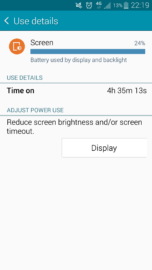
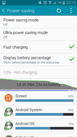
In our battery test, we had charged the Galaxy Note 4 fully on a Friday night. We used it like a normal smartphone user, one that mainly looks at his or her smartphone for the latest news, take some pictures, and look at the latest social media updates. We also watched a video for about half an hour; we used YouTube for some video clips, made a few phone calls for a duration of 20 minutes, and at home we mainly used a Wi-Fi connection.
Below are the results. We should note that the screen brightness was set to Auto at all times, but set halfway when we were watching a video for about 30 minutes in full-screen mode.
Wrap Up
After Samsung’s release of the original Note back in 2011, the media immediately said it was too big and that it would not sell. Fortunately, Samsung proved them wrong and we have the fourth generation of the Galaxy Note in our hands. The Galaxy Note 4 has received a noticeable upgrade in terms of build quality and specifications, and it has a better screen, camera and smart functions.
Yet there is still room for improvement. We think the back does not feel that great (but it’s very ergonomic), and it would have been great if the speaker had been in a different location (the bottom, or even the front, where they can offer the best experience. In terms of the interface, there are a few improvements, like a shift to a better colors and better apps (read: S Note). They’ve added a better S Pen and Samsung’s own shell seems to be less heavy than before. The confusing part is the app drawer, where there are a lot of apps with similar functions, but we think that overall the device is a worthy upgrade over the Galaxy Note 3.
All around us, we see more and more brands coming out with large-screened devices. Manufacturers like HTC, Nokia, Sony, and now even Apple are all trying to make it into the phablet scene. However, the fact remains that once again Samsung is one step ahead of its competition with their stylus and smart phablet-focused features. Only Samsung still knows how to make the Galaxy Note series a category of its own, while other manufacturers are simply stopping at putting a big screen on otherwise standard devices.
As you can see, the review isn’t that big, which is due to the fact that it’s basically the same phone as last year, but with just the right features and improvements to justify an upgrade. Samsung could do better with the back cover and the placement of the speaker, but all in all, the Galaxy Note 4 is almost the perfect Galaxy Note device.

