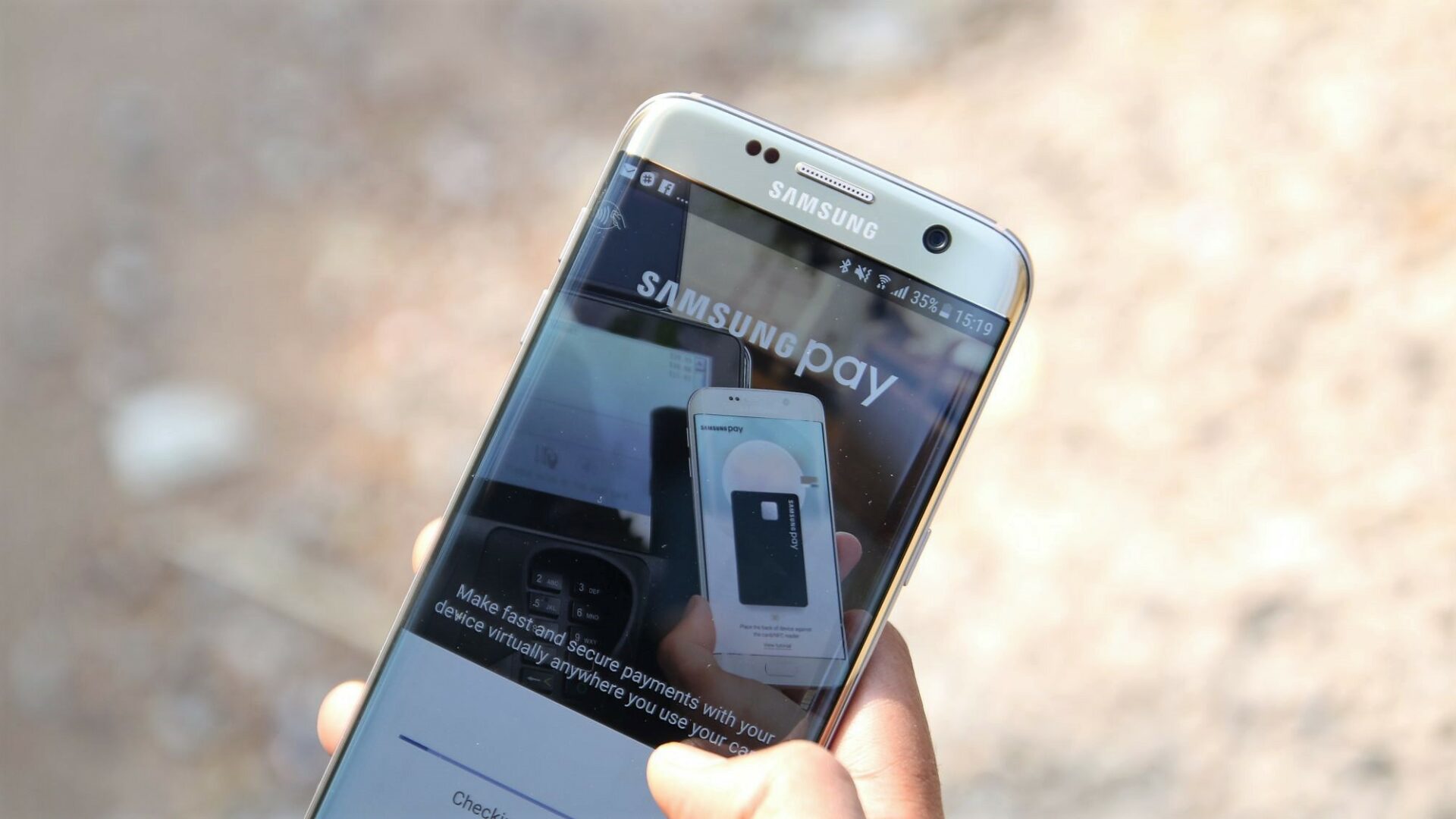
Samsung is rolling out a new Samsung Pay update which brings some user interface tweaks. It looks like the company wants the Samsung Pay app to have a cleaner look which is why it has done away with the on-screen section menus in favor of a more traditional bottom navigation bar. This makes the app feel less cluttered and that's something that users will certainly appreciate.
Samsung Pay UI cleaned up
Samsung has rolled out version 2.8.18 of the Samsung Pay app for supported devices. The version number varies by market and this particular update seems to have been released in the United States only so far.
There's a new bottom navigation bar now in Samsung Pay which gives it a clean and traditional look. The navigation bar can now be used to view the wallet, check up on rewards, visit the Pay store and also to find out new deals.
This minor user interface change should also make it easier for users to navigate the various features that the Samsung Pay app offers.
If you're based in the United States, you can head over to the Play Store right now and download the latest version of Samsung Pay. It may be a while before this update is rolled out in other markets.


