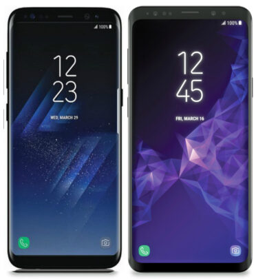
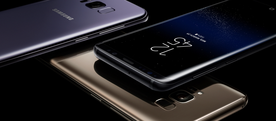
Earlier today, alleged press renders of the upcoming Galaxy S9 and Galaxy S9+ leaked online. We already knew from various leaks and rumors that the Galaxy S9 duo will be very similar to their predecessors in terms of appearance. It was believed that any major design changes to the Galaxy S9 pair will be only on the back side of the devices with a new dual camera setup (reportedly for the Galaxy S9+ only) and a more sensible fingerprint reader placement.
Well, going by the renders leaked today, that may not be entirely true. It appears that Samsung is slightly tweaking the design on the front as well, and we are not sure everyone will like the design. Ever since the renders leaked, our team at SamMobile has been vigorously debating about the design. So far, the opinions have been diverse. Here is what some of our team members think –
Danny Dorresteijn
I believe the Galaxy S9 pair will be a minor visual upgrade to the current Galaxy S8 line-up. My feelings towards the upcoming devices are reminiscent of what I felt during the Galaxy S7 Edge launch. The Galaxy S6 Edge had a stellar design, which made the refined Galaxy S7 edge not so exciting. It feels like a repeat of the same with the Galaxy S9.
Martin Reinders
I personally like the design of the Galaxy S9. From the renders, it looks like the side bezels are thicker while the bottom bezel is smaller compared to the Galaxy S8. The top bezel mostly remains the same. In my opinion, all of this gives the Galaxy S9 pair a more symmetrical design compared to the current Galaxy S8 line-up.
Naresh Nekkanti
If the renders are true, then I personally think it’s a step backward in design for the flagship Galaxy line-up. The side bezels are almost non-existent in the current Galaxy S8 series. This gives the user an illusion of a completely bezel-less display. I was hoping Samsung will just make the top and the bottom bezels slimmer in the Galaxy S9 series, but it seems they have other plans.
Abhijeet Mishra
I'm not sure what I think of the S9 seen in these renders. For some reason, the phone looks more rugged, but that could just be the lighter shade of black around the screen. The side bezels look like a step backward, but as someone who never uses the Edge screen features, I wouldn't have an issue with that. Again, the render makes me think this is more on the lines of a Galaxy S9 Active, and I find it a little hard to believe Samsung is indeed going with this design for its next major flagship.
Let us know what you think about the Galaxy S9 design in the comments section.
