The Galaxy S8 and Galaxy S8+ were the most beautiful smartphones on the market when they launched back in early 2017. The Infinity display made for immersive viewing without any notch getting in the way, and nothing came close to the overall design of Samsung's then-new flagships. With the Galaxy S9 and Galaxy S9+, Samsung took the excellent design of the S8 and S8+ and sat down to refine it in ways both major and minor.
Galaxy S9+ vs Galaxy S8+: What's different, and what isn't?
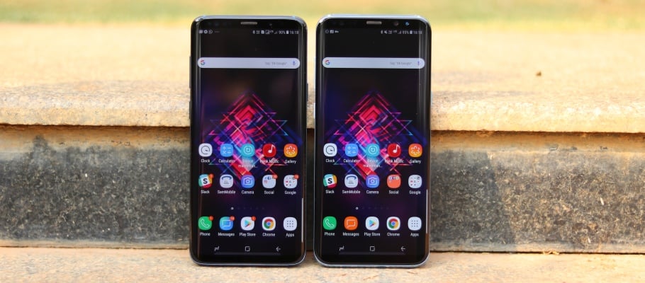
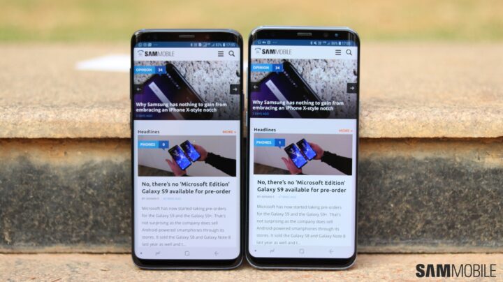
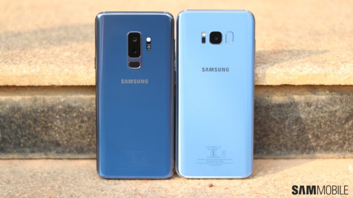
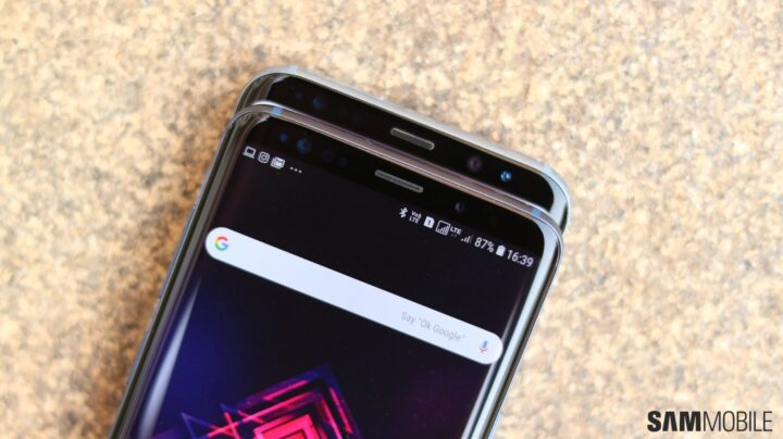
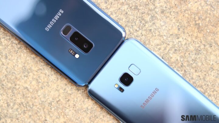
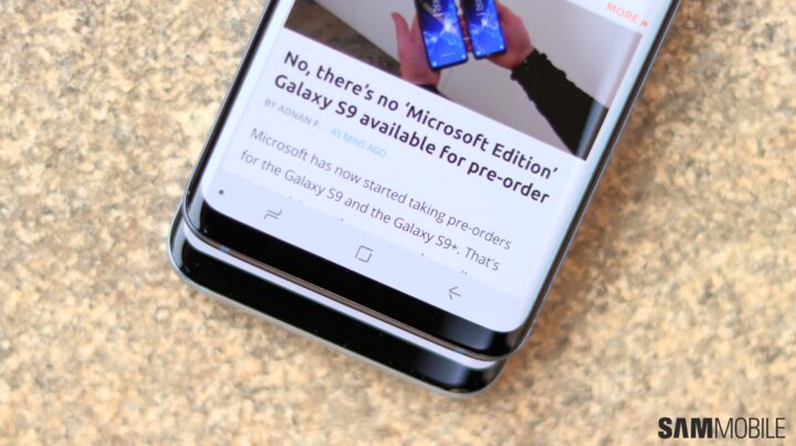
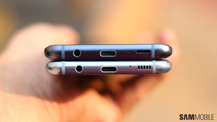
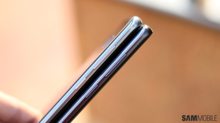
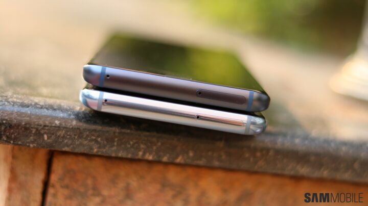
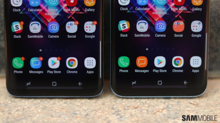
The major changes include a re-positioned fingerprint sensor (which may or may not be placed a tad too low for you) and a dual camera for the Galaxy S9+. Most of the minor ones don't always stand out, but they include narrower bezels, a darker top bezel, a matte finish for the metal edges, and a speaker grill that is now one big cutout and not multiple small holes. In fact, some of these changes are so hard to spot – or don't make much of a difference – that you would need to see a Galaxy S9 and Galaxy S8 side by side to notice, so we decided to put the S9+ and S8+ next to each other and take a couple of pictures that you can check out.
Take a look at the pictures below, and let us know your thoughts in the comments. Of course, there are also numerous new features and improvements under the hood, and our Galaxy S9 review will give you a good idea of how well they work together when taken as a whole. Lucky enough to have received your Galaxy S9 or Galaxy S9+ already? Tell us how you're liking your phone so far, especially if you upgraded from the Galaxy S8 or S8+ instead of an older or less costly smartphone (Samsung or otherwise).
