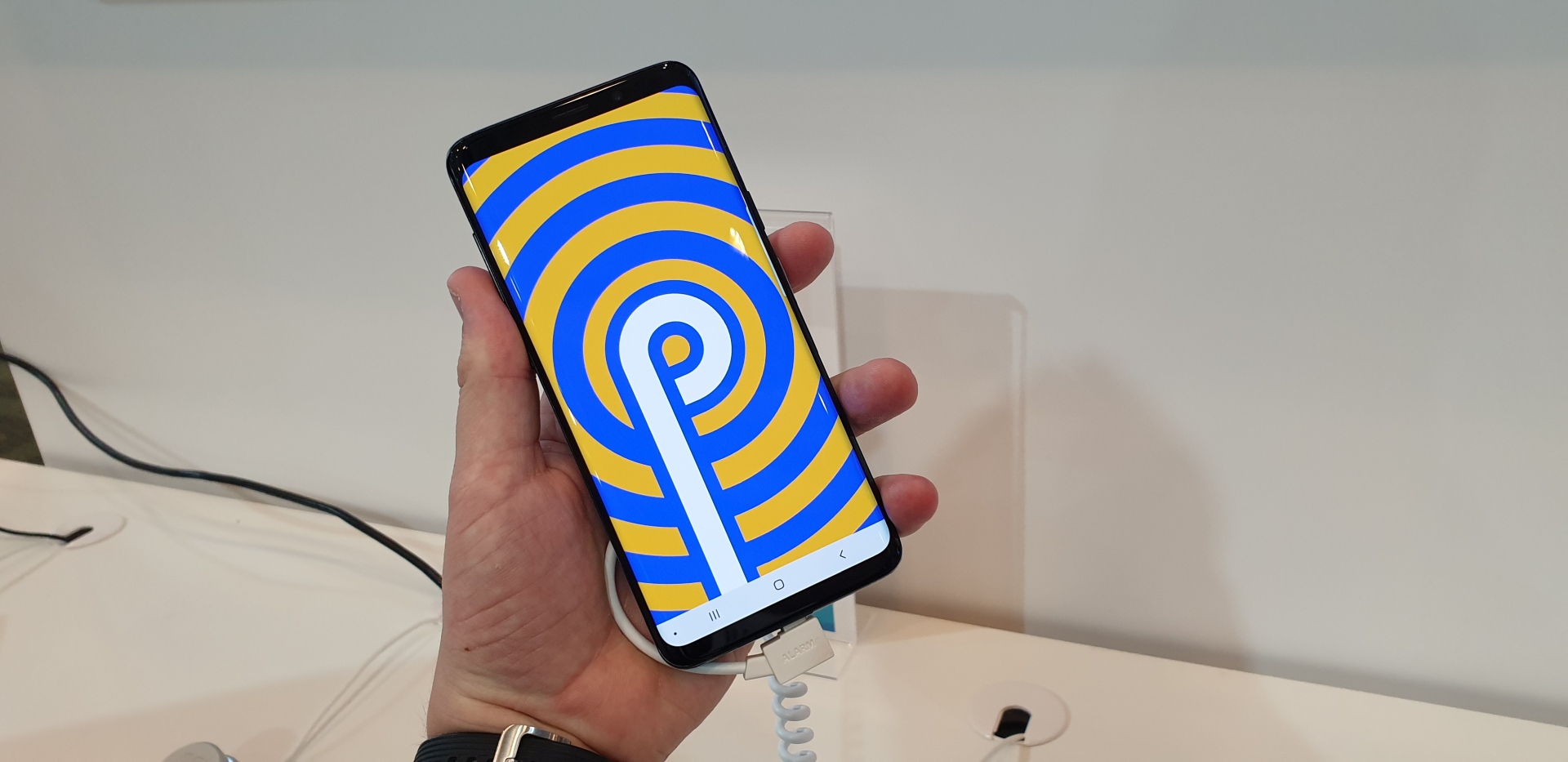
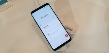
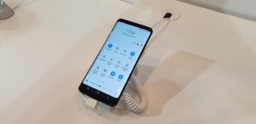
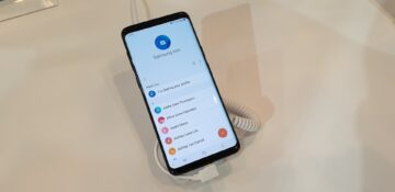
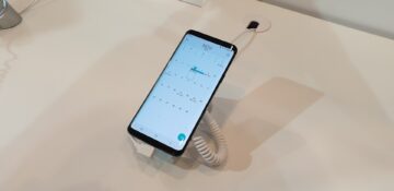
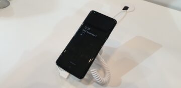
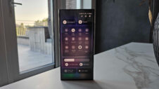
The Samsung One UI is official today. Samsung is basically reinventing the wheel with this new user experience for smartphones. It will change the way we interact with devices that have large displays. The idea is to help users focus on what really matters. Samsung wants hardware and software to work together in harmony so the rounded corners of its devices are reflected in the subtle curves of the UI elements.
One UI takes a different approach to display content and controls. Users will see only the essential features related to what they're doing in a system app like Messages. The new UI provides a continuous and fluid experience where necessary buttons appear when they're needed and gently disappear when they're not.
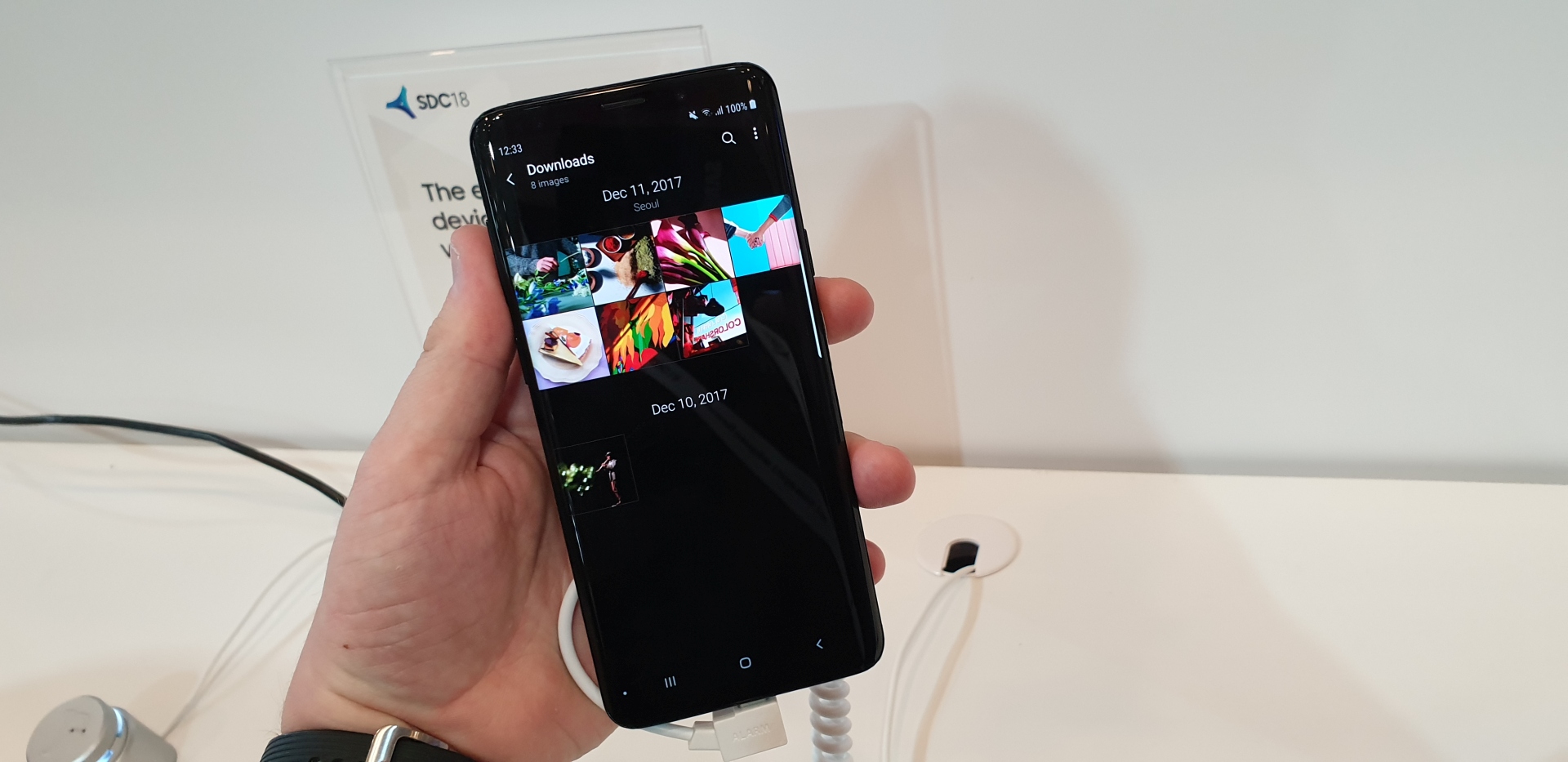
Its splits the display into viewing and interaction areas so that the controls are lower down on the screen. This makes it easier for users to control the device with just one hand. That's all well and good, but what does the new UI feel like in person? Continue reading for our thoughts on it.
Hands-on with Samsung One UI
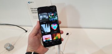
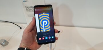
In the time we have spent with the Samsung One UI here in San Francisco, we can attest that it does look really clean and simple. While the changes are significant, they're easy to understand. That doesn't mean there won't be a bit of a learning curve when you move from the current user interface. That's because some of the controls have been switched from the top to the bottom. That may lead you to pause for a second when you try to figure out where that button that has seemingly always been in one place has suddenly disappeared.
The only thing that some fans might take longer to adjust to is the new app icons. The icons appeared online a couple of weeks ago and judging by what we heard from our readers, not a lot of people are digging this look. They can thank the heavens for icon packs if they just can't stand these icons. They don't take anything away from the simplicity and smoothness of this new user interface. Full marks to Samsung for that.
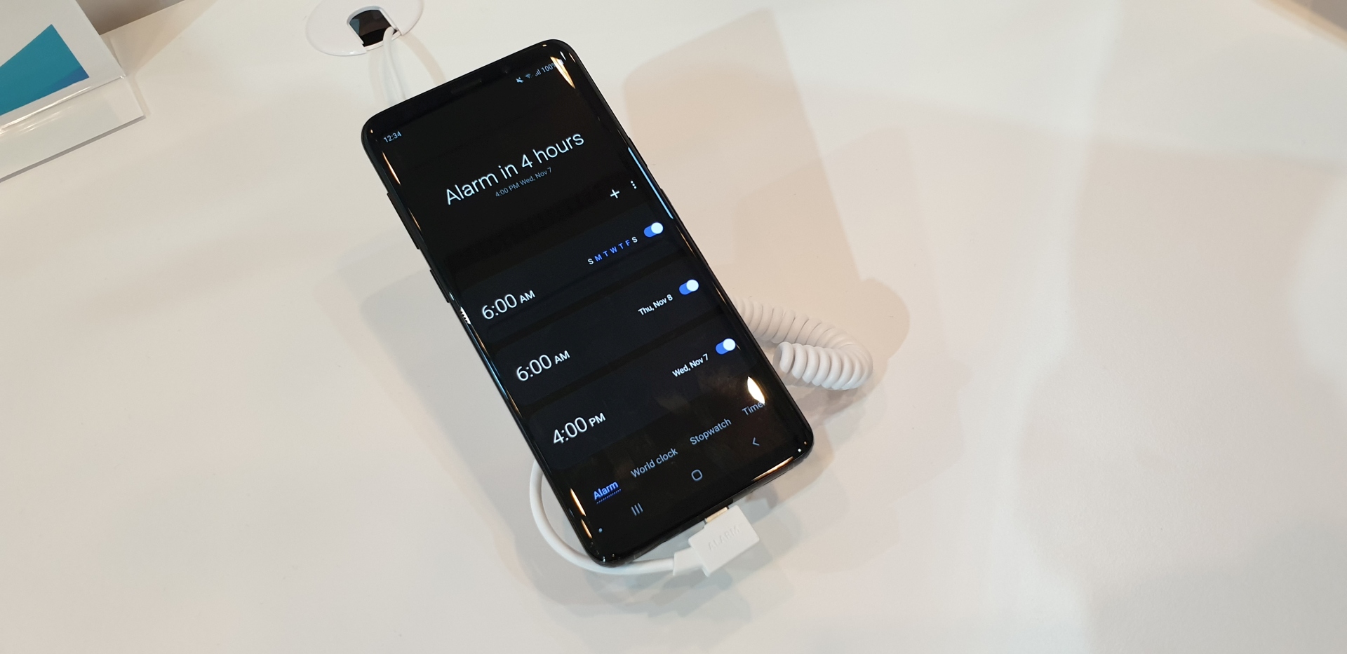
Sure, it will be a slight inconvenience the first few times, but that's to be expected of any major user interface update. You'll get used to it soon enough and that's largely due to the simplicity of the One UI. This is also the first Samsung UI to feature a system-wide night mode. We really like it as it's not only more visually comforting but it looks great too.
Samsung will launch an open beta program for Android 9 Pie, of which the One UI is an integral part, for the Galaxy S9 later this month. It's going to release Android 9 Pie for the Galaxy Note 9 and Galaxy S9 in January 2019.
