Netflix arguably has the most intuitive UI compared to all streaming services. While Amazon Prime Video is the second biggest streaming service out there, its UI left a lot to be desired.
Amazon also did not pay attention to revamping its user interface and making it more appealing for its users. Well, it seems at long last, this is going to change as Amazon is rolling out Amazon Prime Video's biggest makeover in years.
Amazon Prime Video UI has been completely revamped
The new Amazon Prime Video user interface will be available on Samsung smart TVs in addition to Google TV and other platforms, including Android TV, Fire TV, Apple TV, Roku, and other platforms. The update with the complete revamp is rolling out starting today. Samsung smart TV owners can already access Prime Video's Watch Party feature.
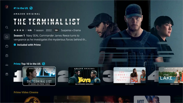
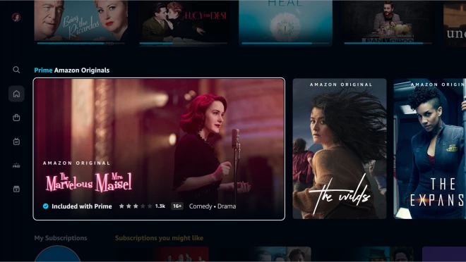
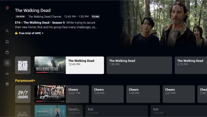
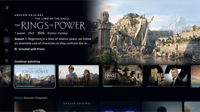
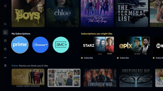
As per Amazon, the new UI is “less busy and overwhelming for our customers.” The outcome of this is an overall Netflix-ish-like UI, which isn't bad, to be honest.
In the new interface, the navigation bar containing Search, Home, Store, Live TV, Free, and My Stuff sections, now runs along the side of the UI, with featured content on top covering almost the entire homepage. There is a new top ten list as well, and content included with the Amazon Prime subscription is marked with a blue checkmark.
Individually purchased content has a golden shopping bag icon. The new Amazon Prime Video UI is also live for Android and tablets during the initial rollout. The web interface and iOS will be updated in the coming months.
Join SamMobile's Telegram group and subscribe to our YouTube channel to get instant news updates and in-depth reviews of Samsung devices. You can also subscribe to get updates from us on Google News and follow us on Twitter.
