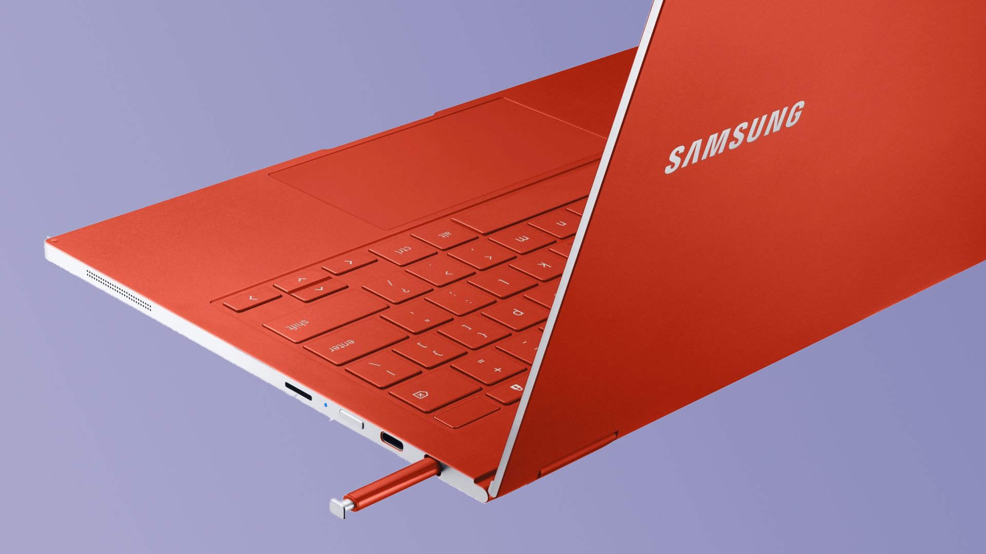
Google has been working on the Material You redesign for ChromeOS since the beginning of this year. Later in June, we saw the first glimpse of Material You's dynamic colors. Thanks to some ChromeOS enthusiasts, we now have a look at how the Material You redesign for ChromeOS will look on your Samsung Chromebook.
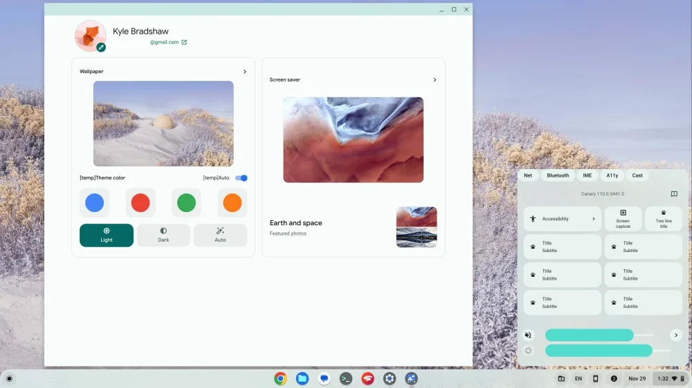
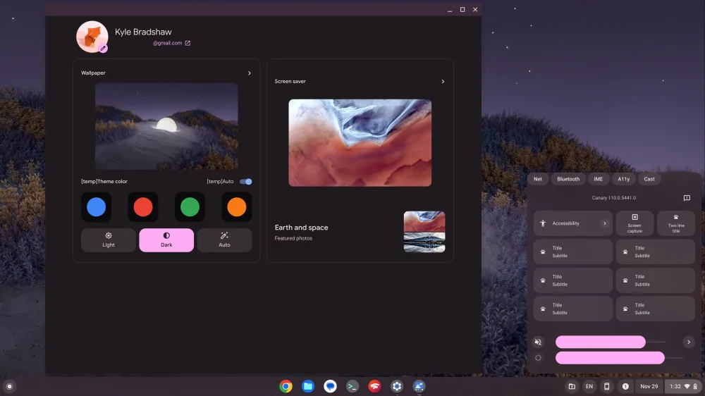
The Material You dynamic color works a bit differently on ChromeOS than on Android. It does not match your ChromeOS accents to the dominant color of your wallpaper. Apparently, there are two placeholder themes, burgundy red and mint green, with a light and a dark variant, which ChromeOS applies randomly. It applies all over the app shelf, quick settings, and the Files app.
The quick settings are is now massively overhauled and you will see them look quite a lot like the quick settings on Pixel phones today. The ChromeOS notifications area now has its separate area to the left of the calendar in the Taskbar. There are a few one-click options such as Screen Capture inside a half-size button. The volume and brightness sliders on the Material You redesign for ChromeOS look similar to their Pixel counterparts, the only difference being that the icons appear on the side of the slider instead of inside it.
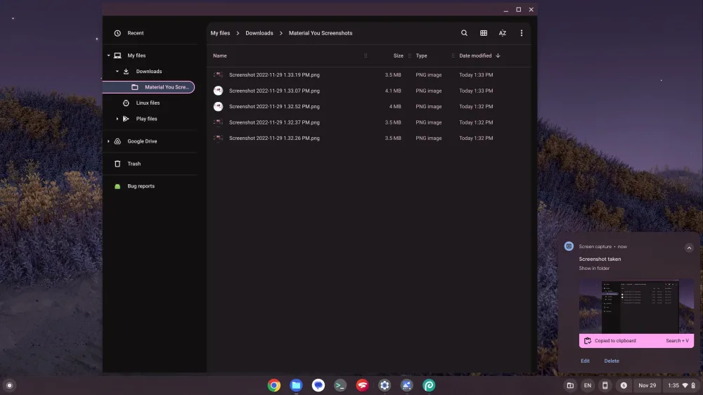
The Files app now features two shades of background colors and is heavily redesigned. There are multiple text colors, and bright accent shades to show what you have selected. Overall, as noted by 9To5Google, it seems like Google wants to make ChromeOS feel like using a Pixel phone, which is not a bad thing, to be honest. However, there is still a long way to go, and at the rate, things are going for the ChromeOS Material You redesign, you will see the fully-baked Material You makeover on your Chromebook sometime in 2023.
