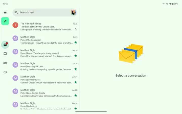
The Gmail app on Android tablets is seeing a similar change to what the Google Chat homescreen looks like. As per 9To5Google, the Gmail app now shows a left-aligned navigation rail on the Android tablet. You will also see a hamburger menu icon at the top-left of the navigation rail, followed by a compose button.
The story continues after the video…
The Gmail navigation rail on Android tablets is arriving via a server-side update
You will also see four tabs; Gmail, Chat, Spaces, and Meet. If you tap on any of these tabs or are in any section, a circular tab indicator is used instead of a pill-shaped highlight to let you know where you are within the app.
Previously, the bottom bar used to shrink your inbox or message list, but now the navigation rail does not hide and also does not eat up viewing space, but the view isn't that drastic.
The navigation rail feature is still rolling out. So, if you haven't received it yet, then you probably need it for a bit. The feature is visible on the Gmail app v2023.11.12.x.
