Google's Material You theming gives a consistent color scheme across the board on Android. Google is now giving the Material You treatment to Google Chrome's address bar on Android. The Material You redesign brings more Dynamic Color to Google Chrome's address bar.
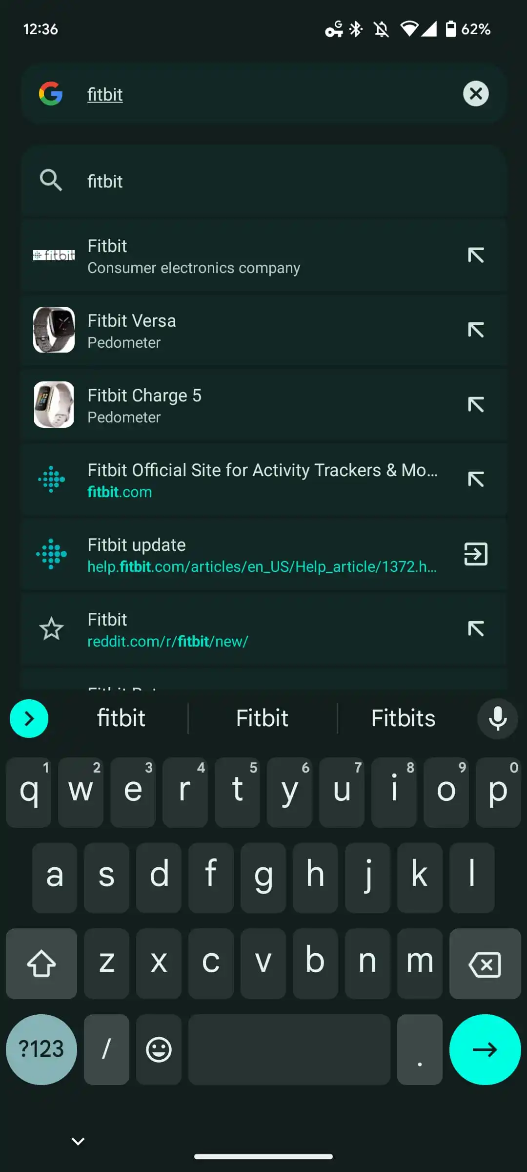
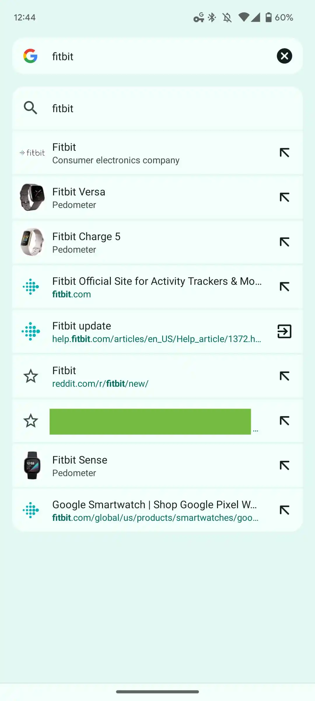
When you tap the address bar, it no longer appears as a small, pill-shaped container. The new shape is a bit larger and now has a more rectangular shape, which goes in line with Google's Material You theme. The search results, websites, and suggestions are no longer shown as texts on a light/dark background. Instead, each web result or suggestion is placed inside an individual card of its own in the Google Chrome browser.
Notably, the card has a slightly lighter background as compared to the rest of the screen to make the search results stand out. Dynamic Color scheming helps the page appear less cluttered without having much impact on how the text appears. As noted by 9To5Google, Google Chrome Material You address bar looks reminiscent of the unified Pixel Launcher search. However, this time, the design will be visible on your Samsung Galaxy or other Android phones.
The Google Chrome Material You address bar redesign feature was under testing via the beta channel. Now, the feature is rolling out in the stable channel with Chrome 109. Do note that this is a server-side update and does not require any manual input. The changes will appear to you in Google Chrome, as soon as the feature goes live in your region. In case it isn't available, you can use the Chrome Flag: chrome://flags/#omnibox-modernize-visual-update.
If you are someone who prefers Google Chrome over Samsung Internet on your Samsung device, you could soon see this new design change.
