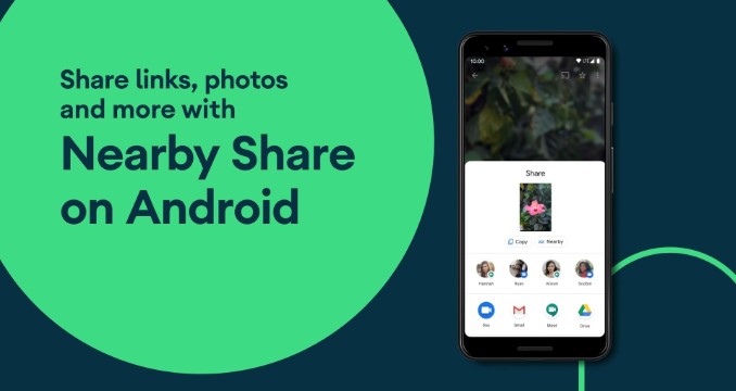
Similar to Samsung's Quick Share, Google's Nearby Share feature allows you to send files between two Android devices. It creates a peer-to-peer Wi-Fi network using Bluetooth pairing to facilitate file transfer between them, and it even works offline. While the feature is nice, the Material You makeover is all set to arrive for Nearby Share to make it even more attractive.
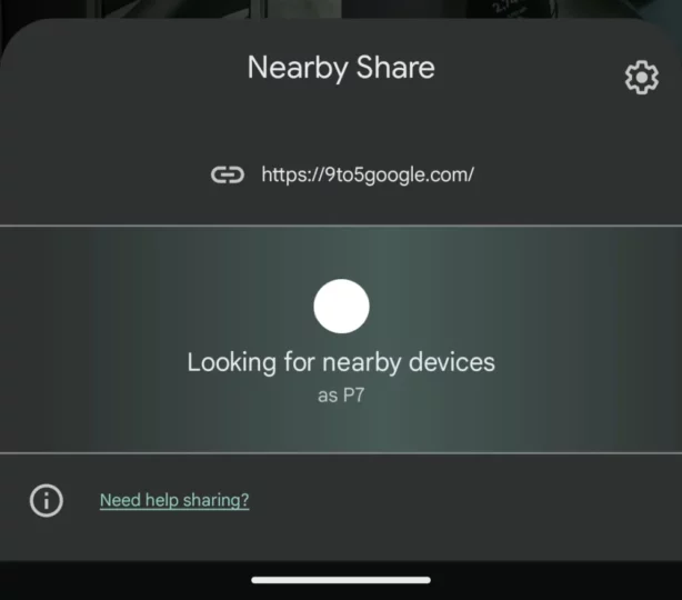
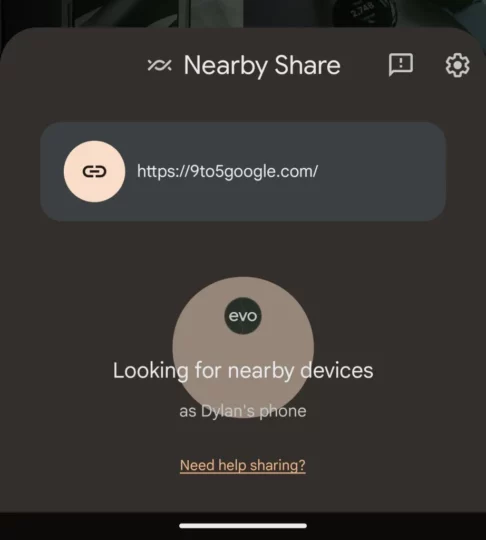
In an APK insight post by 9To5Google, it is found that Google is working to update the UI elements of the Nearby Share and give it a Material You coat of paint. When you launch Nearby Share on your Samsung Galaxy device (or any other Android device), it will show a sheet called ‘Looking For Nearby Devices' that slides from the bottom. Previously, there was a left-to-right wave animation to note that the feature is looking for nearby devices. However, after the Material You redesign, you will see Material You shapes expanding and dissolving behind your profile avatar. It is a subtle but good-looking UI change.
The text on the panel is also now slightly bigger compared to the previous design, and it is now centered. On the sheet, you will see the Nearby Share icon making an appearance. A small but noticeable change: share previews are now larger and now placed inside a card with icons. This will show you what is being shared. Image previews will also be shown when you share them.
Do note that this new Material You design for the Google Nearby Share hasn't rolled out yet. It is expected to arrive in the near future and will possibly roll out via a server-side update with the latest version of Google Play services.
