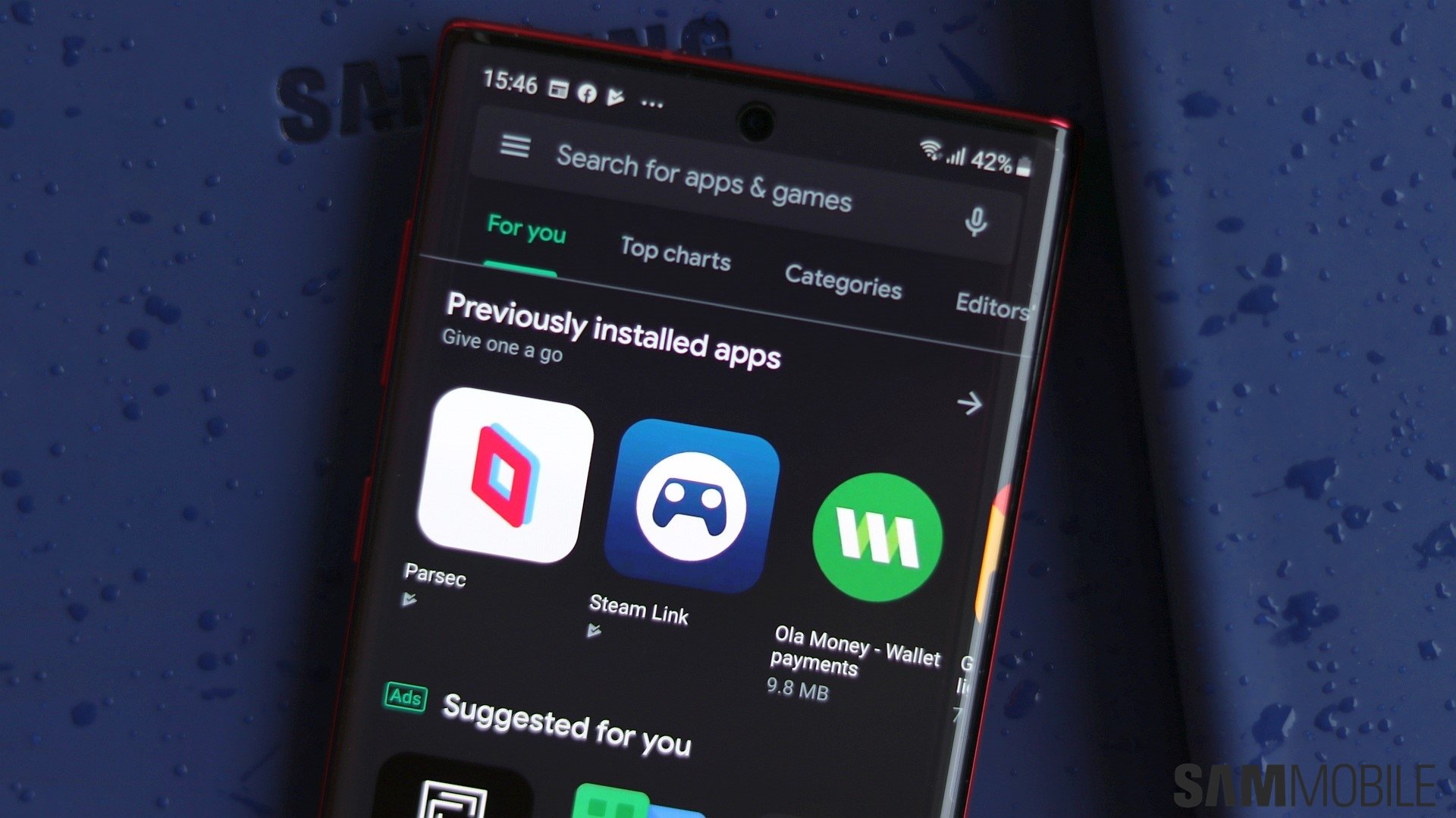
Google recently made a few changes to the Play Store's UI elements, bringing Material You design to Chromebooks and tablets. Now, the company is bringing some more Material You elements to the Play Store for Android devices. When the Material You redesign first arrived on the Play Store in October, it updated the homescreen, search field, and bottom menu bar, and applied dynamic color to key elements.
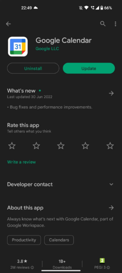
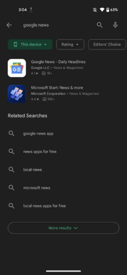
Now, as per 9To5Google, the latest Material You makeover of the Play Store brings new buttons. Material Design 2-inspired rectangular buttons are now replaced by Material You-inspired pill-shaped buttons. These design changes can be seen on Install, Uninstall, and Update buttons, whereas the category filters go in the opposite design direction.
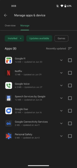
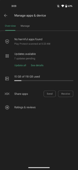
The new change is also visible on the Manage Apps & Devices page and the search results page. Sadly, these new pill-shaped buttons do not feature dynamic coloring and remain green. The Google Play Store website still hasn't received the Material You makeover. The new design is already live for Android smartphones and tablets and is arriving via a server-side update.
Join SamMobile's Telegram group and subscribe to our YouTube channel to get instant news updates and in-depth reviews of Samsung devices. You can also subscribe to get updates from us on Google News and follow us on Twitter.
