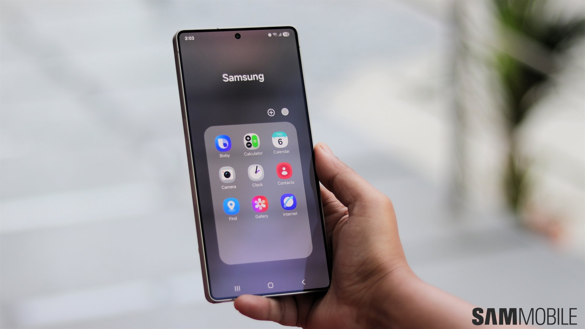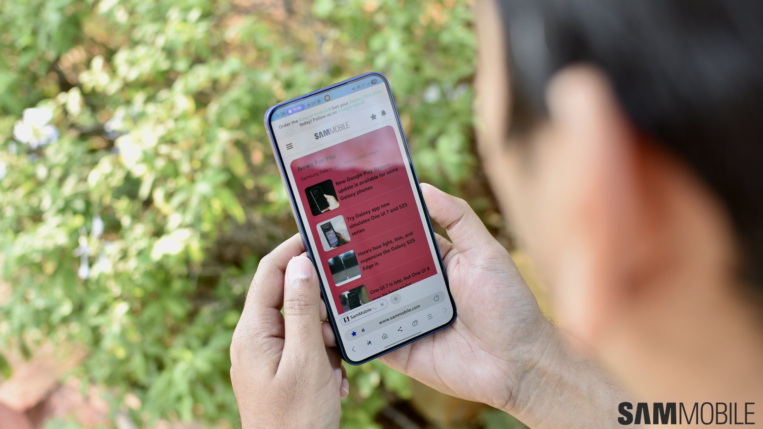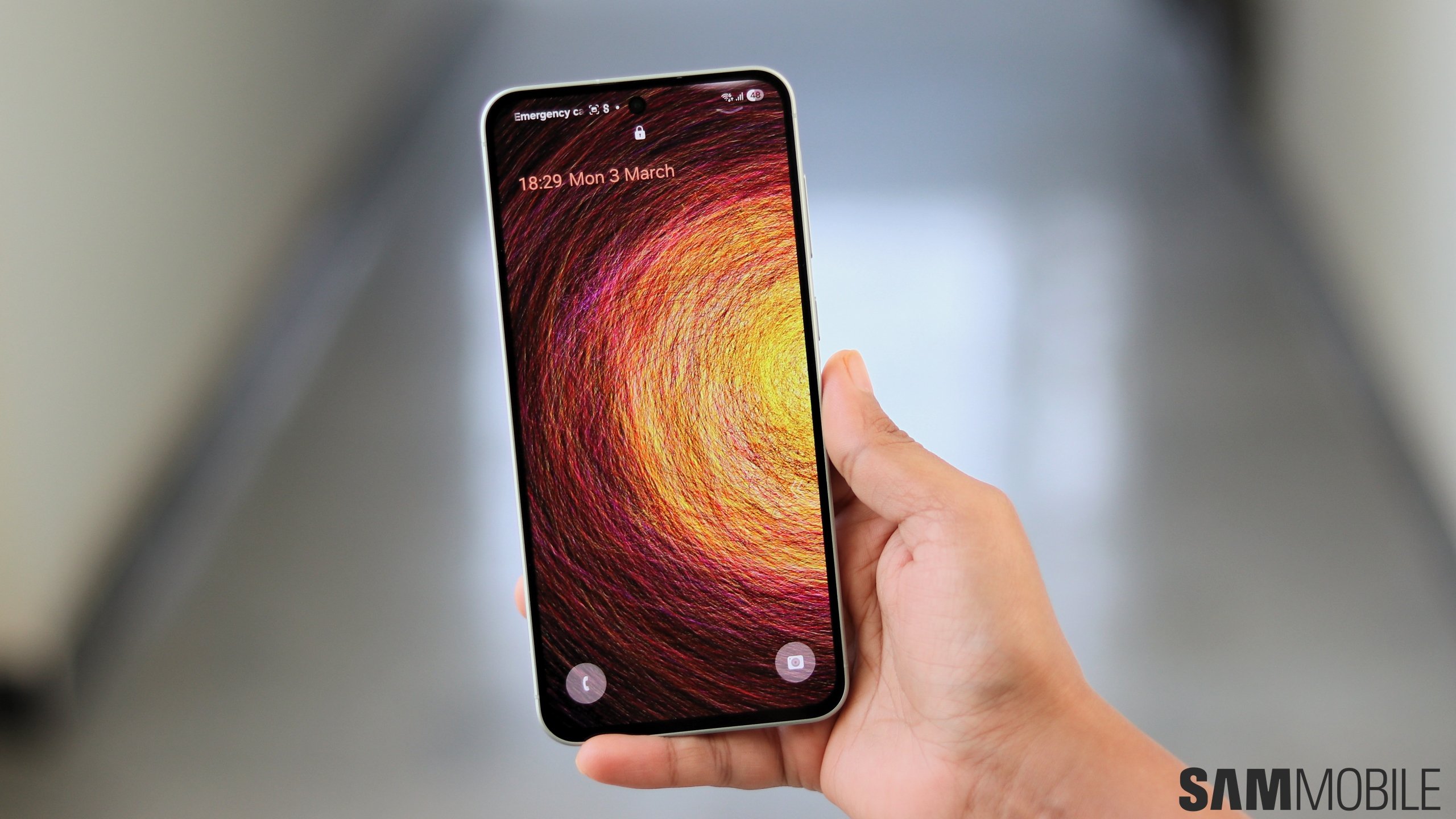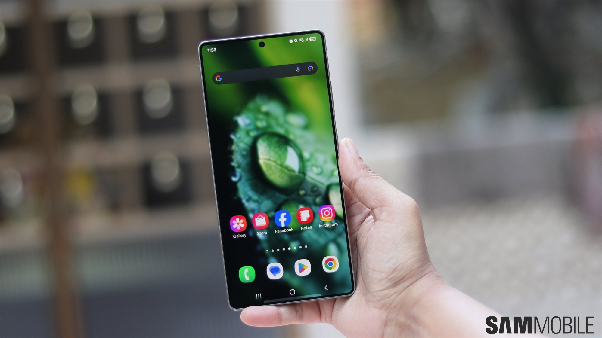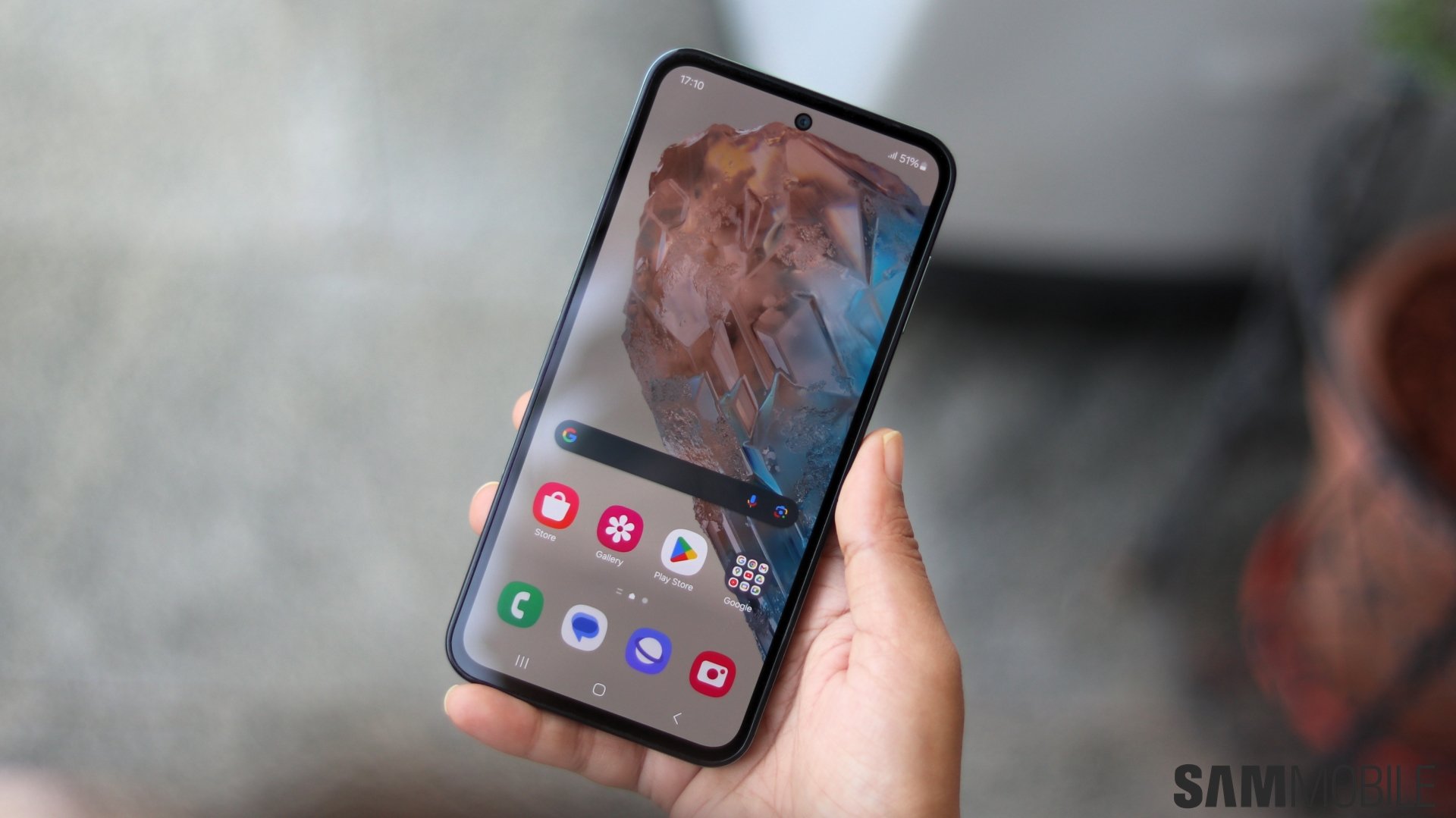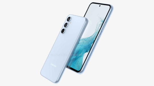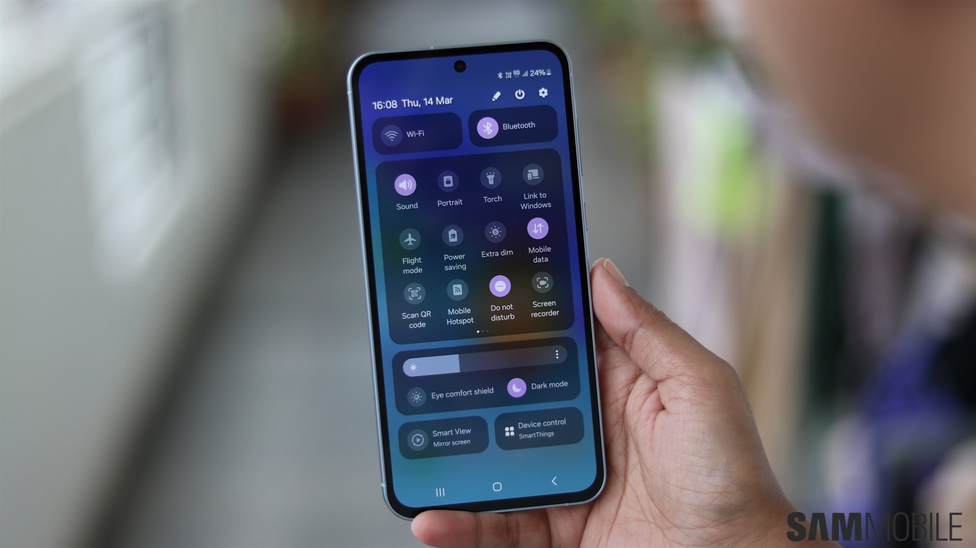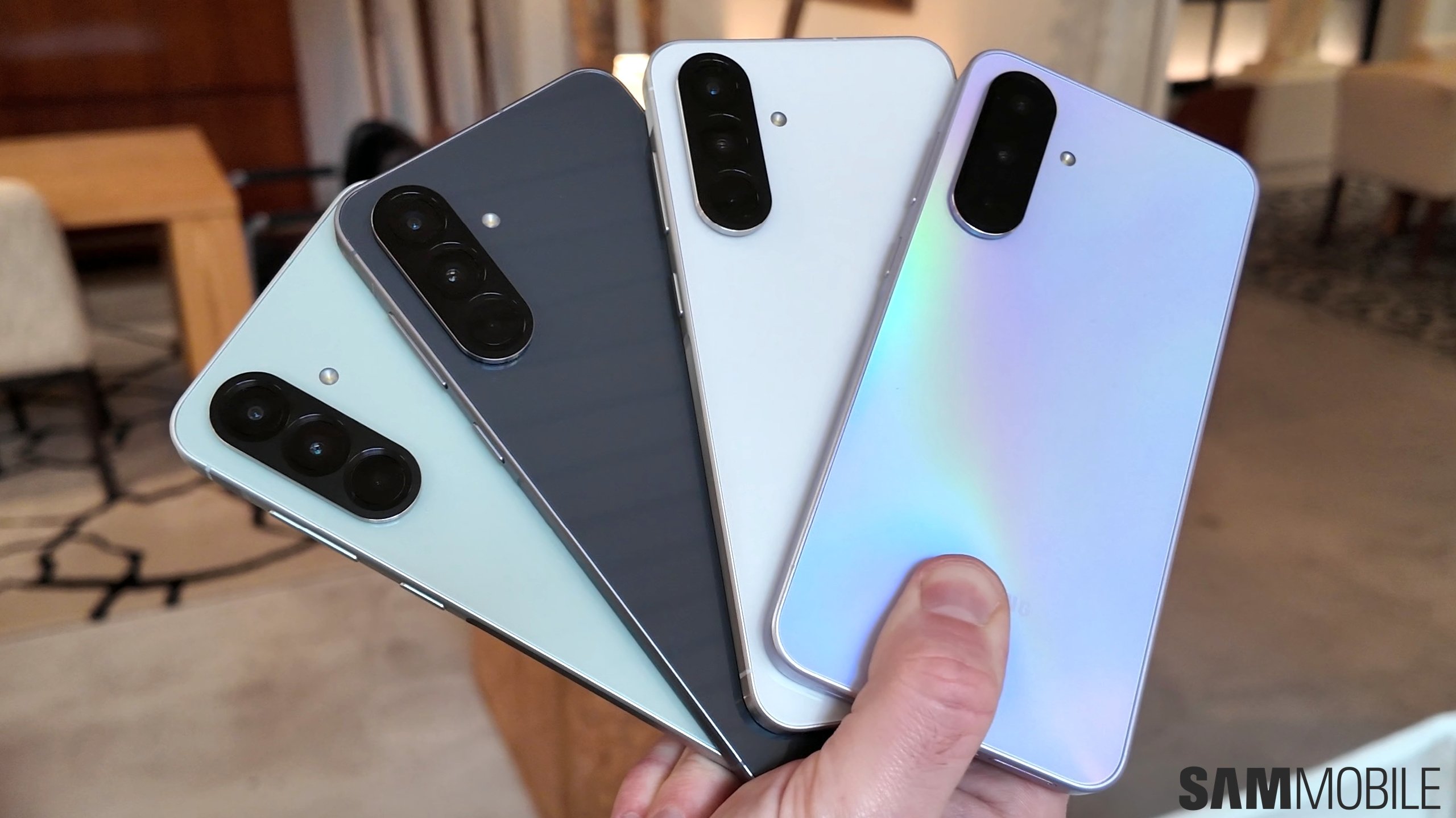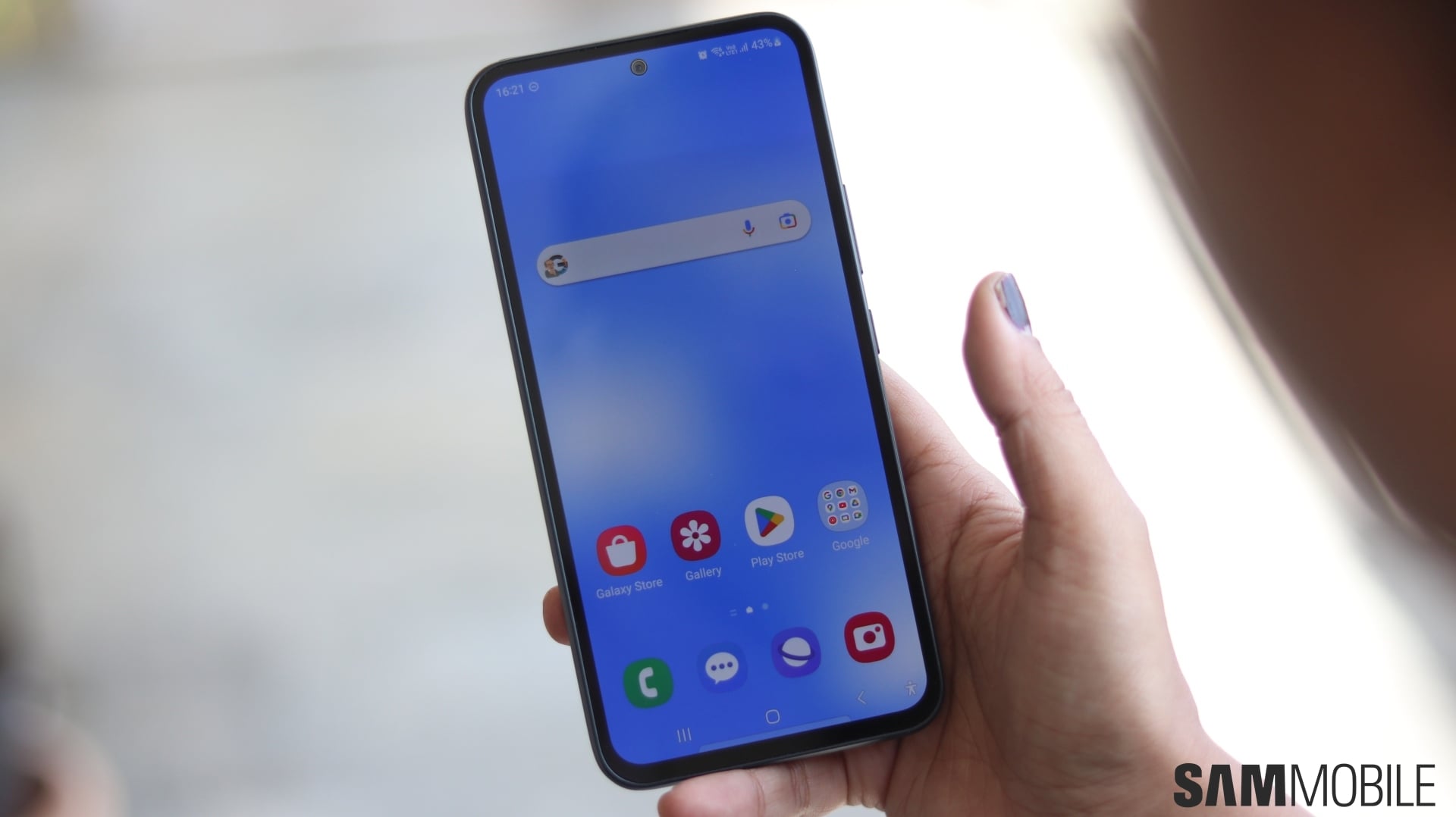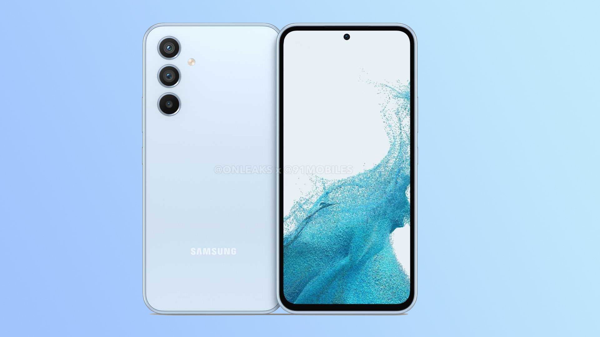
Hardware specs are mostly unknown, so we'll leave that part to the side for the time being. Nevertheless, as far as the exterior design is concerned, the Galaxy A54 appears to put practicality and the user experience above all else, which is something I believe is the key to success in the modern smartphone era. Some people prefer stand-out, outlandish smartphone designs, even to the detriment of the user experience, but as it happens, I'm not among them. As such, I honestly believe that the Galaxy A54 is on the right path as far as its design is concerned. And here is why.
The Galaxy A54 has Galaxy S22 design practicality
Some of you might recall how I fell in love with the Galaxy S22+ two weeks into using it. Or more specifically, I fell in love with its practical design. I upgraded from the Galaxy Note 10, and as much as I loved that flagship, switching to a flat-panel design with a grippier frame made a world of difference to my daily user experience.
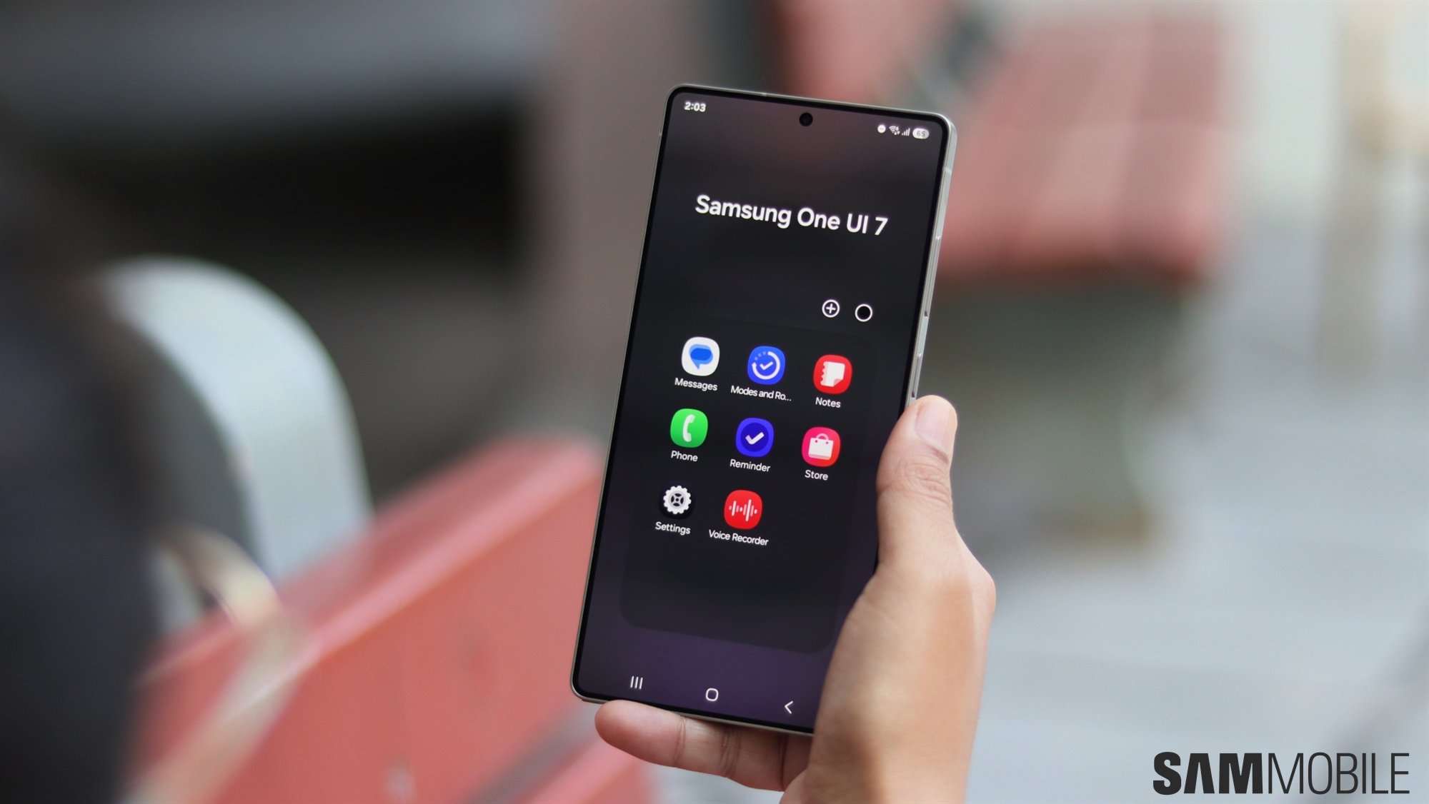
Granted, devices featuring a curved “Edge” display design and thin frames can look nicer in photos, partly because they have thinner side bezels. One or two bad actors seeking social media attention will always cry foul when they see thicker bezels, claiming they're the worst thing in the history of smartphone design. But in practice – and in the real world where most of us live – slightly thicker bezels help with One UI navigation gestures (which I personally love). Devices featuring flat screens, flat back panels, and uniform frames are more practical and user-friendly than phones with curved panels and thin frames.
Furthermore, build quality and a phone's resilience go a long way in this economy, and equally, so does a phone that doesn't slip out of your hands like a bar of soap. And while you could always argue that you can achieve a better grip by wrapping your phone in a protective case, that's a two-way street. A protective case will also make your phone seem like it has thicker bezels, thus negating its superficial beauty and the idea that bezels are the worst.
Regardless, the Galaxy A54 seemingly has those characteristics, i.e., flat panels and a uniform, thicker frame, similar to the Galaxy S22. As such, the upcoming mid-range phone is halfway to becoming a winner in my book. Even if we leave practicality aside for a moment, I don't think the Galaxy A54 looks bad at all.
Don't get me wrong; there's nothing inherently wrong with liking smartphones that place style and design uniqueness above everything else, including practicality. I've been there, and Samsung did it for years and continues using slightly curved panels for the Galaxy S22 Ultra and, presumably, the Galaxy S23 Ultra. But if you're looking for a comfortable user experience and design practicality (and I assume most mid-range smartphone customers do), I think you'll probably love the Galaxy A54 next year. That is, assuming the recent renders are close-to-accurate. If they are, I believe that Samsung is making the right design choices.
These are my proverbial two cents regarding the Galaxy A54 and design choices in general. But what's your take? Feel free to share your thoughts on smartphone design philosophies and the Galaxy A54 in the comment section.
