Samsung will release a new firmware update later this year, and based on many leaks so far, One UI 7.0 should be a significant step up with tons of improvements across the board. But despite all the good news, we're beginning to feel like Samsung's proprietary One UI skin for Android OS may never look truly amazing unless it breaks free from Material You's shackles.
Google's Material Design (known as Material You since 2021) was released at the right time and helped the Android platform become more consistent when it needed it the most.
Material Design was released exactly ten years ago, in the summer of 2014, as a series of UI and UX guidelines for all Android phone manufacturers to follow. Its purpose was to give Android OS a coherent identity and help OEMs create consistent UIs through well-defined design principles.
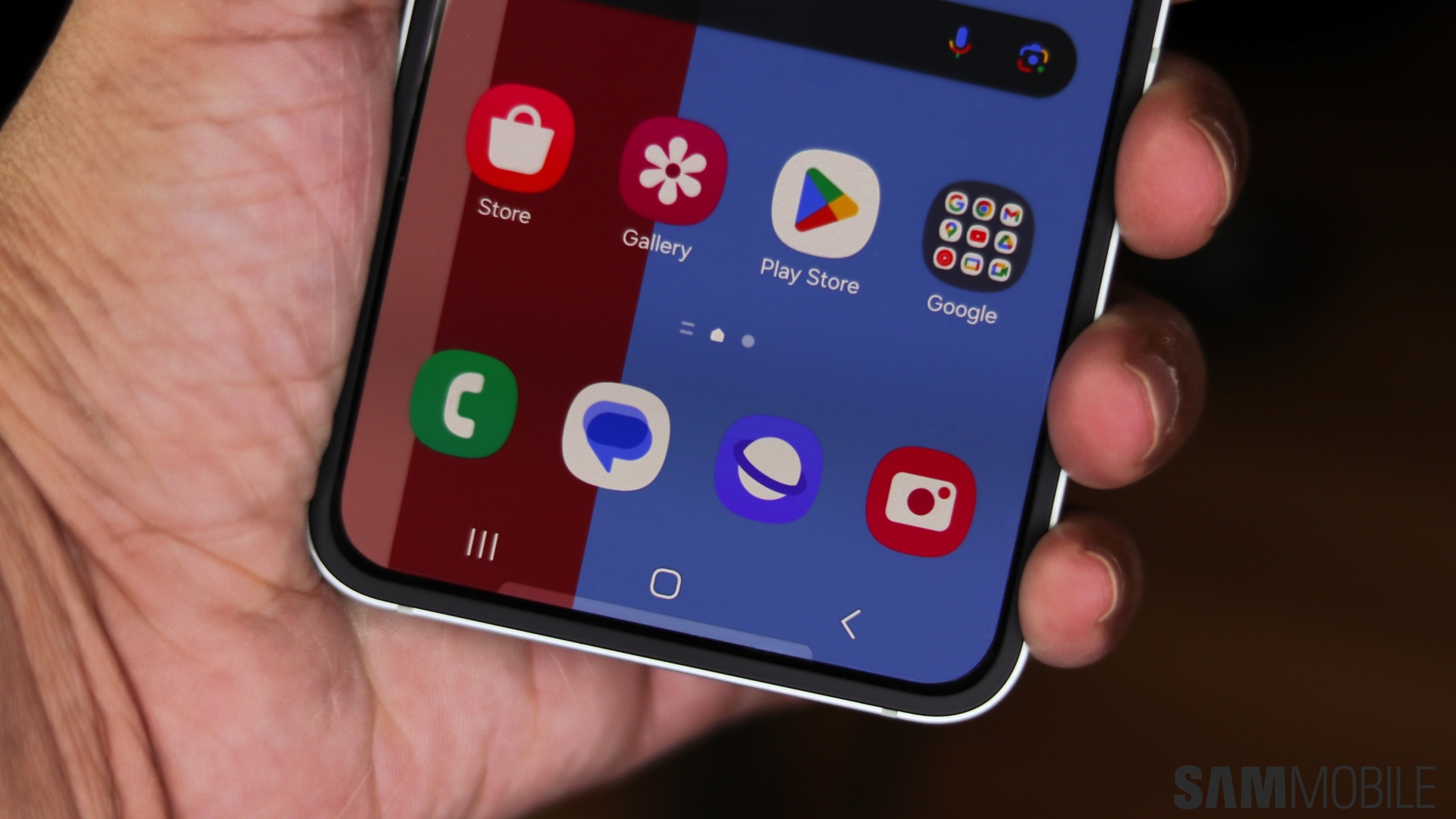
Today, Material You follows the same core ideas as ever. It's all about round corners, geometrical shapes, and layers of paper-like flat surfaces defined by shadows. It promotes a minimalist approach to designing a mobile UI. And we feel it's become a double-edged sword.
You see, even if Material Design feels like it was a necessary step in the evolution of Android OS, many things have changed since 2014. And now, Material You is beginning to feel somewhat like a restrictive cage for platforms such as One UI – platforms that have evolved over the years and created their own identity.
That's the core problem holding Samsung back. No matter how different the upcoming One UI 7.0 or future updates might be, they'll still be based on Material You design principles. This means they will feel like Android and will never look as good and inspiring as this animation shared by @TheAppleDesign on X:
What you see above is a short screen recording of an upcoming Apple Intelligence feature for the iOS Photos app. And we must admit we feel a bit of envy. Those iOS animations look amazing, and unfortunately, no matter how much we support Samsung, none of One UI's elements have such rich visuals.
Samsung seems to be held back by Google's design language
We can hardly blame Samsung for some of the aesthetic shortcomings of One UI. In fact, we believe that, over the past few years, Samsung went above and beyond to squeeze everything it could out of Material Design and Material You's guidelines to create something a bit more animated, colorful, and beautiful than Google's bland default Android UI.
Even so, compared to how Apple's iOS is evolving, Samsung's One UI appears to be reaching its limit, and there's not much the Korean tech giant can do to leap ahead. Not as long as it continues to be shackled by Google's Android UI design principles.
It's an unfortunate turn of events, but it is the result of two major tech giants with significantly different views working together for more or less the same goal: Offering an alternative to iOS and increasing Android phone sales.
Material Design was once the answer to the messy Android landscape. It came at the perfect time to breathe some life into Android OS. But today, most Android phone manufacturers are gone, and Samsung is arguably the only one that truly matters. And in the current landscape, these design principles set by Google feel more like a prison that holds One UI back.
The story continues after the video
As good as One UI has become over the past few years, it still feels a little bit too sterile, and we can't help but put most of the blame on the relationship between Google and Samsung. Because of Material Design and Material You, One UI is highly functional but not awe-inspiring. It's minimalist but not breathtaking. It's utilitarian but lacks a sense of creativity. It works very well and boasts plenty of good features, but that's about the gist of it.
We're hoping One UI 7.0 will bring Samsung closer to realizing its own software design vision, which we're sure would exceed Google's somewhat limited and strict view. But we won't hold our breath for anything spectacular. Still, we hope Samsung will eventually overcome this hurdle and that One UI will break free of Android's shackles one way or the other.


