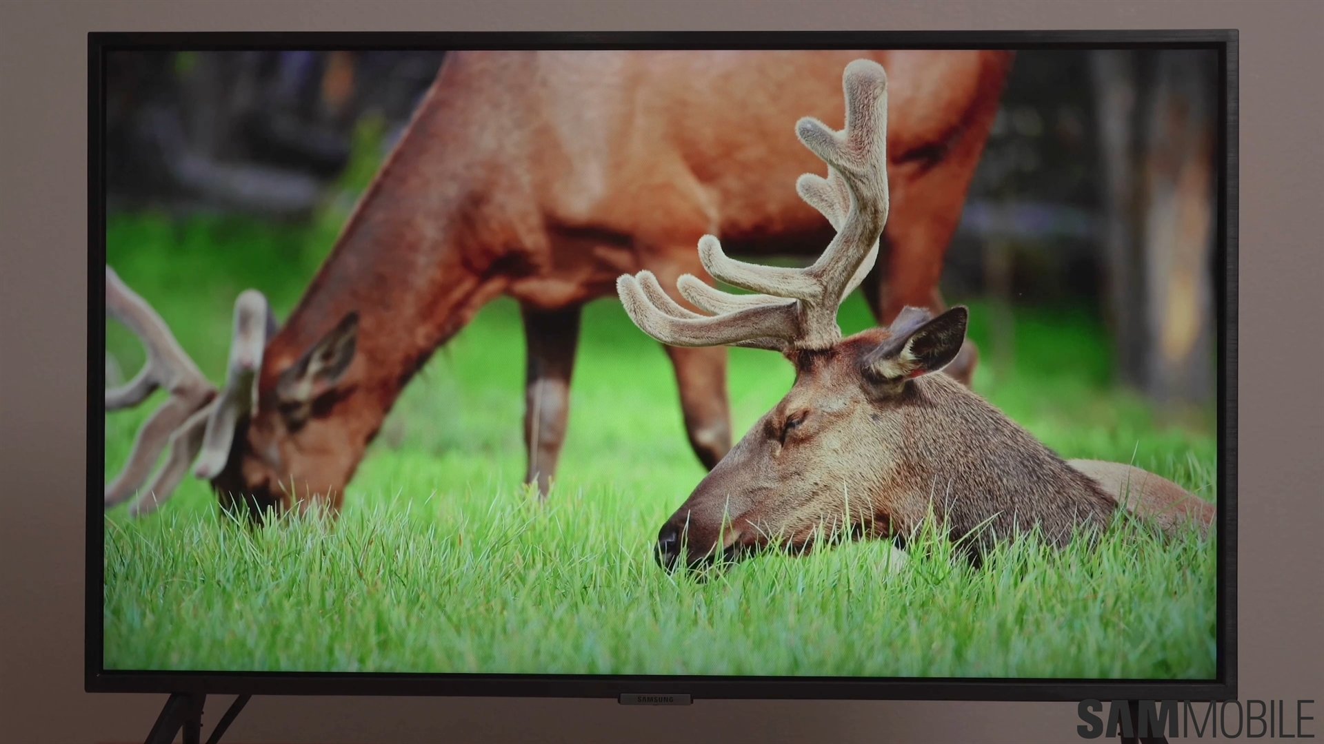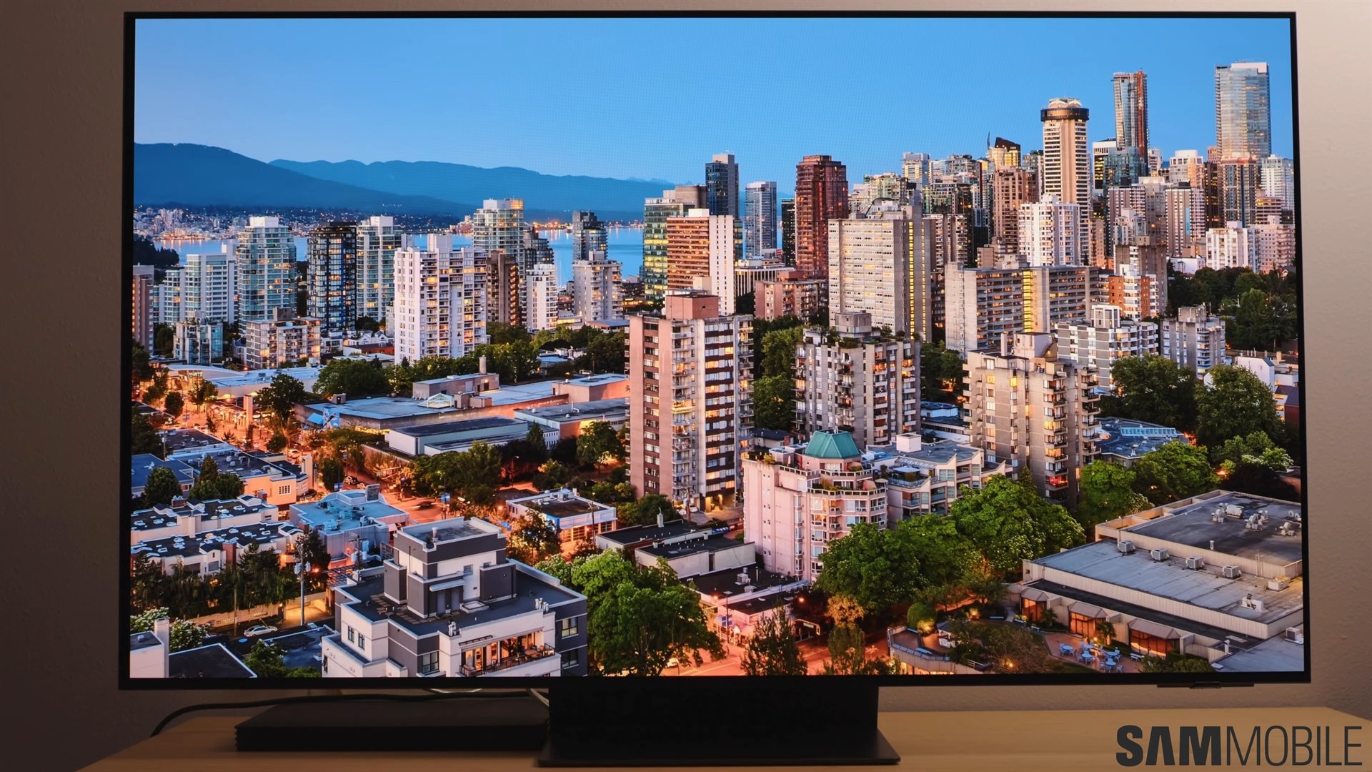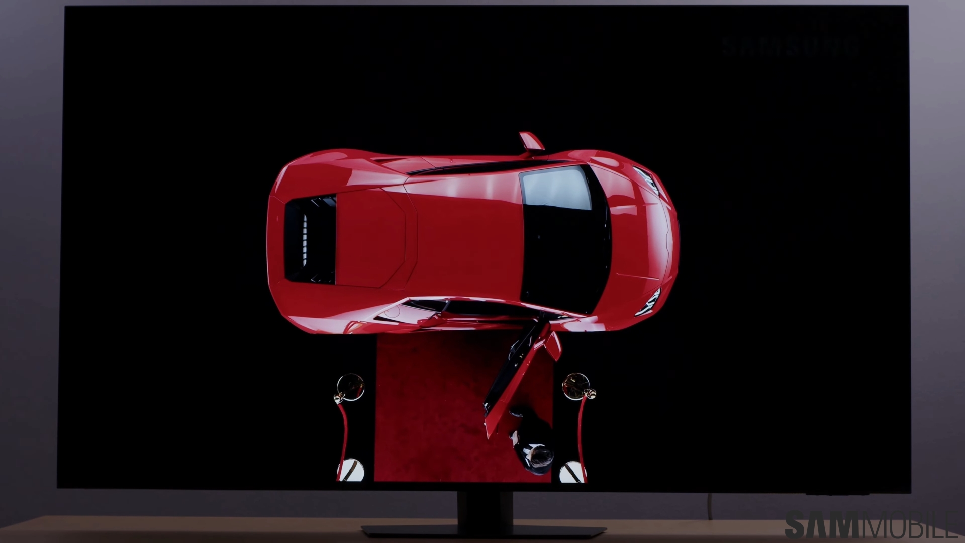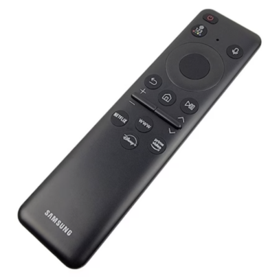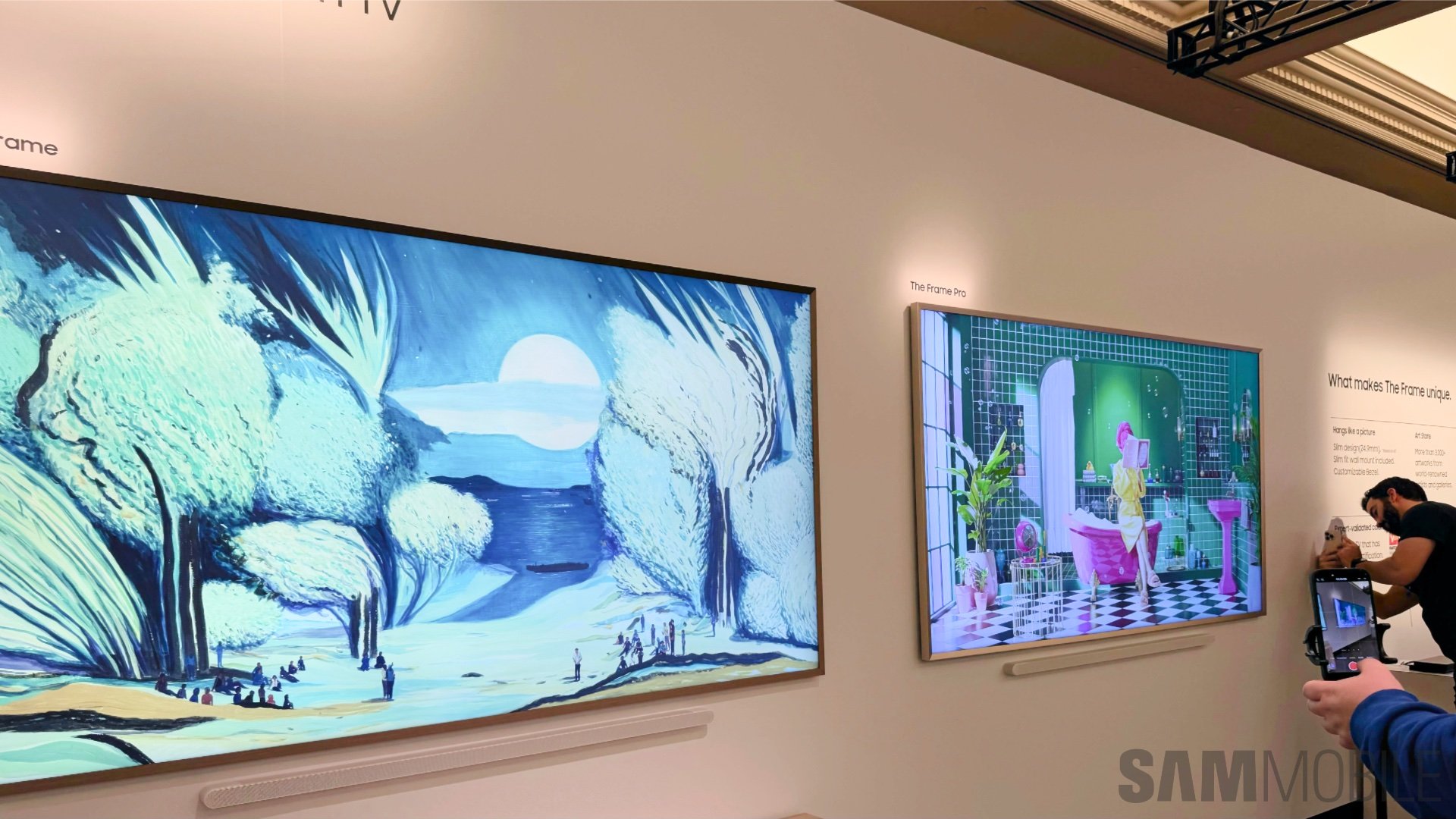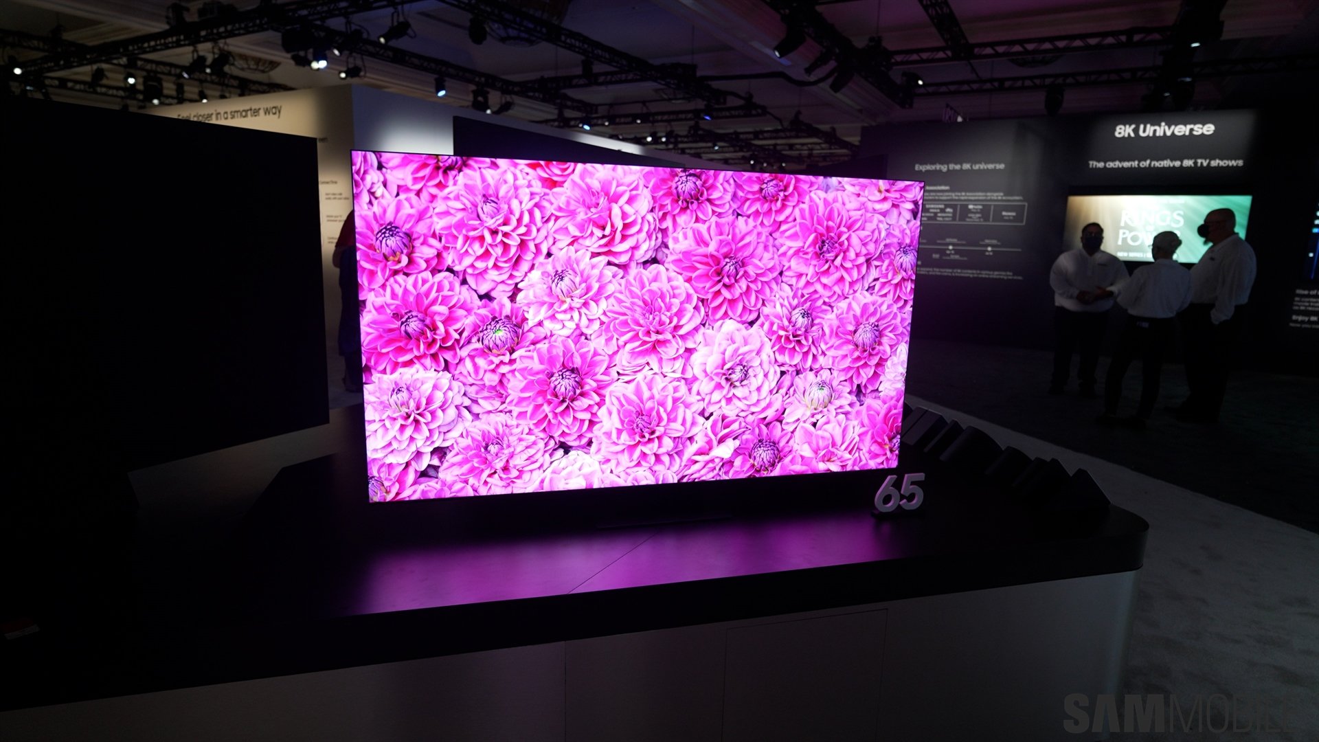
Surprisingly, it's not just the fantastic 4K display and its high brightness with quantum micro LED backlight that blew me away. I also quickly began appreciating the SolarCell remote much more than I ever thought I would. I never expected it to feel so much better than a traditional remote, but it's incredibly intuitive and satisfying to use.
Samsung has the best remotes in the game
Over a year ago, when I was using a Crystal UHD TV from 2020, I wrote an editorial expressing the things I'd like to see improved on Samsung's smart TVs.
I wished Samsung's TV menus were snappier. I asked for the SmartThings TV remote to get a dark mode, and I said Samsung should get rid of the archaic remotes with rubbery buttons, which not only feel unsatisfying and outdated but are almost impossible to use intuitively without peeking at them from time to time.
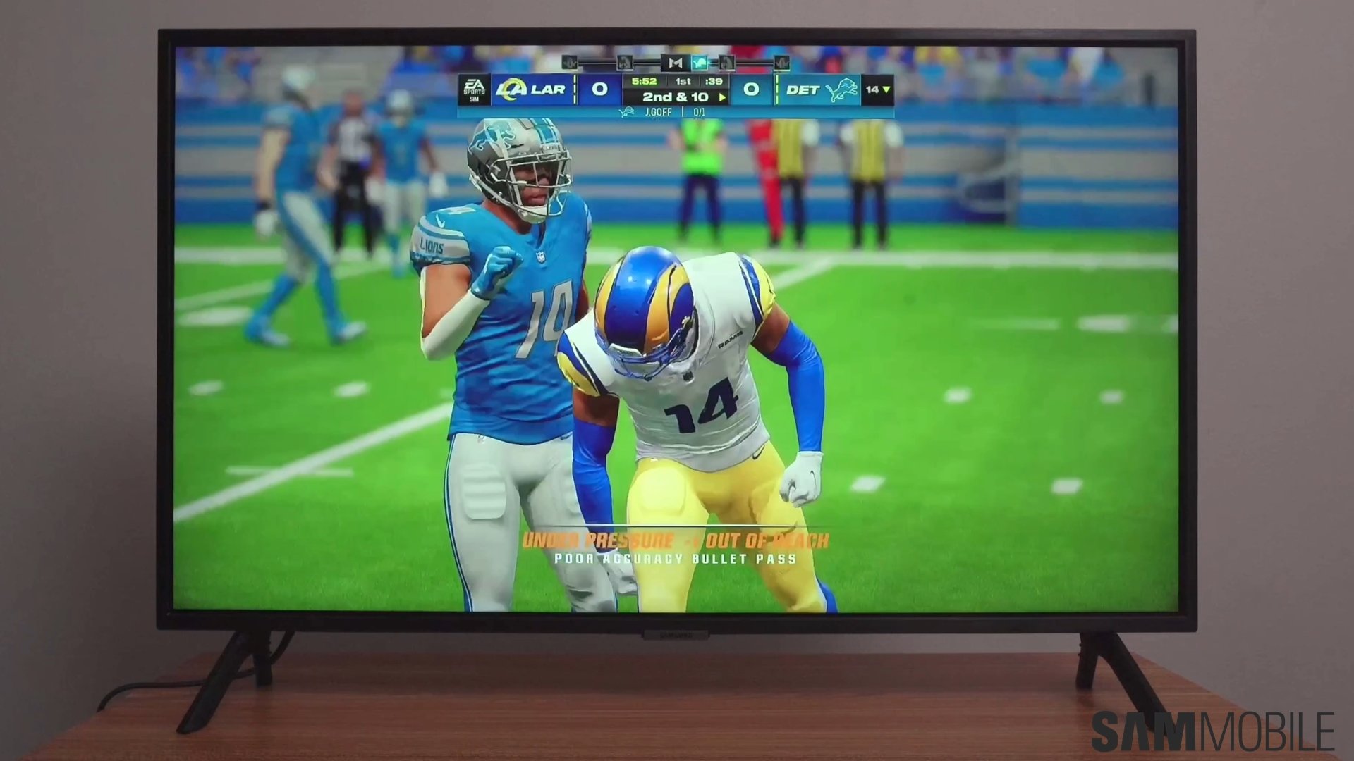
Well, I'm happy to say that Samsung's newer TVs are indeed faster thanks to better hardware and Tizen OS updates. And, surprise, surprise! SmartThings now supports dark mode for the virtual remote.
Better yet, Samsung got rid of the gummy remotes even for modern Crystal UHD TVs. Even though it may sound trivial, it is not. I've never used a more intuitive remote than Samsung's SolarCell. As soon as I picked it up, I instantly knew which buttons to press to navigate the menus, and I could feel the layout without looking at the remote.
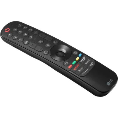
Even compared to high-end remotes from other TV brands, like LG, Samsung's modern remotes are in a class of their own. The layout is just so simple and easy to remember. The remotes are slim and light, and the fact that SolarCell models can be recharged through USB-C or the embedded solar cell is fantastic.
Samsung was brave enough to stray from the traditional TV remote design and got rid of as many buttons as possible. Even the numeric keypad is gone and now exists only in software form, which I don't mind at all.
- Samsung's clean, touch-friendly remote design is unmatched.
- LG's 2023 flagship TV remote is stuck in the past.
This redesign has massively decluttered Samsung's modern TV remotes. It made them very easy to navigate using only your tactile senses. No more second-guessing and peeking at the remote while you're watching TV.
And the good news is Samsung's remotes are in another class regardless of whether it's the SolarCell variant equipped with a USB-C port and a rechargeable battery or a regular AAA-powered model. The layout is almost always the same. You only get a few navigation buttons, a settings key, a few shortcuts for streaming services and/or the web browser, and two rockers for volume and program controls. And every one of these buttons is satisfyingly clicky instead of mushy.
I knew I wanted mushy remote buttons to disappear years ago, even when I wrote my editorial on quality-of-life TV improvements. But I never thought I'd appreciate Samsung's new remote design as much as I do now. I will never want to go back to traditional, cluttered, and oversized TV remotes, and I'm surprised that a remote will be one of the deciding factors the next time I buy a TV.
