Much has been said and written about the Galaxy Note 10. Samsung's latest flagship phablet brings some significant changes, and while some have been polarizing, others have been praised across the board. However, the device's design is perhaps one of its most underappreciated attributes.
That's partly because much of the focus was on other things in the run up to the launch. The will it/won't it charade for the 3.5mm headphone jack or the expectation that this might be the first smartphone on the market with a three-stage variable aperture, for example. While the Galaxy Note 10 doesn't have either of those things, it does have a truly exceptional design. The leaked renders don't really help since people form their opinions about the design without actually seeing the device in the first place.
Galaxy Note 10 design is refinement personified
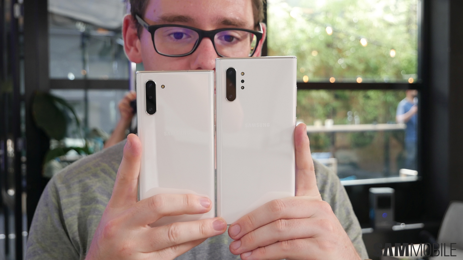
As highlighted in our Galaxy Note 10 hands-on, the new flagship's exceptional build quality is evident the moment you hold it in your hands. The metal and glass build feels just as premium as any Samsung flagship before it, if not more. It really feels like a solid device and that's a good thing. Nobody wants to pay $1,000-$1100 for a device that doesn't look the part.
Samsung has a unique design challenge with the Galaxy Note series. Part of what makes a Note flagship a Note in the first place is its signature squarish silhouette. Throughout the years we have seen the design being reformed. It has been refined from the days of chunky bezels and plastics to the sleek and modern design that we love today. Samsung has managed to retain the silhouette with every generation of the Galaxy Note and that's also the story with the Galaxy Note 10.
Even though it may feel like the Galaxy Note 10 design isn't all that different from the Galaxy Note 9, the more you look at the new device and the more you play with it, you come to understand the nuances of what Samsung has achieved with its new flagship. It is refinement personified.
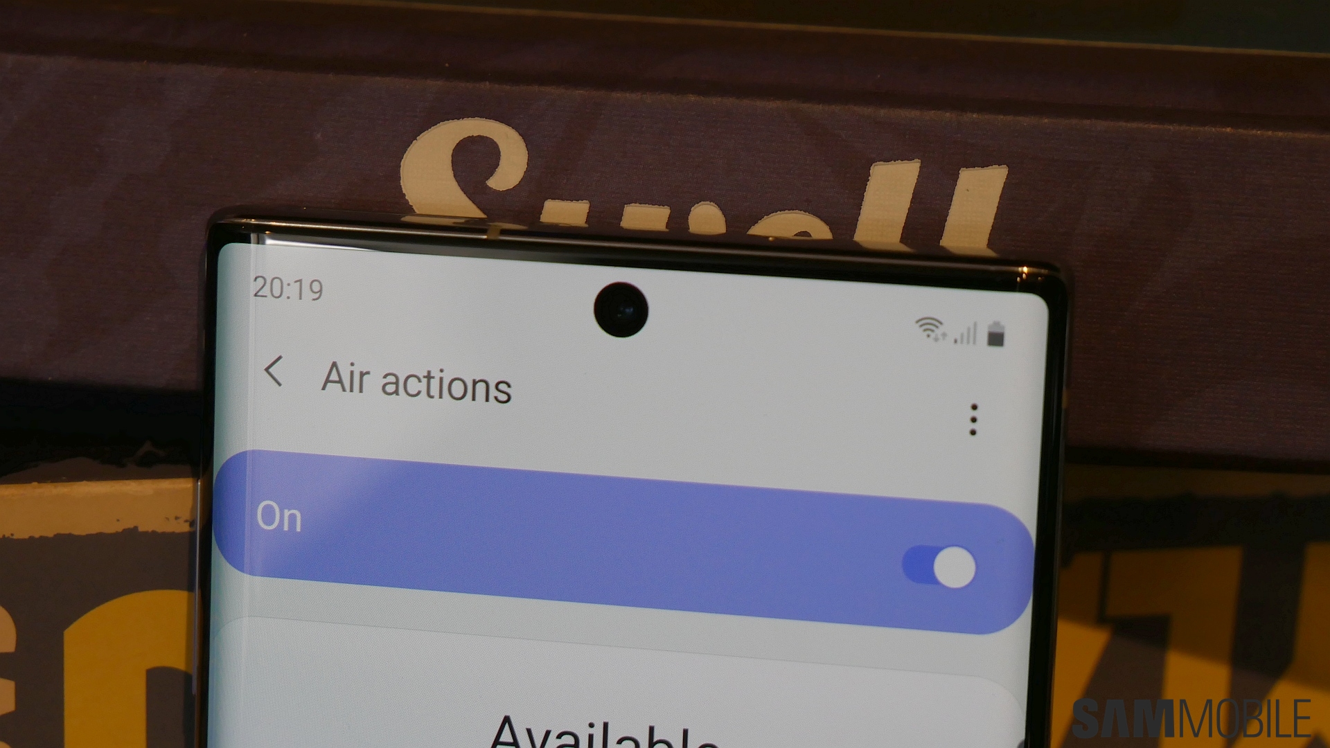
There were obvious gains to be had by adopting the Cinematic Infinity Display. It places the cutout for the camera in the middle instead of the right corner as the Galaxy S10, allowing for an edge-to-edge display with notably slimmer bezels. That's why Samsung was able to fit a 6.8-inch display on the Galaxy Note 10+, which is only marginally taller than the 6.4-inch Galaxy Note 9. The front of the device just captivates you with beautiful glass that curves subtly around the edges and blends into the frame.
And what to say about that frame. It accentuates the Galaxy Note 10's svelte figure and allows for a snug fit in your hand. There's often a tradeoff between beauty and functionality, but that's not something that we find here. Samsung has beautifully trimmed all the edges so it all looks prim and proper in a frame that's unapologetically a Note.
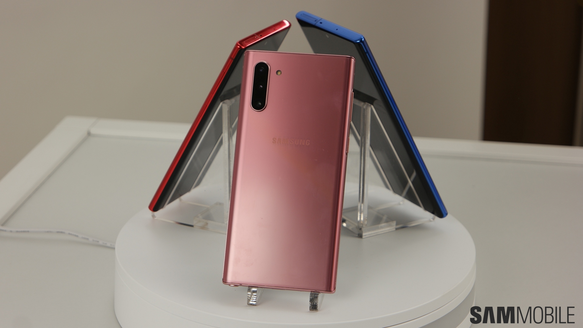
There's a whole range of beautiful colors to choose from and they absolutely complement this design. You couldn't go wrong with either one. Yes, there are some polarizing things about the new flagship. You may not like that it doesn't have a headphone jack or that the microSD card slot is only available on the more expensive model. What we and should appreciate, though, is that the Galaxy Note 10 is absolutely the most beautiful Android smartphone launched so far this year.
SamsungGalaxy Note 10
