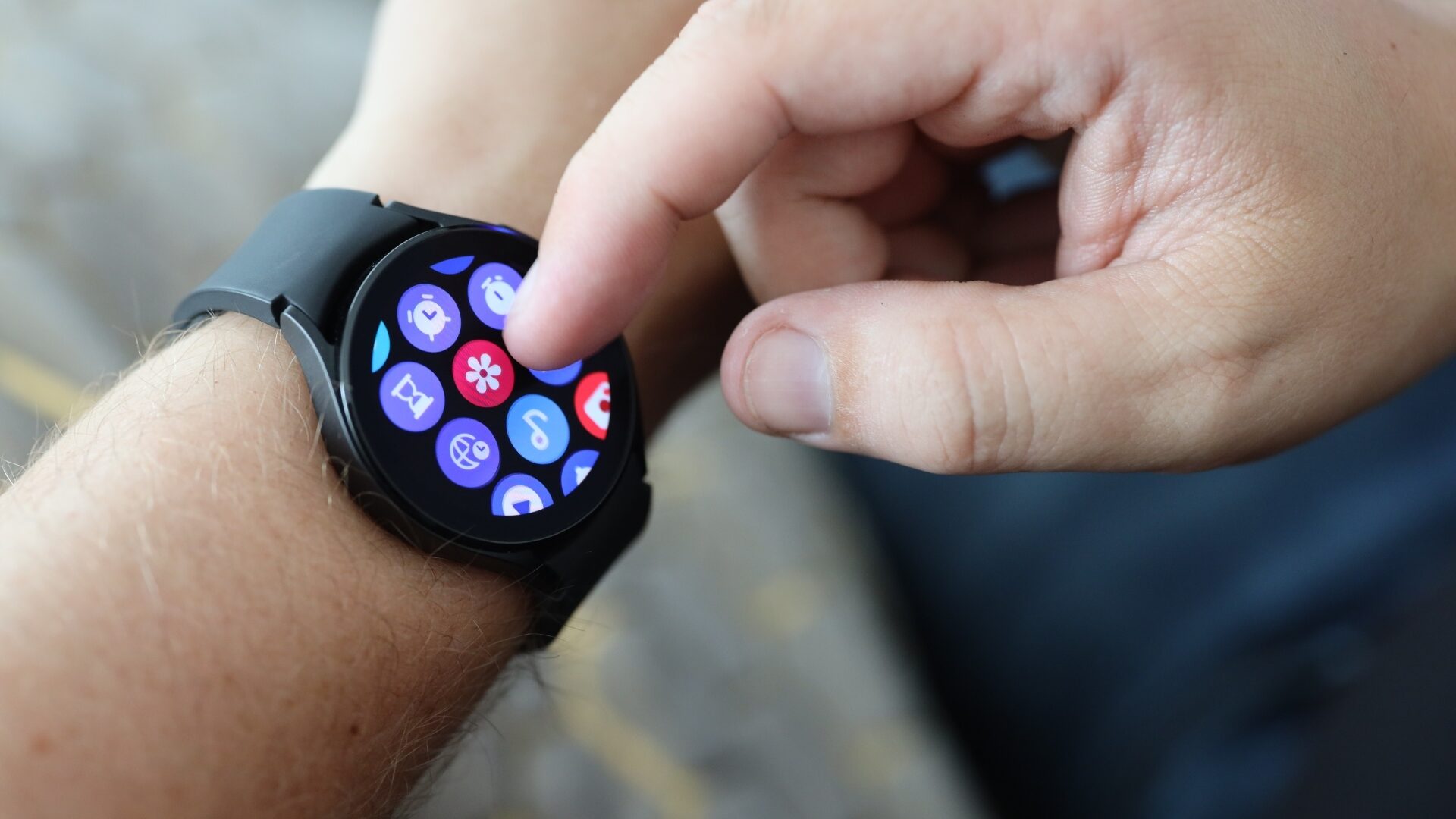
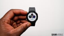
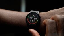
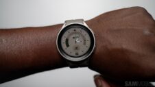
Samsung might do away with its Classic smartwatch series this year, which could mean the end of the physical rotating bezel. Sad news for Classic smartwatch fans, but perhaps the virtual rotating bezel employed by the non-Classic Galaxy Watch 5 models will remain a part of the experience. My question is, should it?
The purpose of the Classic's physical rotating bezel is to deliver a tactile sense of feedback when navigating the UI and allow the use of said UI without leaving smudges and fingerprint marks on the circular display.
The virtual rotating bezel has the same code running underneath, and thus it works similarly, except it's touch based and lacks the critical component, i.e., the physical rotating ring surrounding the screen.
And as “cool” as it may be from a purely technical standpoint, Samsung's virtual rotating bezel falls short of the physical counterpart and comes across as more of a gimmick than a core component of the product. It's an alternative method of navigating the UI, sure, but it isn't needed or nearly as useful as the physical bezel.
Using the virtual bezel on a Galaxy smartwatch doesn't offer tactile feedback and doesn't prevent smudges on the screen. More so, it arguably isn't any faster or more convenient than the conventional method of navigating One UI Wear using familiar taps and swipe gestures.
I'd happily trade the virtual bezel for more active pixels
Offering one streamlined method of navigating the UI can be an advantage in itself. But could there be other benefits to removing the virtual bezel functionality from the Galaxy Watch series?
Well, ditching the virtual bezel completely may allow Samsung to adopt a more full-screen design with thinner display edges and more active pixels. At the very least, it could allow the company to shrink down the bezels without worrying about how this might affect the functionality of the touch-based virtual bezel.
Besides, the virtual bezel doesn't always work as intended, and in the past, Samsung has had to spend time and resources fixing bugs and undesired behaviors. If anything, maybe Samsung should've done away with the virtual bezel first before considering ditching the Classic formula.
All in all, I often wonder if the virtual bezel is worth the hassle. It makes sense to keep it around for as long as the Classic series is viable. The code is there, so, why not make use of it?
On the other hand, without the Classic series around, the virtual bezel is starting to feel like the vestige of something greater. Or a somewhat unnecessary addition that might hold back precious development. Perhaps it's time to let the virtual bezel go and focus on improving other, arguably more critical areas of Wear OS and One UI.
What's your opinion on Samsung's smartwatch bezels? Do you use the virtual bezel? And if you do, how important is it to your user experience? Leave a comment below.
Join SamMobile’s Telegram group and subscribe to our YouTube channel to get instant news updates and in-depth reviews of Samsung devices. You can also subscribe to get updates from us on Google News and follow us on Twitter.
