
Design
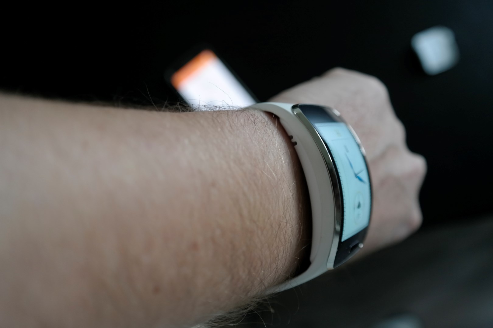
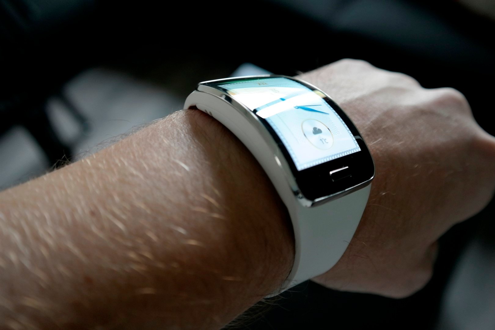
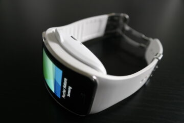
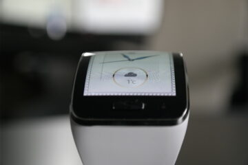
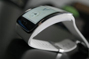
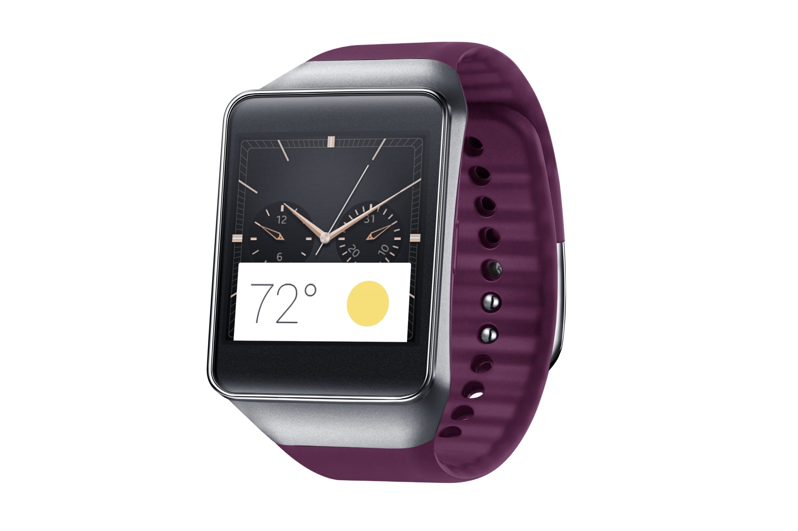
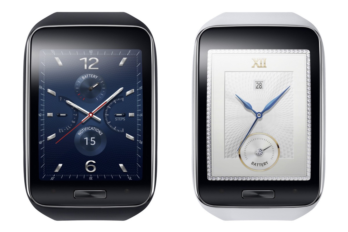
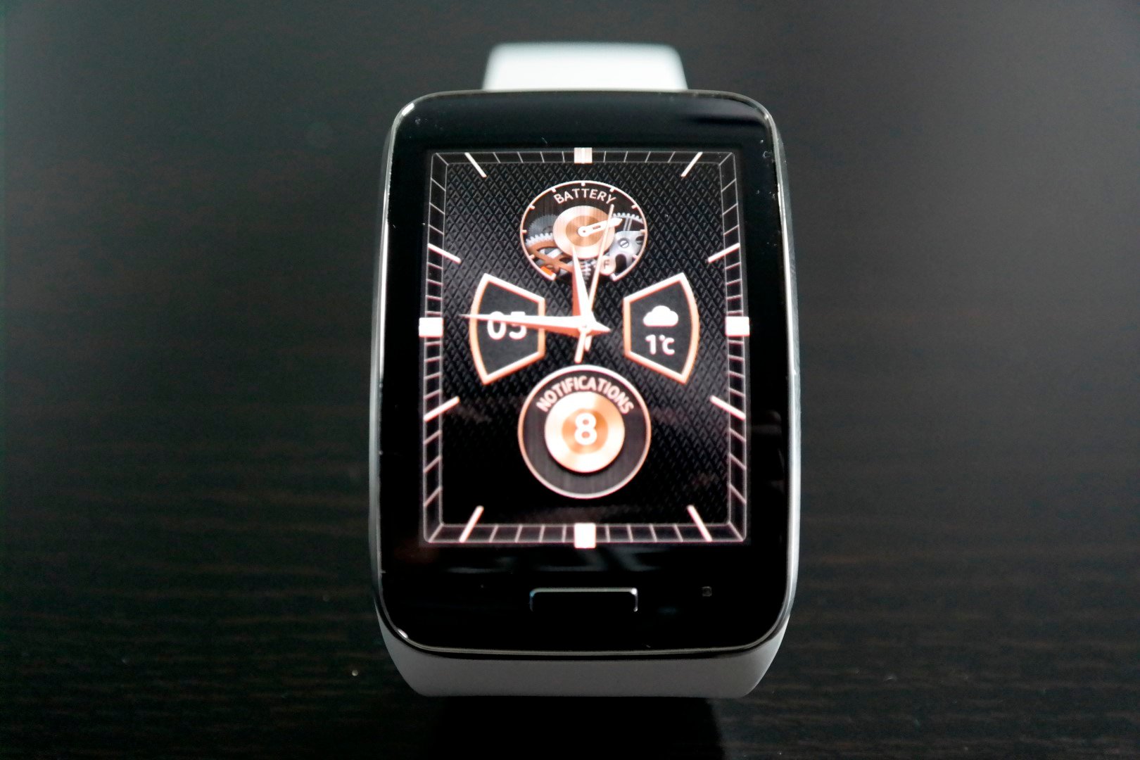
With its curved screen, the Gear S sets itself into an entirely new category, something the Gear Fit did as well when it was announced at the MWC in Barcelona. The Gear S has a beautiful 2-inch curved display – the display is actually two Gear Fit displays melded into one big display. Samsung sees the Gear S as a standalone smartwatch, so it brought overs its iconic “phone” home button to the watch as well. When you look at it from the front, you’ll see the big display with a home button placed at the bottom. A metallic bezel surrounds the screen, and its casing is made entirely out of plastic.
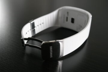
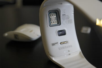
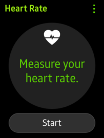
The strap comes in two types: Bangle and Strap, where the latter is smaller. Its clasp is the same as we find on all Samsung watches and is chrome colored with Samsung’s brand name on it. At the back of the watch we find the SIM slot (for some of our US readers, it’s possible your carrier’s SIM is included with the watch), heart rate monitor, and the charging port. It has a silicone band which feels a little cheap if you ask us. The Gear S’ weight is 67 grams, and the watch never feels heavy on your wrist. The thickness and diameter are 1.2 cm and 5.8 cm respectively, so the watch is definitely on the big side. We can imagine it will look silly if you have small wrists, but thankfully the wristband is interchangeable so you can swap them out to whichever ones you like, with a few options already released in the market.
Here’s a funny thing about the Gear S’ design. I came home one day and showed the watch to my girlfriend, who responded that she didn’t like it at all and found it ugly. A few days later I asked her again, and this time her answer was that she kinda liked it now. This is an issue with most of Samsung’s designs – they need to grow on you, and it’s pretty much the same with the Gear S.
Screen and Specifications
The Gear S packs a 2-inch Super AMOLED display with a resolution of 480×360 pixels and a pixel density of 300 ppi, making it the biggest display on a smartwatch till date. It is beautiful and very vivid, something we’re used to from Samsung’s AMOLED screens. Its readibility is a bit dubious because of the curvature of the screen – the upper side has the tendency to pick up a glance effect. Other than that it’s bright enough to read in daylight conditions, though in direct sunlight it’s a bit hard to read.
The Gear S runs on a dual-core 1GHz processor, 512MB of RAM, and Samsung’s Tizen OS. The watch runs smooth and without any slowdowns throughout the system. It comes with 4GB of internal storage, which can be used to store music, pictures and other files. There’s Bluetooth 4.0, so you can connect your favorite headset when you want to listen to music when you go out for an evening run (without needing to take your phone with you.) You can also connect a headset with a mic, so that you don’t have to talk to your watch and look all awkward.
Interface and Apps
The Gear S works the same as all other Gear devices. The initial setup needs to be done on a Samsung phone through the companion app, after which it can be used as a standalone device. In Gear Manager, you can set different settings like the wallpaper and clock face. Other settings are notification settings, S Health, and a few others.
When it comes to the watch’s interface, it’s just something you will need to get used to. When in standby mode, the screen is black, and when you make a motion with your arm as you would to look at a normal watch, you will see a very minimalistic digital clock. Tapping the screen once will bring up the main clock face.
From there everything is a swipe away. When you swipe from the top, you will see its notification bar with settings like screen brightness and volume. There is a “do not disturb” option as well – when you turn this on, all notifications and alerts will be disabled. Swiping from the left will show you all notifications grouped in one page, more swipes to the right will bring you to the individual app grouped notifications, while the app drawer will show up when you swipe up from the bottom to show you a list of all installed apps.
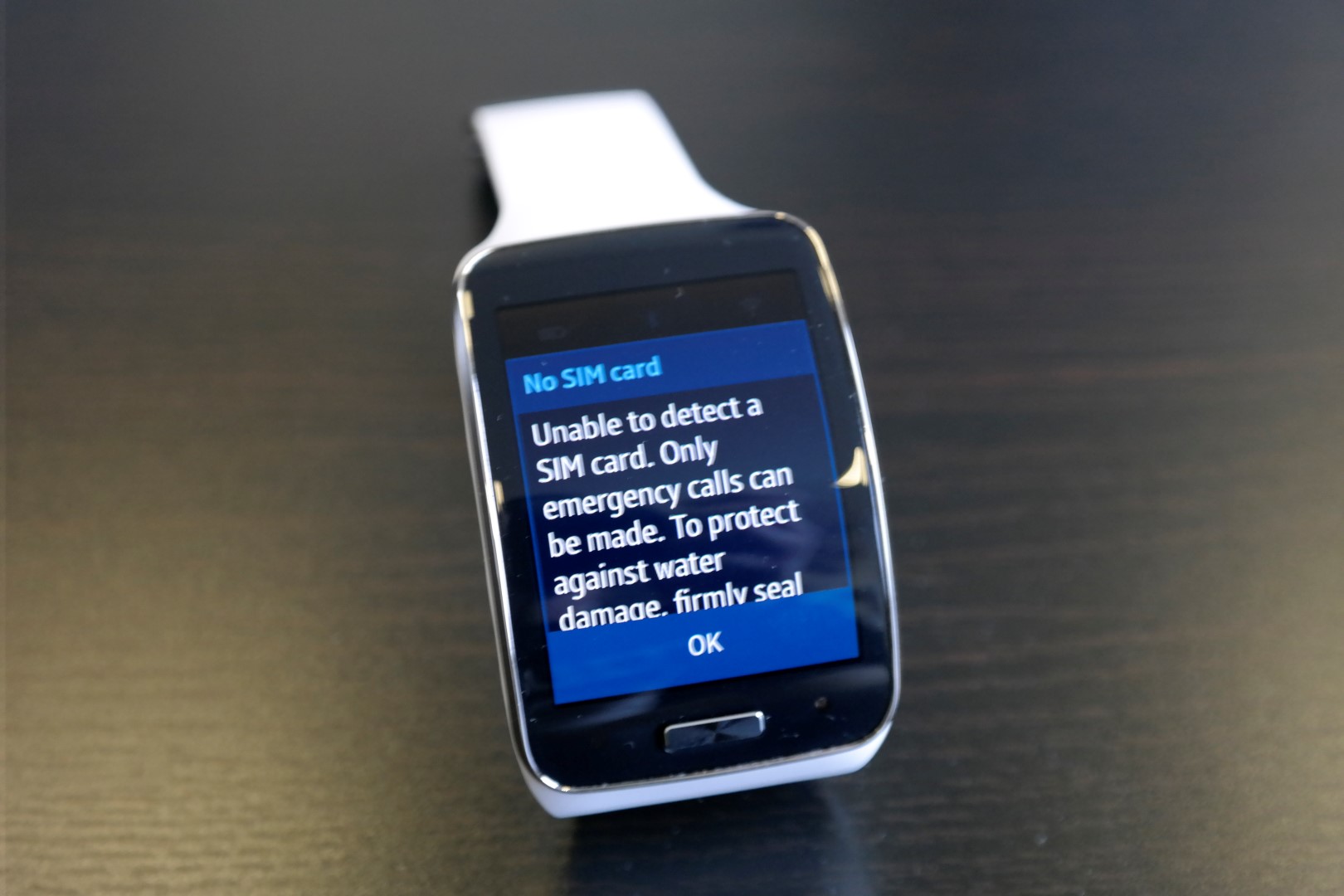
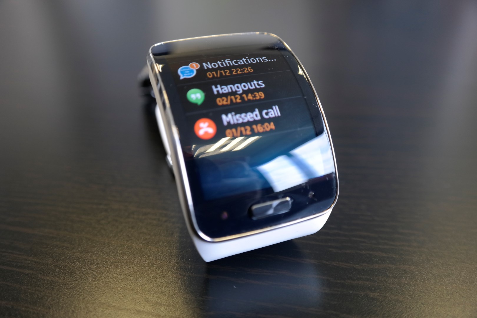
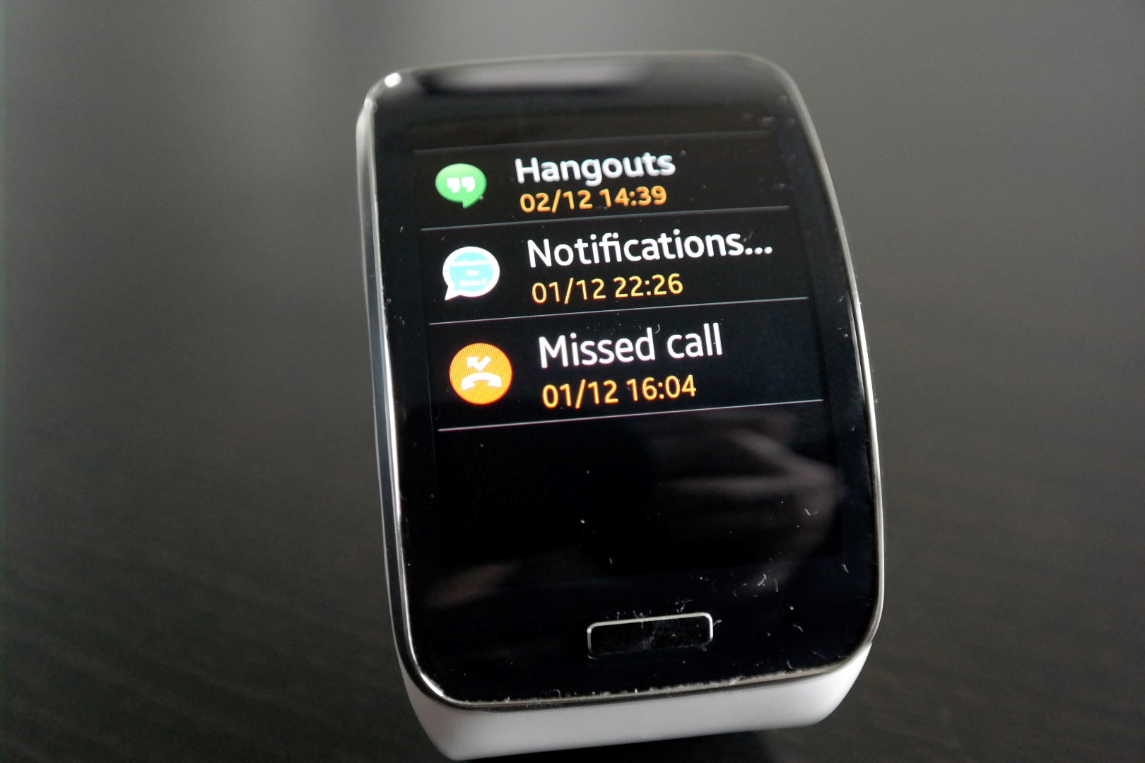

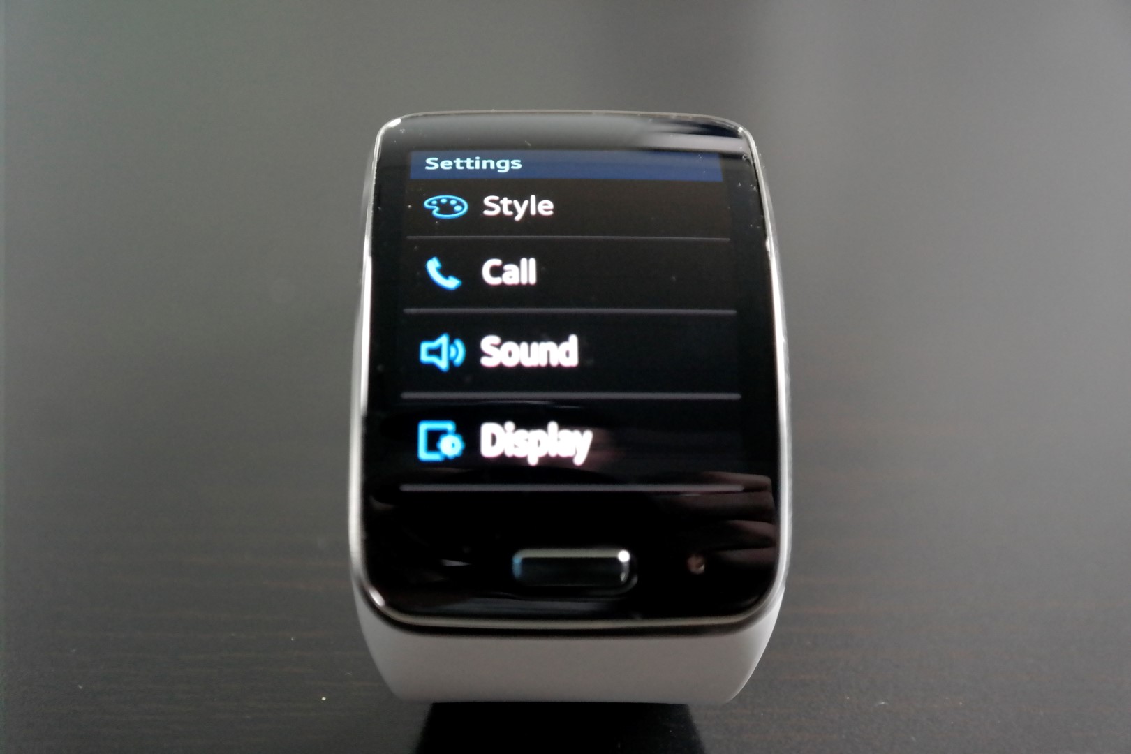
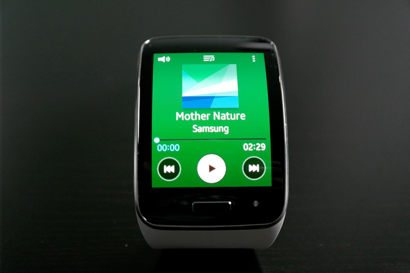
To go back a page or dismiss something, you just have to swipe from the top to the bottom of the screen, a gesture that is present on the earlier Gear smart watches as well.
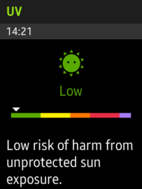
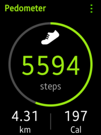
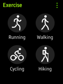
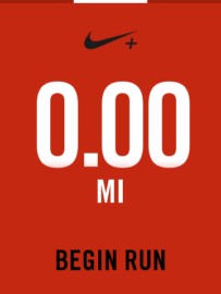
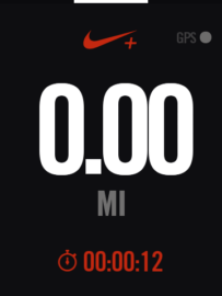
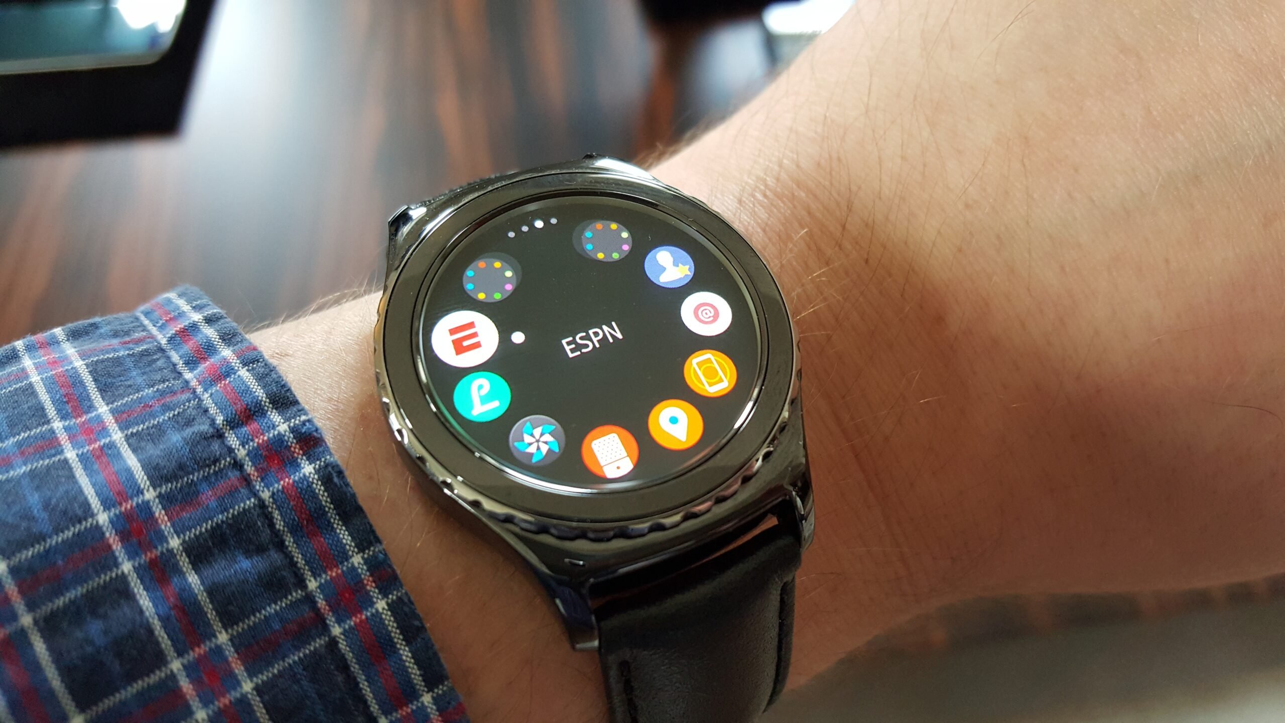
When it comes to apps, the Gear S comes with a good set, with one of the best running apps around, Nike+, included as well. The app on the watch keeps the amount of miles you run, while the companion app on the phone collects the necessary data from those runs so you can compare them with your friends and family (the data syncs between the phone and watch whenever the two are connected, so you can use the Nike+ app on the watch without having your phone nearby and sync the data later on.)
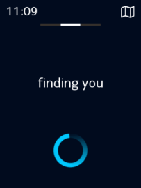
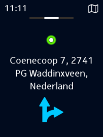
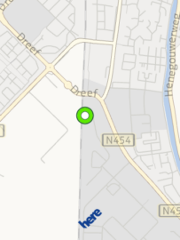
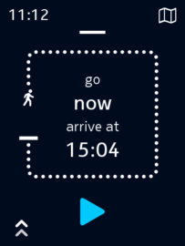
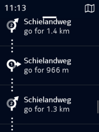
The Gear S also packs the Nokia HERE navigation app, which has a beautiful design. Again, you can use it without your phone, but unfortunately only for walking directions. As the watch runs on Tizen, big apps like Facebook, Twitter and Instagram aren't available, though you might find some third-party apps on the app store.
Usage
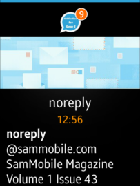
Everyday usage with the Gear S comes with one shortcoming. When connected via Bluetooth, you can’t reply to Hangouts, WhatsApp or any other messenger app except for the standard SMS messenger app that comes with the watch. Luckily, there are talented people like Paco Salazar and his outstanding app Notifications for Gear S, which lets you reply to almost every messenger app out there with a tiny keyboard. I find this very handy as I can leave my phone in my pocket; a nice addition to this is that it shows you notifications from every app with all its content, making the Gear S much more bearable. But as a standalone device, the Gear S lacks important apps like WhatsApp, Hangouts and Gmail, on which I rely heavily, making the use of the watch as a standalone device hard for me. I used the Moto 360 for a while to see what the fuss was all about, but before using the Moto 360 I used the Gear 2. I thought I would miss the call function and I did; you can imagine calling through a watch would look funny and it kinda does, but it’s extremely useful and practical as well. For example, when I'm in the kitchen cutting vegetables and get a call, I can just say “answer” and take the call.
Battery Life and Charging
The Gear S packs a 300mAh battery. That isn’t much, but since Tizen is quite optimized, you will get two and a half days worth of battery life with heavy usage, and a day or two more with normal usage.
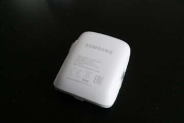
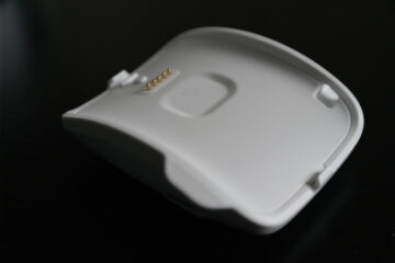
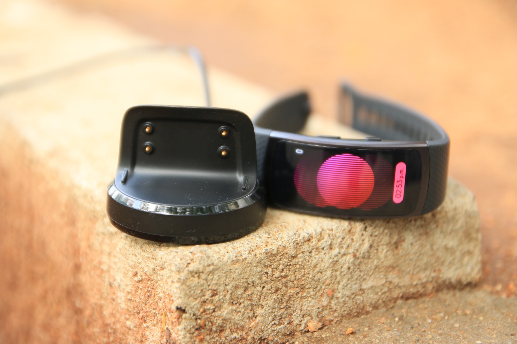
Samsung opted for a charging cradle ala Gear 2, Gear Neo or the Gear Live, so this means that it will click into its back. There were complaints of broken casings with the Gear Live, but with the Gear S it snaps on really easily. The nice addition to this charging cradle is that it is a 350mAh battery pack as well, so when you aren't in a position to juice up your watch, you just click on the charging cradle and it fills your watch up with one charge.
When you’re using the watch as a standalone device, battery life is a different story. Without making phone calls, it’s possible to get a full day worth of battery life. But when making a few phone calls and getting some notifications, you will need to bring your charging cradle along as you will need to charge the watch by the end of the day or even halfway through the evening.
Wrap up
The Gear S is Samsung’s sixth smartwatch, and you can clearly see that Samsung wants to set its smartwatch lineup apart by adding curved screens. The watch isn’t very noticeable when wear it, even though it looks heavy. The Gear S is a solid piece of hardware with a very futuristic and geeky look thanks to its enormous curved display.
The only big downside of this watch is its lack of apps. There just aren't enough apps, and it will always be like this especially if Samsung keeps making different screen sizes as developers will constantly make their apps compatible with a new screen size (it also doesn't help that the watch runs Tizen and not Android.)
But the big screen is very handy as you can read a lot of content on it, and it has decent battery life in Bluetooth mode. When used a standalone watch, it becomes less attractive as you miss out on major apps that many people regularly use (WhatsApp, Facebook, etc.) For a quick run without your phone the available apps are okay, but it’s not more than that.
All in all, the Gear S is a nice watch, nothing more, nothing less. Should you buy it? Well, that is up to you – it costs €399, which is a lot of money for a watch. I would say you should go for the Gear 2 as you get more apps and more or less the same functionality. However, if you don't mind those missing apps and want to leave your phone at home once in a while, then the Gear S is your only option.
