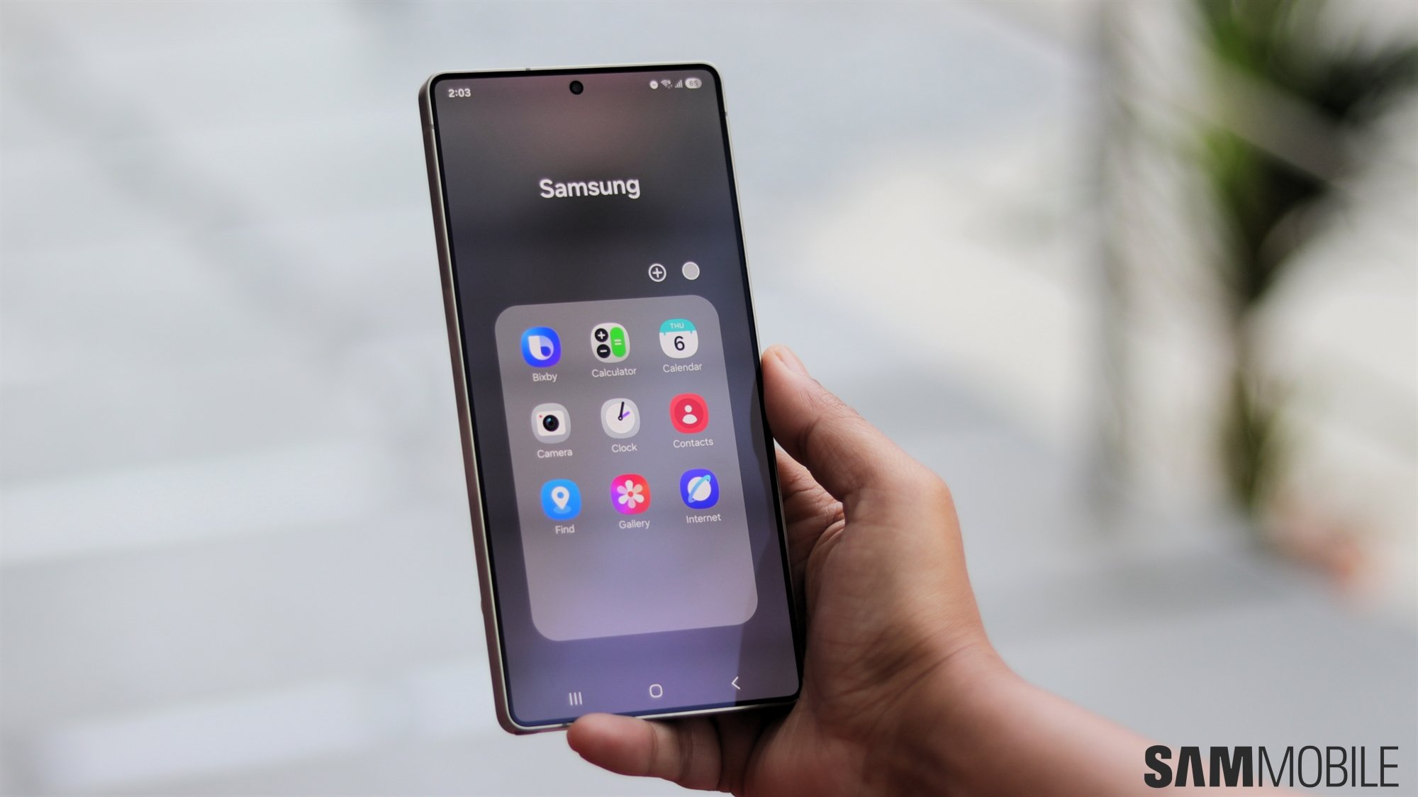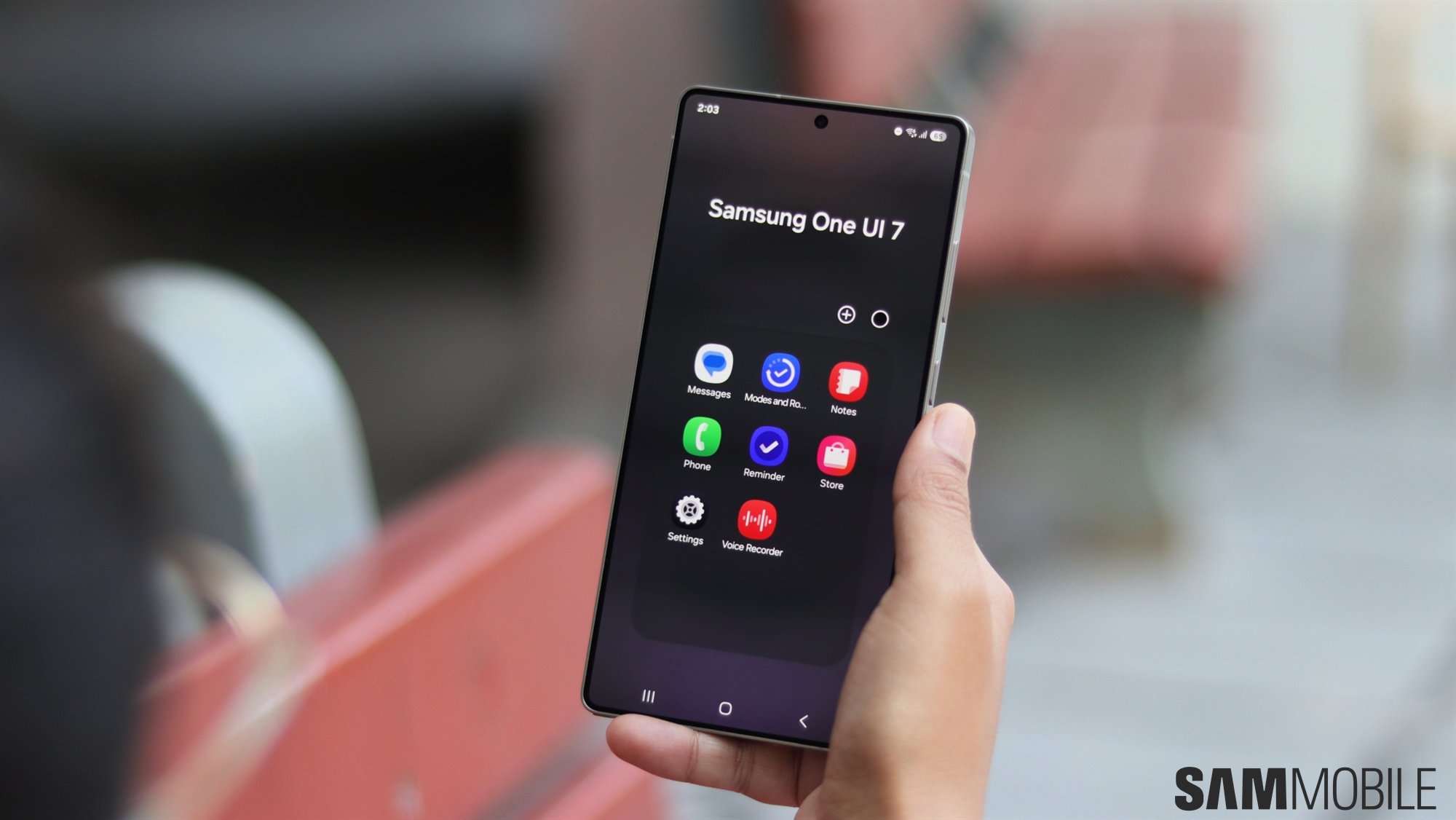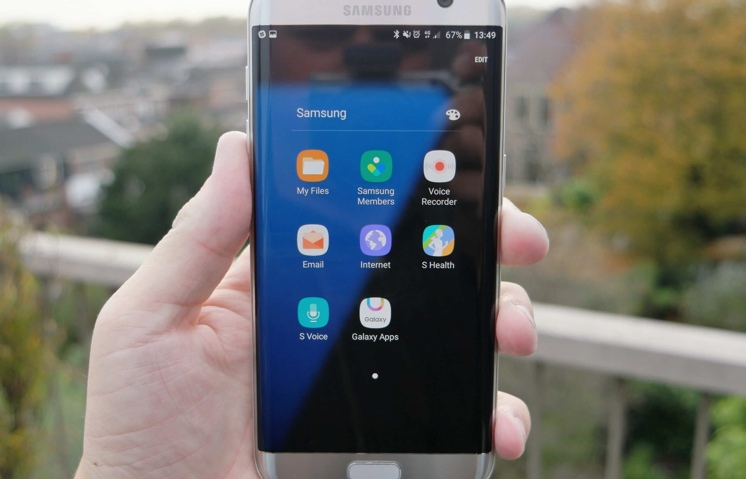
In part 3 of the What's New With Nougat series, we're looking at app folders. If you look at app folders as they are right now you'll find that they don't lend an air of clarity and openness to the user interface. It's like you're boxed into this view of a list of applications. That changes with the new UX that Samsung will offer with Nougat. As you can see in the screenshots posted below, app folders are now transparent, you get to see the background and the entire arrangement looks very clean and tidy. That's really how it should be, don't you think?
