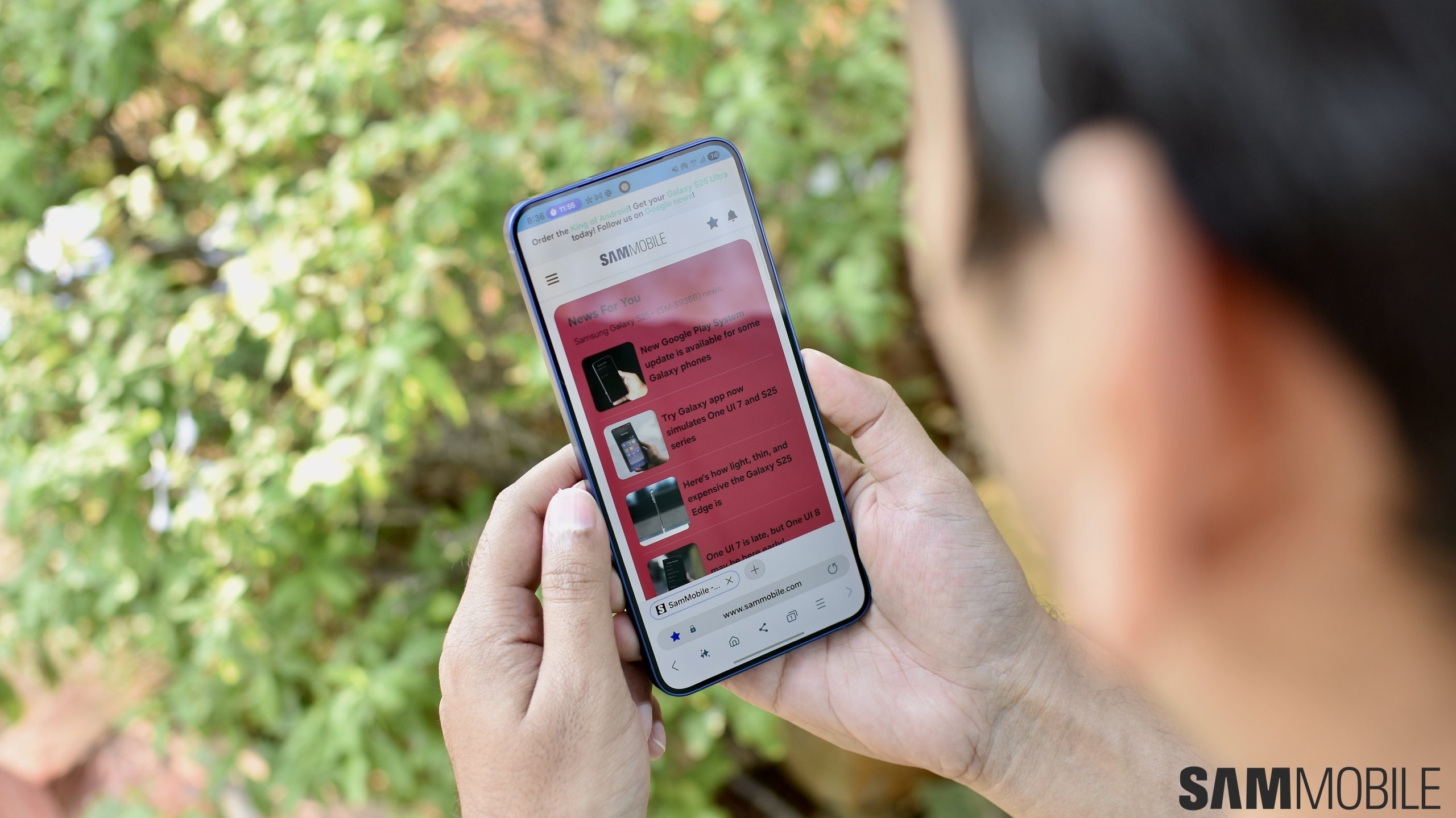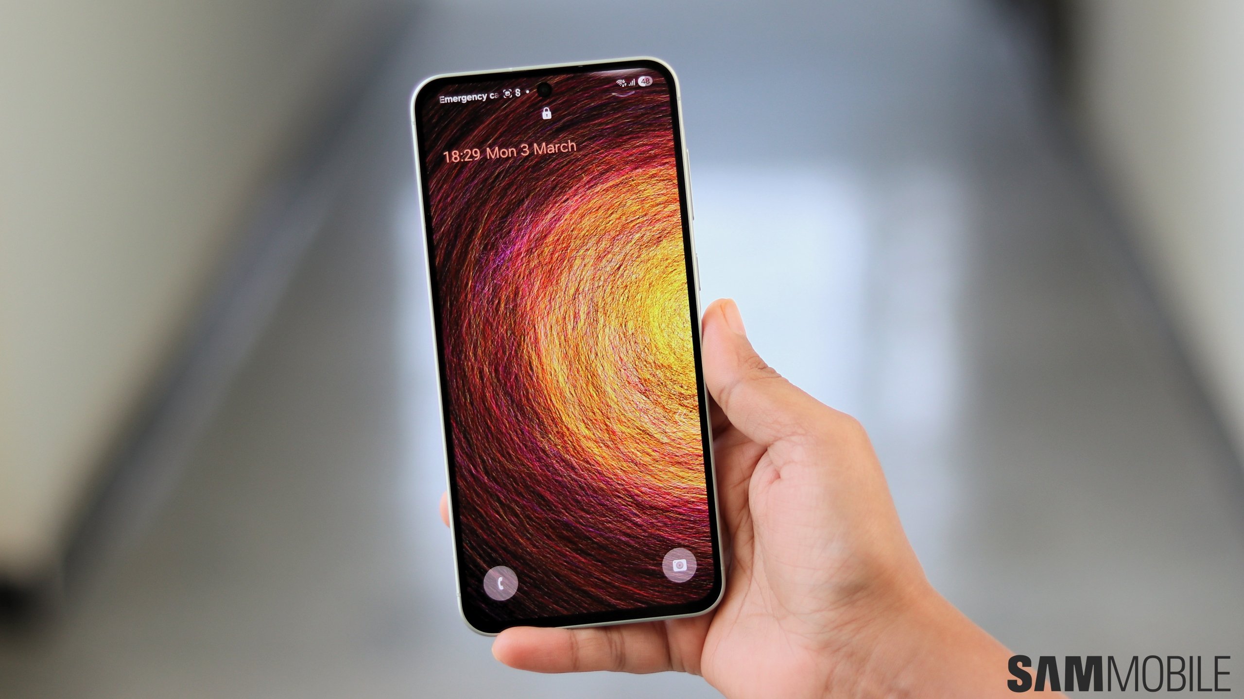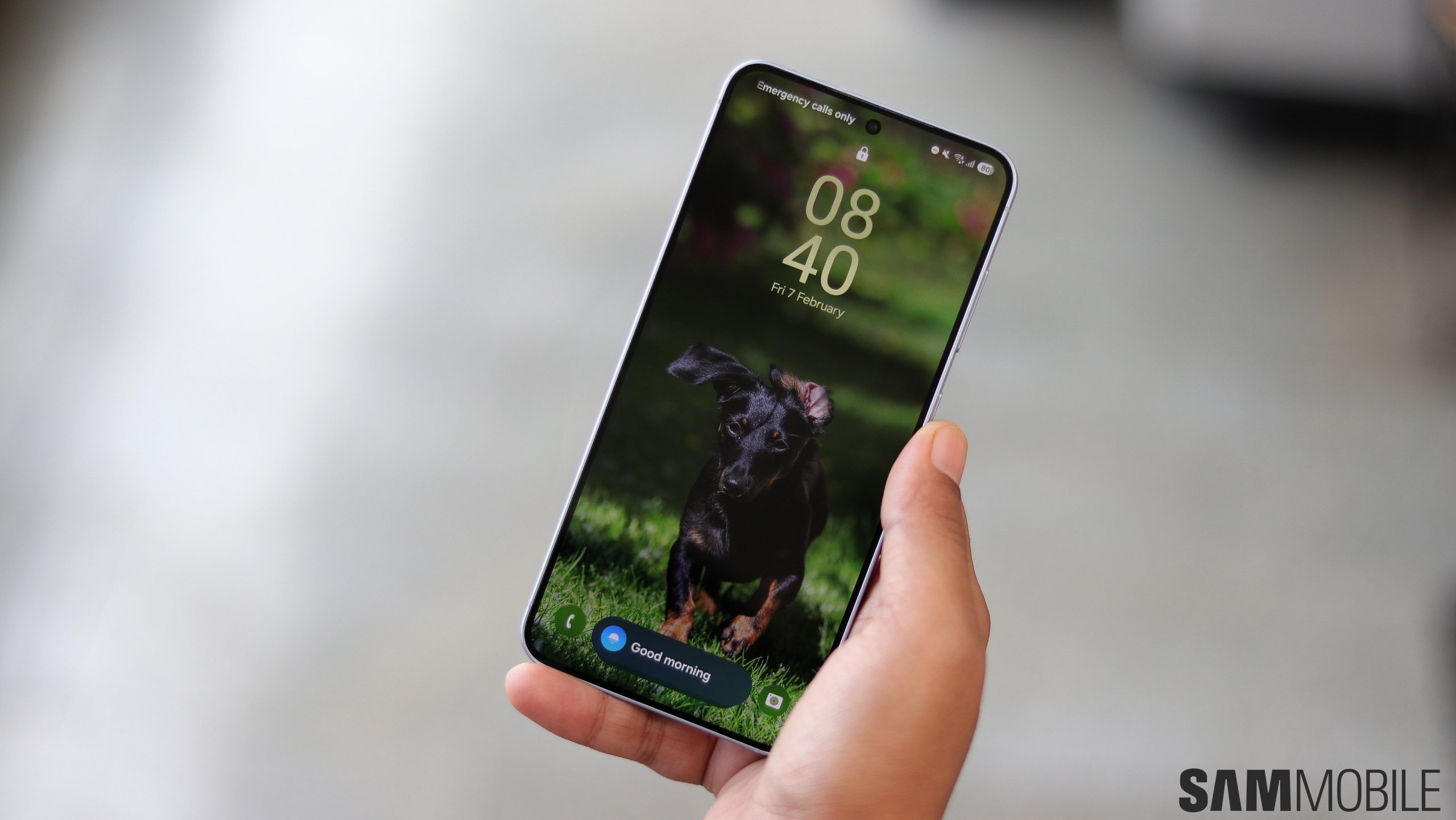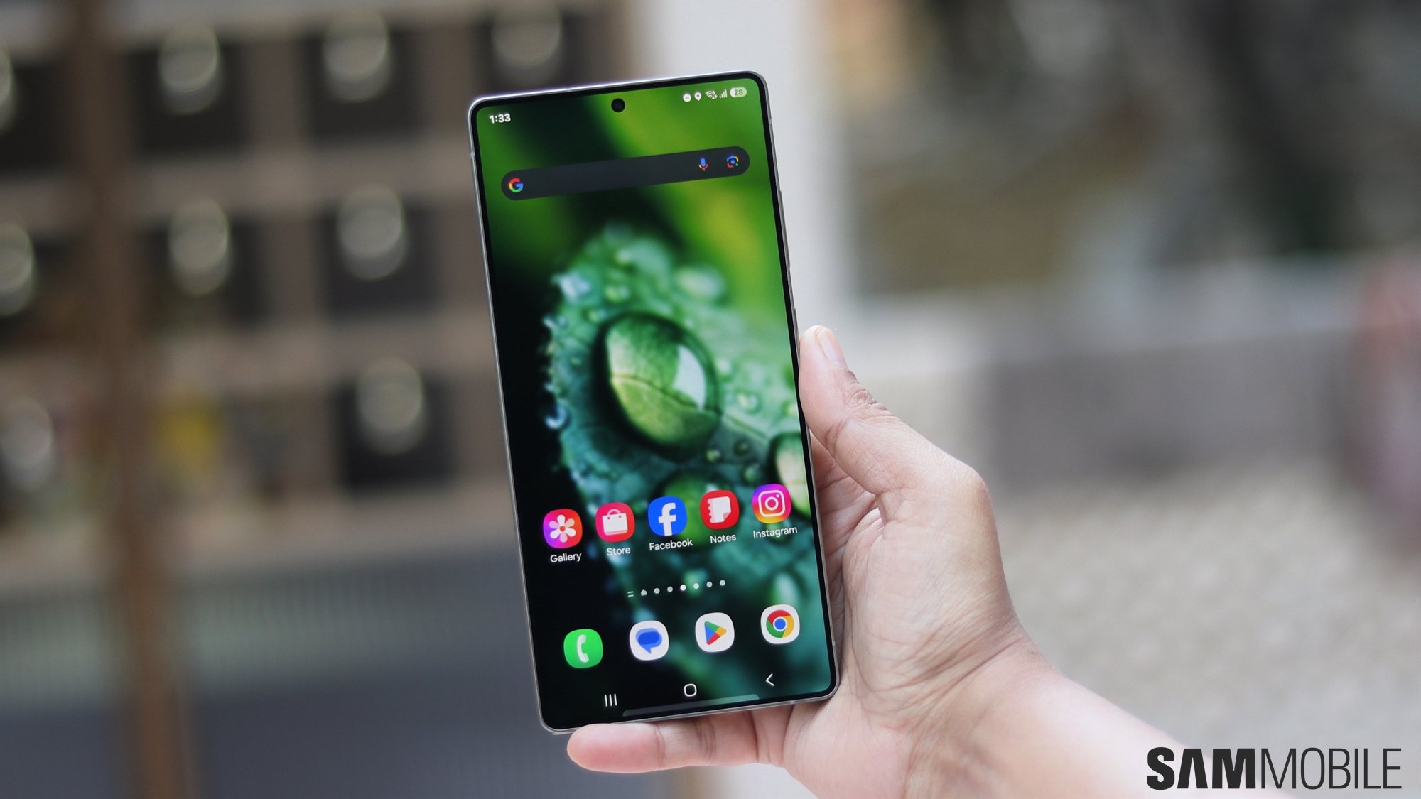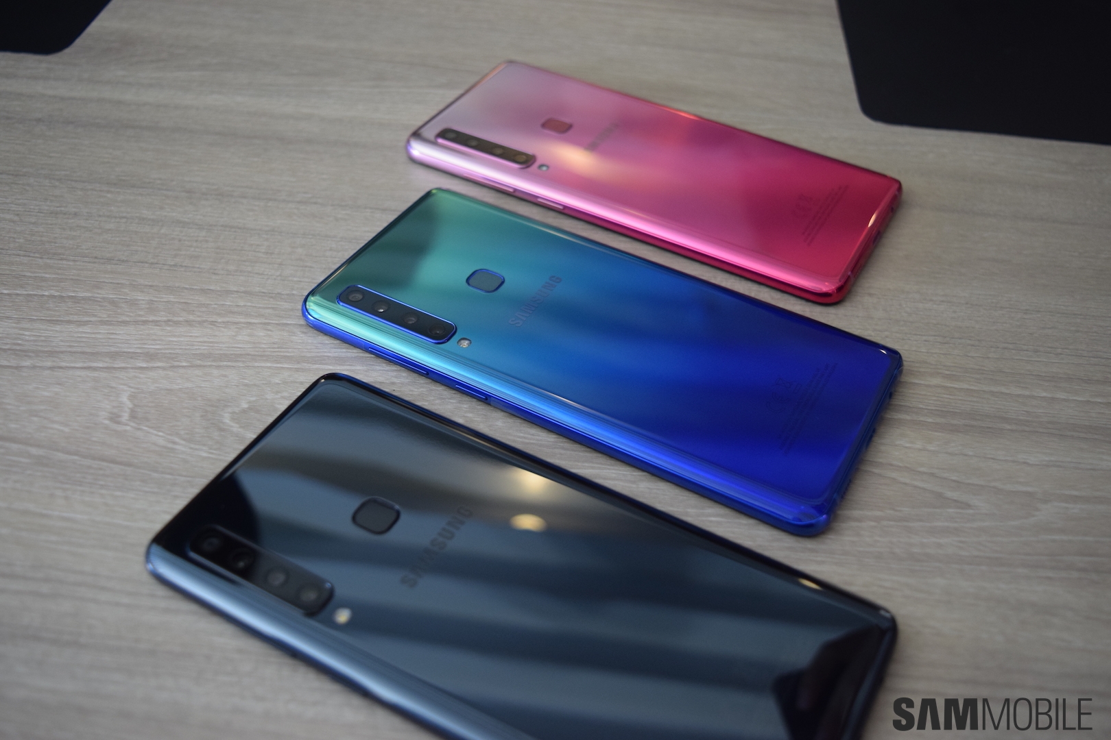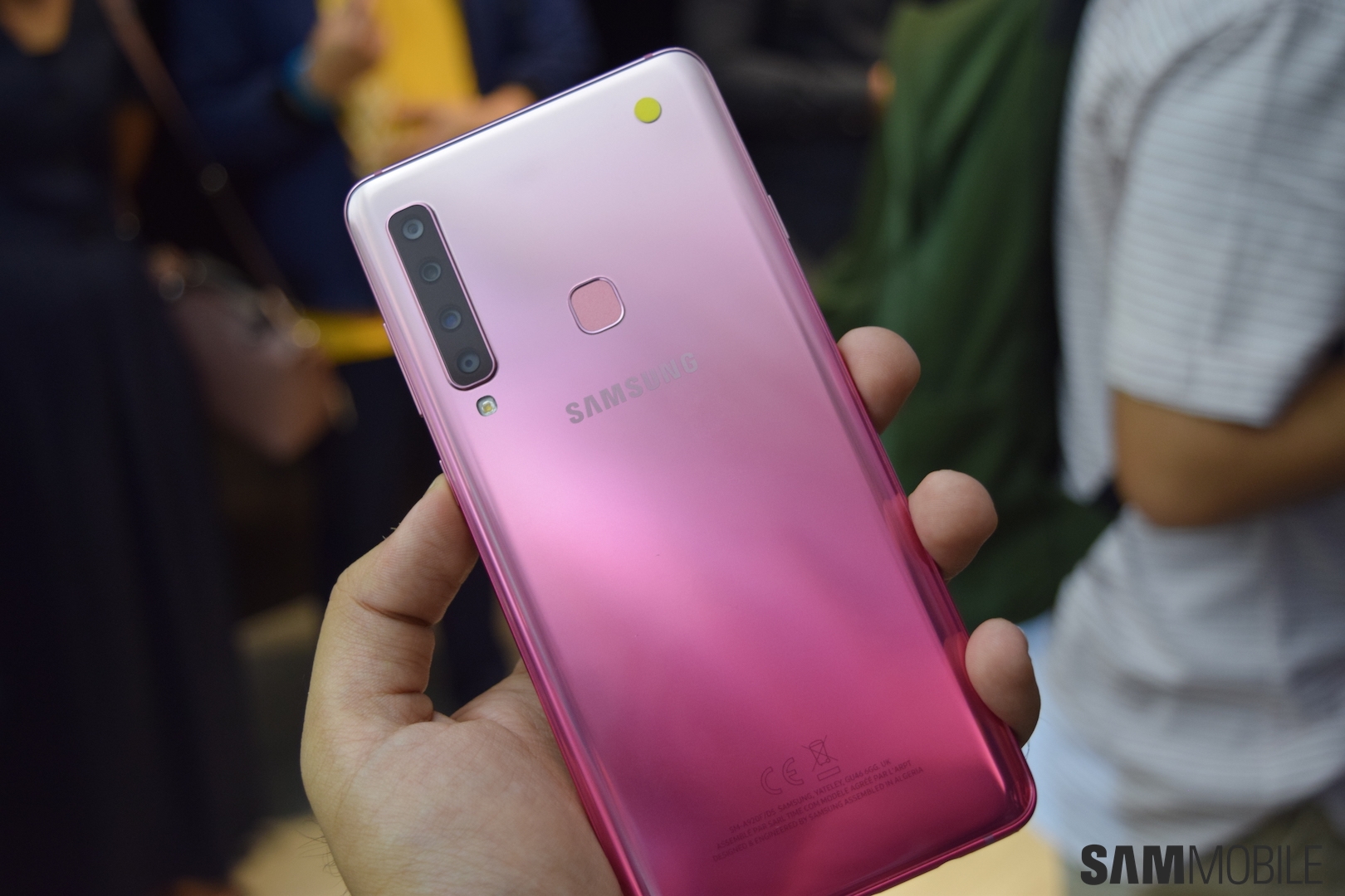
It's evidently not all that different from the Galaxy A7. Park mentioned that both devices have been designed with the same target market in mind: millennials. The Galaxy A7 and Galaxy A9 are aimed at users who are active on social media, hence the triple and quad-camera systems respectively.
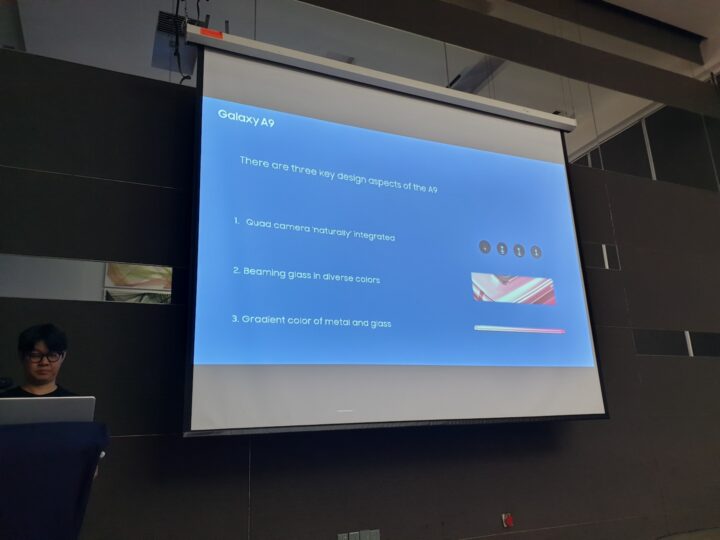
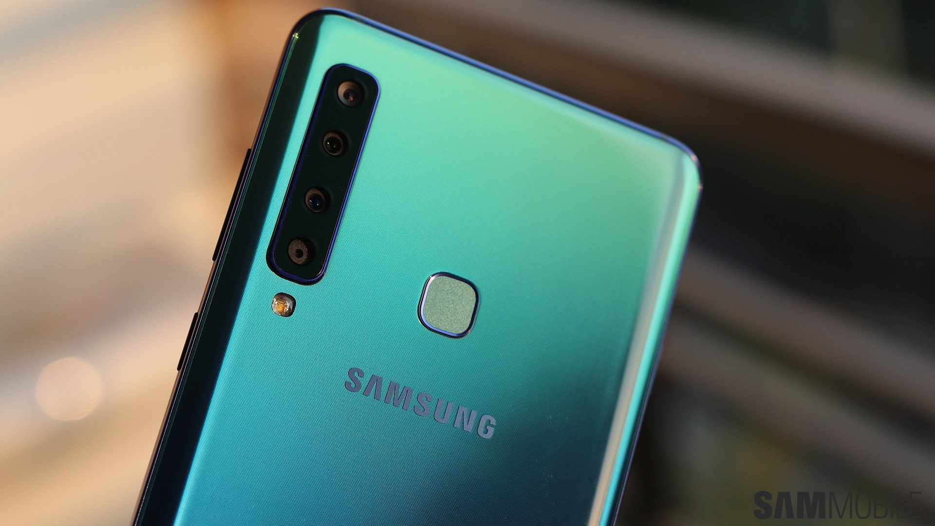
The design team worked with the aim of making the quad camera system look as naturally integrated into the body as possible. They focused on minimizing protrusion to achieve a more natural look. That's the main reason why all four rear cameras are in a straight vertical line.
Samsung gets serious about gradient colors
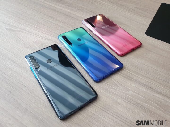
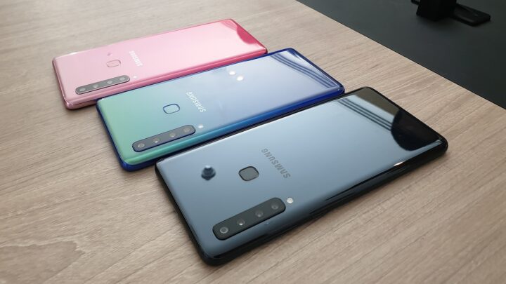
One noticeable change is the adoption of gradient colors. Samsung has design offices across the globe and they conduct research into upcoming trends. The design was based on the trend analysis conducted by these offices. Their prediction for 2018 was that the gradient colors will become a major trend. Not only for smartphones but for other industries such as interior design. Samsung is a bit late to the party, though, as some of its rivals have long adopted gradient colors.
Samsung has increasingly been adopting the use of glass backs on its affordable devices. Park says that the company has moved in this direction as glass gives a more sophisticated look and it also maximizes the level of glow that Samsung is looking to get out of these colors. Glass tends to break but Park confirmed that the Galaxy A9 has Gorilla Glass at the back. He couldn't recall the exact version, though.
We mentioned in our Galaxy A9 hands on that the dedicated Bixby key on this device is placed a bit higher presumably to prevent accidental presses. That's an issue that many users have complained about on other devices. We asked Park if this was a conscious decision on the design's team part. The rather diplomatic answer was that the positioning is based on a guide that Samsung has for ergonomic design. Accepting that the button's placement has been raised to prevent accidental presses would obviously amount to an admission that they didn't quite get it right the first time around.
All things considered, the Galaxy A9 looks and feels like a premium device, the kind that we have come to expect from Samsung over the years. The real star of the show here is the quad camera system. We'll have more to say about that in our full Galaxy A9 review, which will be up in the not-too-distant future.
What's your opinion of the Galaxy A9 (2018) as far as the design is concerned? Sound off in the comments!

