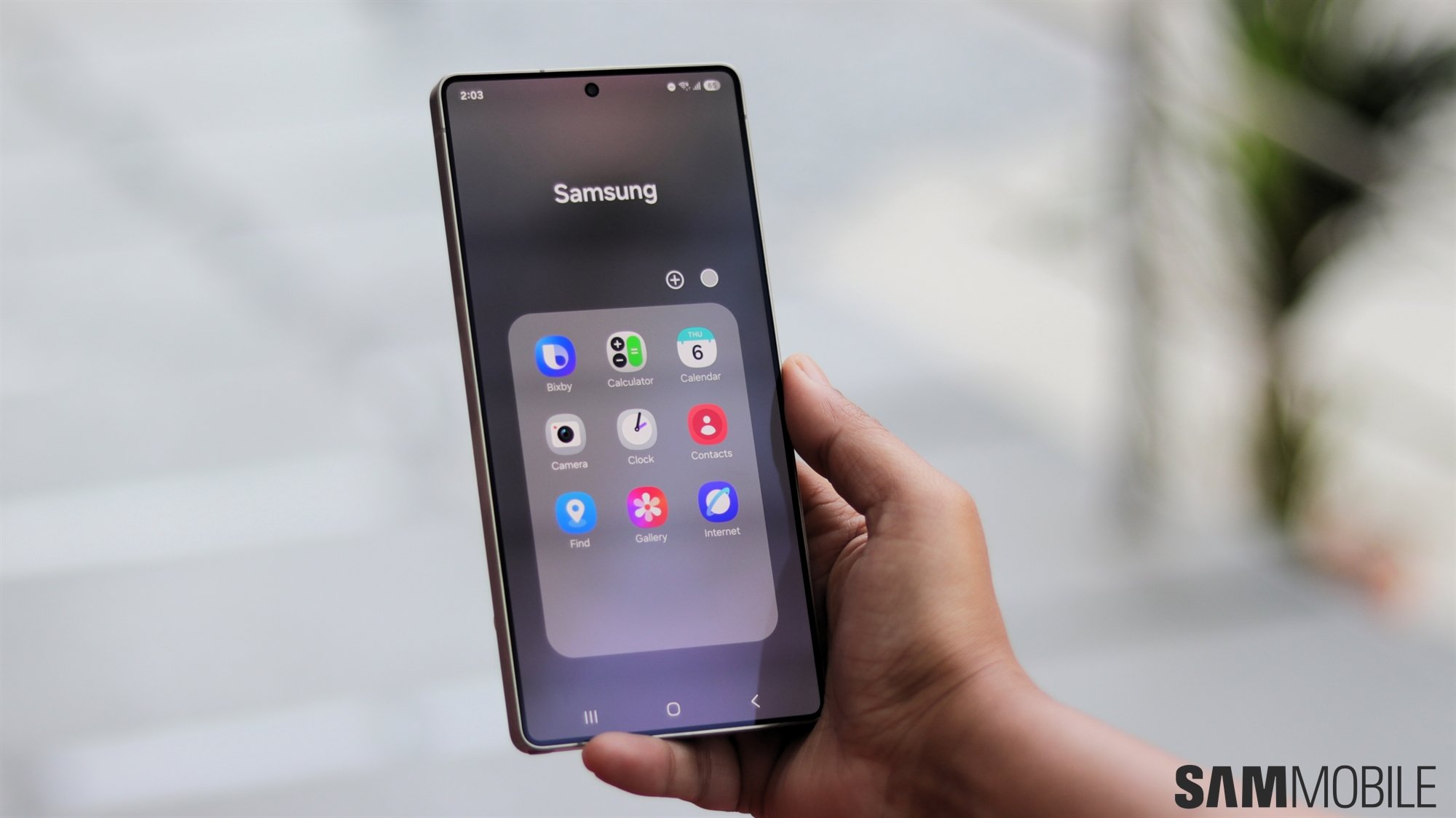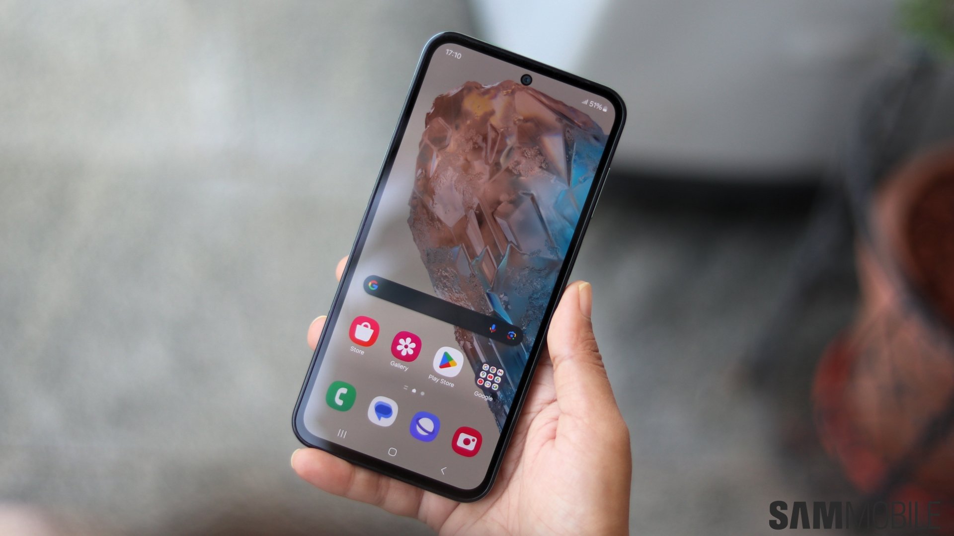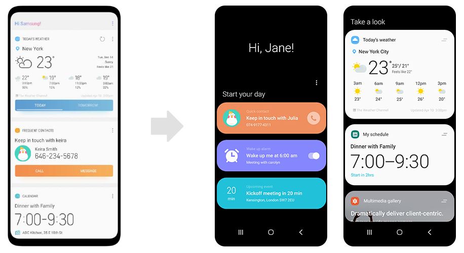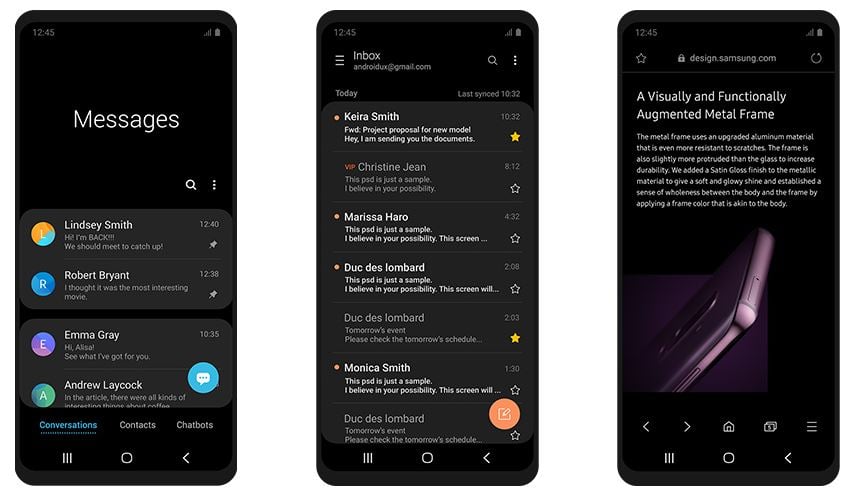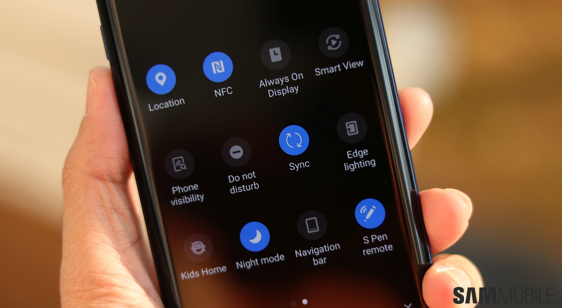
Does the post offer any new details? Well, not exactly, but it's still a nice read, especially for those who haven't had the privilege to take part in the Galaxy S9 or Note 9 One UI beta programs. One UI's primary goal is to make interacting with big-screen phones easier by moving interactive elements to the bottom half of the screen while keeping viewable content in the top half. It also brings what Samsung calls ‘focus blocks' into the mix, which is a fancier way to say you now have a card-based UI that makes it easy to spot “content that matters”.
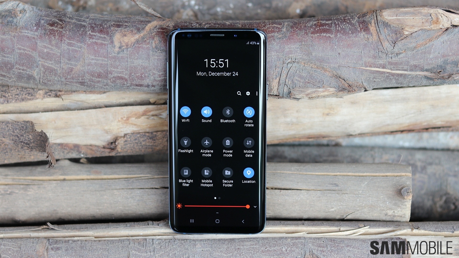
The image comparing Bixby Home on Oreo and Bixby Home on Pie is a good example of the card-based UI, and you can also look at how various other parts of the interface compare s. Samsung's post also talks about Night mode, which makes for comfortable viewing at night. Of course, most of us will use it simply because it looks so beautiful, and it's one of the best features that Android Pie will bring to Galaxy devices.


