Google has updated the account switcher in the Google Messages app with Material You design and Dynamic Colour feature, reports 9To5Google. The latest design change is available in the newly-released beta version of the app. The account switching panel, as the name suggests, allows you to switch between different Google accounts that you've added to the app, and you can find this panel in all Google apps in the top-right corner of the screen.
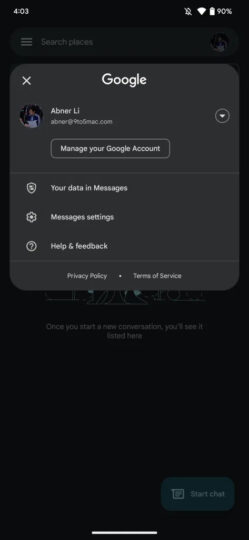
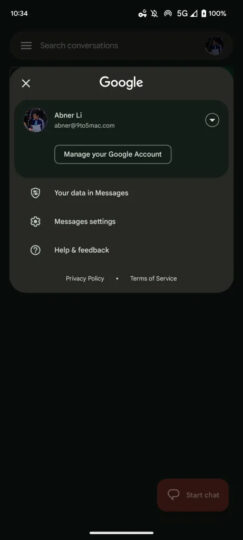
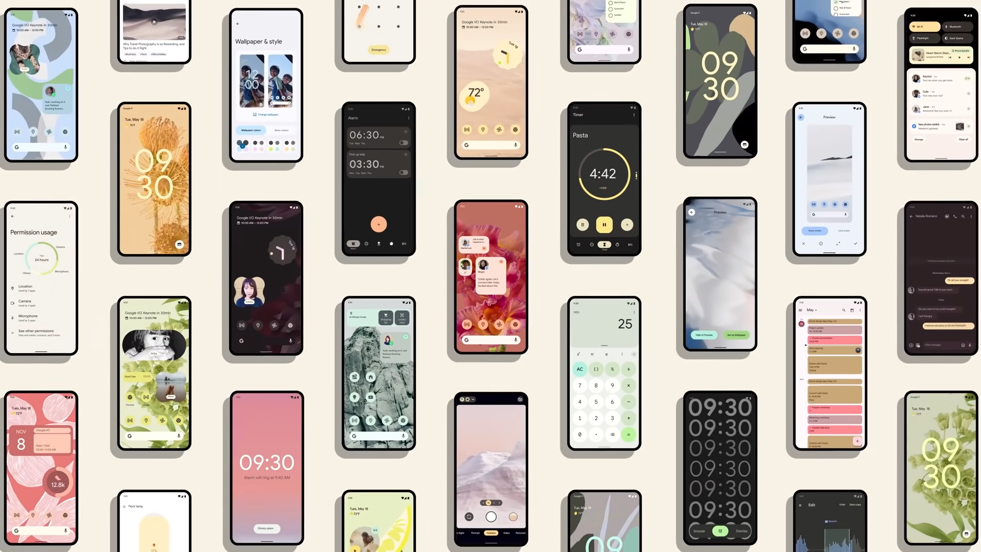
The most noticeable change in the redesigned panel is its colors. Thanks to the adoption of the Dynamic Colour feature, the account switcher now shows up in the same colors that you’ve chosen in the device’s Material You settings, giving the app a more uniform look than before. Up until now, all the other UI elements of Google Messages had Dynamic Colours except for the account switcher, which appeared in an all-white color scheme.
The next noticeable change in the panel is of course the Material You UI elements. The account that’s currently being used is now highlighted in a different color than the rest of the panel. This looks much better than the earlier design which separated the current account from the rest of the panel with a line below it. The Material You design and Dynamic Colours make the account switcher look in line with the rest of the app.
Expect Google to roll out the redesigned account switcher to the stable version of Google Messages as soon as it completes testing it in the app's beta version. While Google Messages is the first app from the company to get the new account switcher, you can expect Google to soon introduce it in the beta versions of its other apps. We could see the public rollout of the new account switcher to other Google apps in a couple of months.
