In April 2023, WhatsApp started testing a bottom-mounted and redesigned navigation bar in WhatsApp for Android. After almost a year, the redesign has finally made it to the stable version of the app.
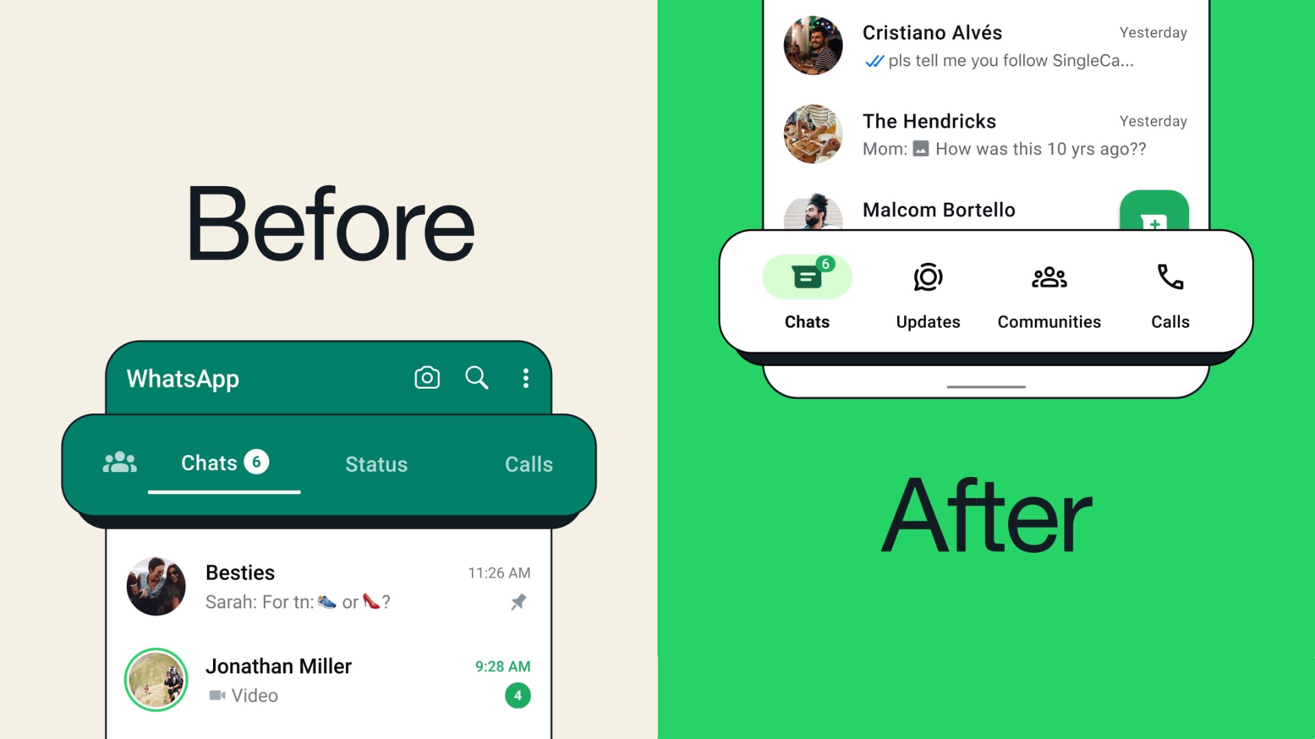
In a new post on X/Twitter, WhatsApp has announced that WhatsApp for Android will now show the navigation bar at the bottom of the display rather than on the top to everyone, which makes it easier for you to access it as it is closer to your thumbs. The company didn’t stop there. It has also redesigned the navigation bar.
The previous navigation bar was green in color, had a small tab for Communities and large tabs for Chats, Status, and Calls, and only the Communities tab had an icon, the other three didn’t. The new navigation bar is white, has equally sized tabs for the four sections, and shows icons for all of them. These changes make the navigation bar look more symmetrical, cleaner, and more modern. The change is live with version 2.24.6.77 globally. So, update the app from the Play Store to enjoy the new design.
