One UI 7.0 app icons might not be weird in the end
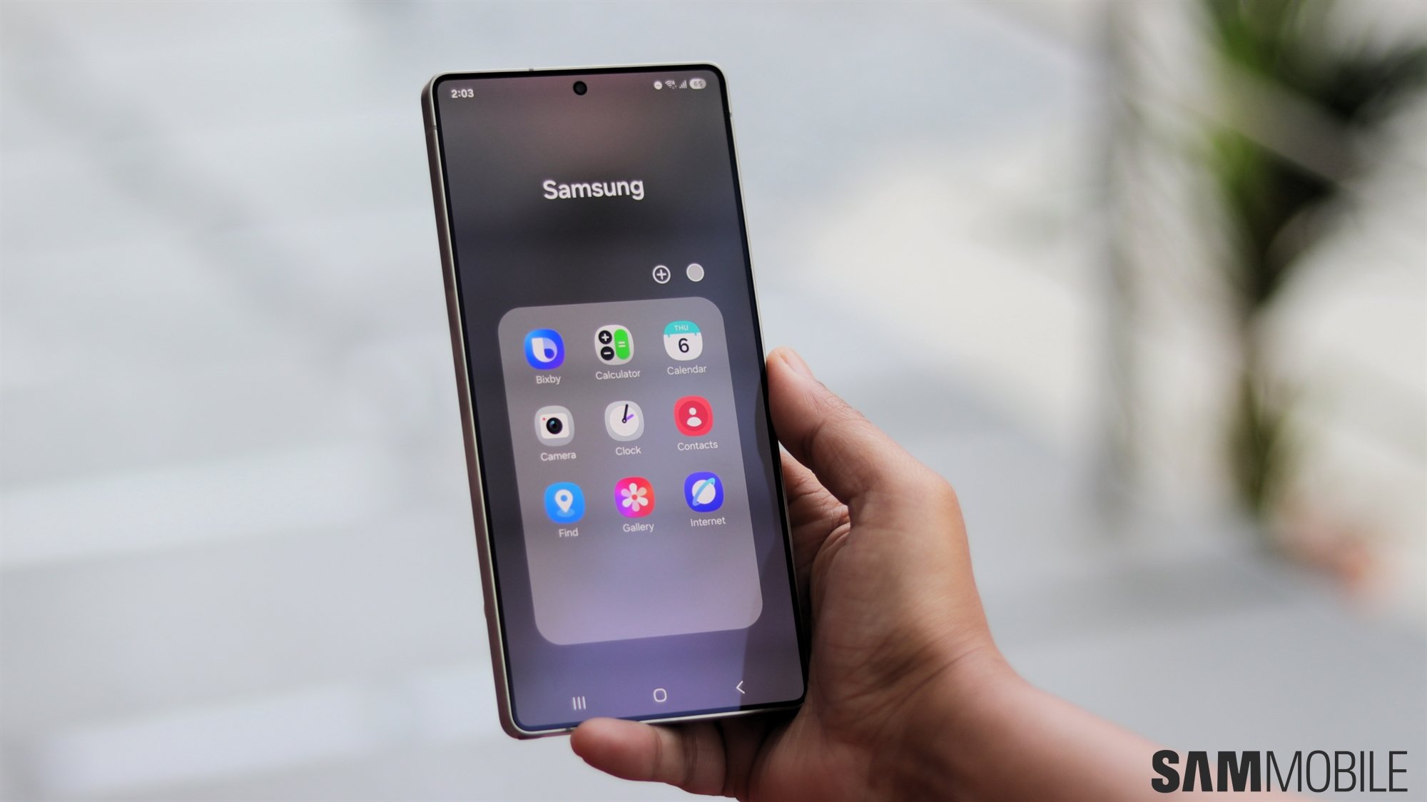
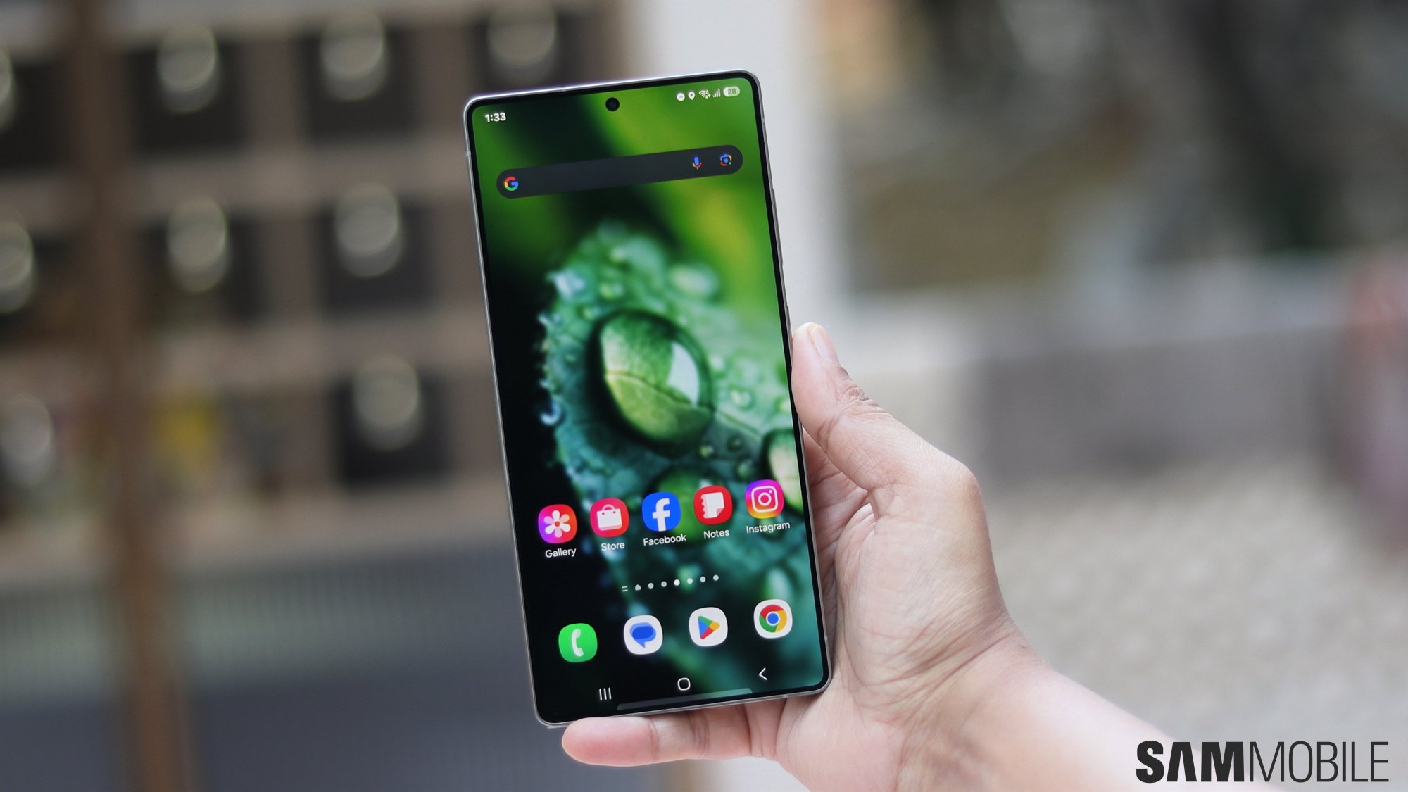
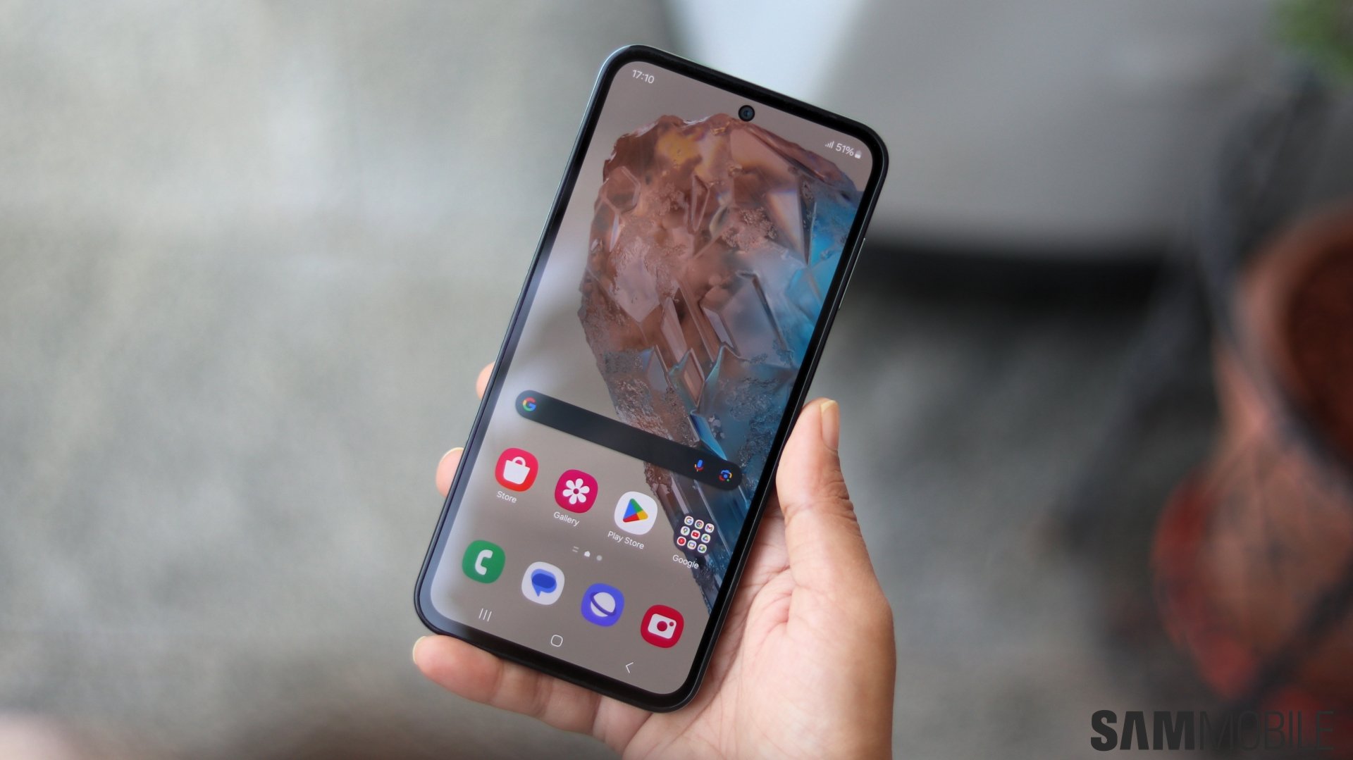
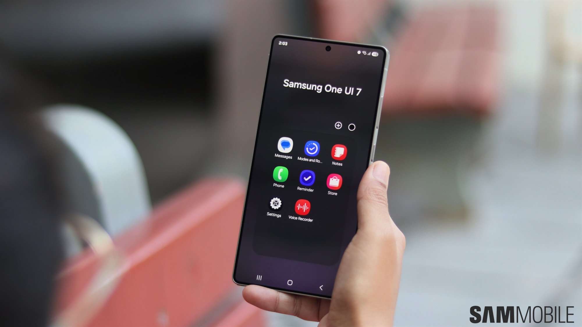
According to tipster Ice Universe (@UniverseIce), Samsung has replaced app icons for several stock apps in One UI 7.0. Those apps include Camera, Contacts, Gallery, Phone, Recorder, and Samsung Notes. This move comes after several Samsung enthusiasts and smartphone users criticized the design of stock apps' icons in the leaked version of One UI 7.0.
The tipster said in their X post that Samsung has used more reasonable and better-looking app icons in the newest internal version of One UI 7.0. Perhaps, Samsung is keeping an eye on user feedback with respect to One UI. We went hands-on with an internal beta version of One UI 7.0 running on the Galaxy S24 Ultra during the Samsung Developer Conference (SDC) 2024 in the US a few days ago, and you can look at the stock app icons in our video below.
We didn't like the app icons for Contacts, Gallery, and Samsung Notes, while icons for Phone, Samsung Internet, and Settings seemed different but fine at the same time. Hopefully, by the time Samsung releases the stable version of One UI 7.0 sometime early next year, app icons for all stock apps will look great.
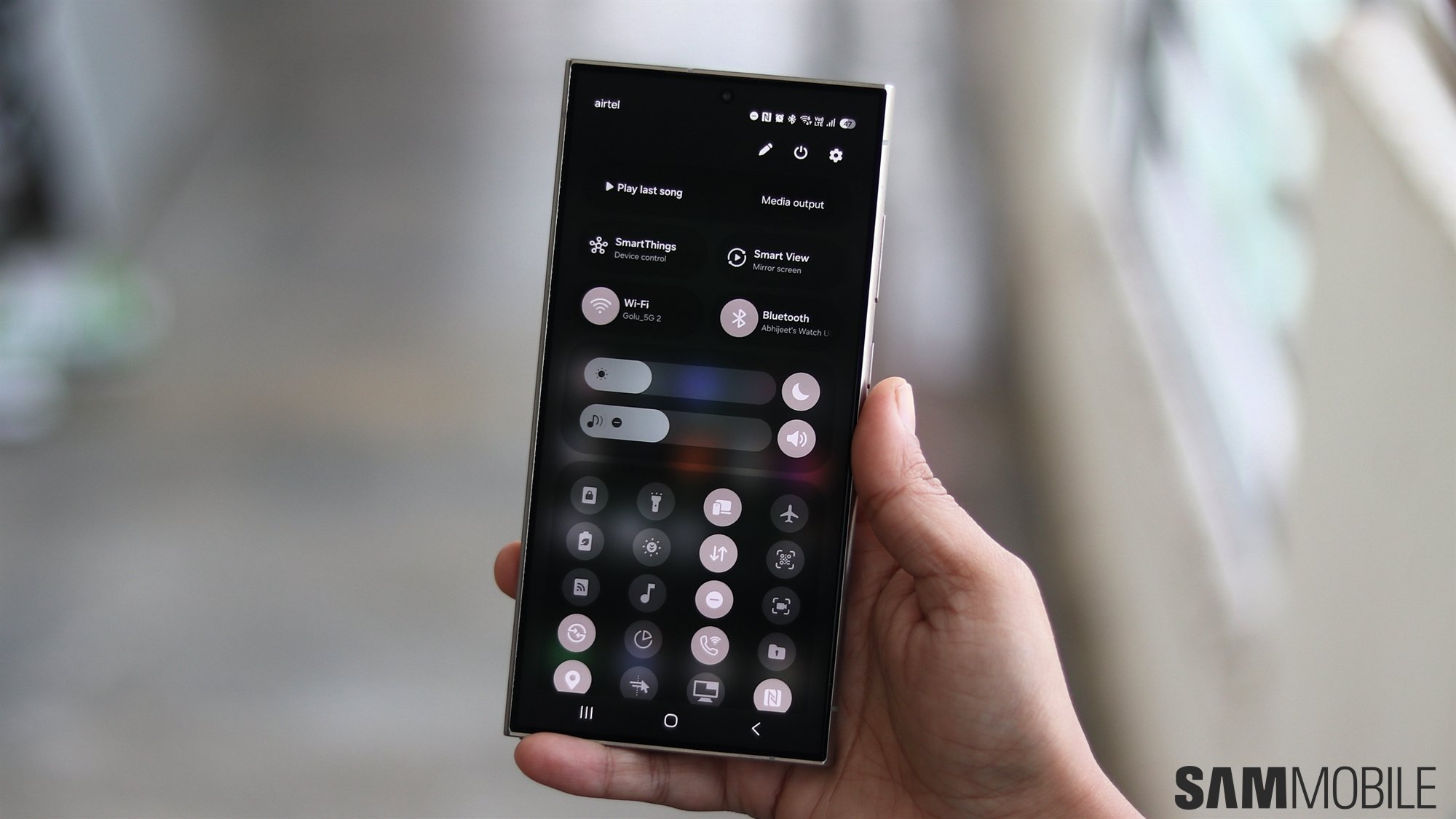
Samsung has improved animations and transitions on One UI 7.0 tremendously compared to previous versions of One UI. It has also changed the battery icon in the status bar, along with the charging animation. It has also introduced a new, two-page layout for the Quick Panel. Notifications now look much bigger with more rounded corners and circular icons.
The app drawer's search bar has moved to the bottom for better one-handed usage. Samsung has made quick settings toggles more customizable compared to earlier. The stock camera app has also received a major UI design revamp, and all the controls are now at the bottom, making it easier to use with one hand.
