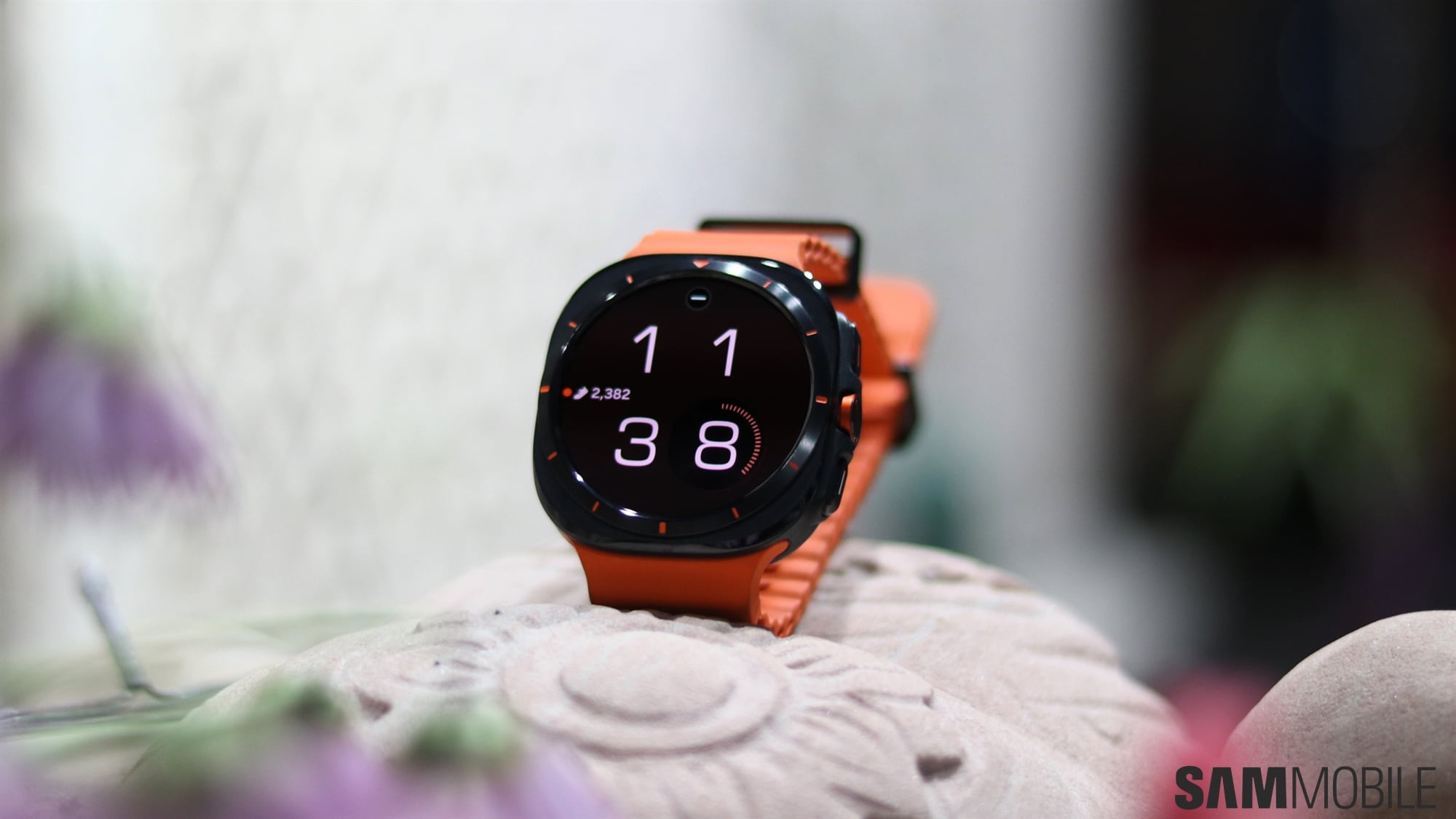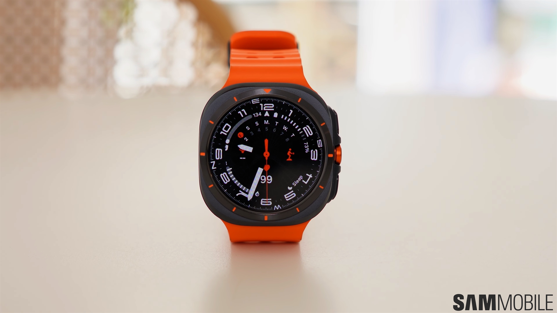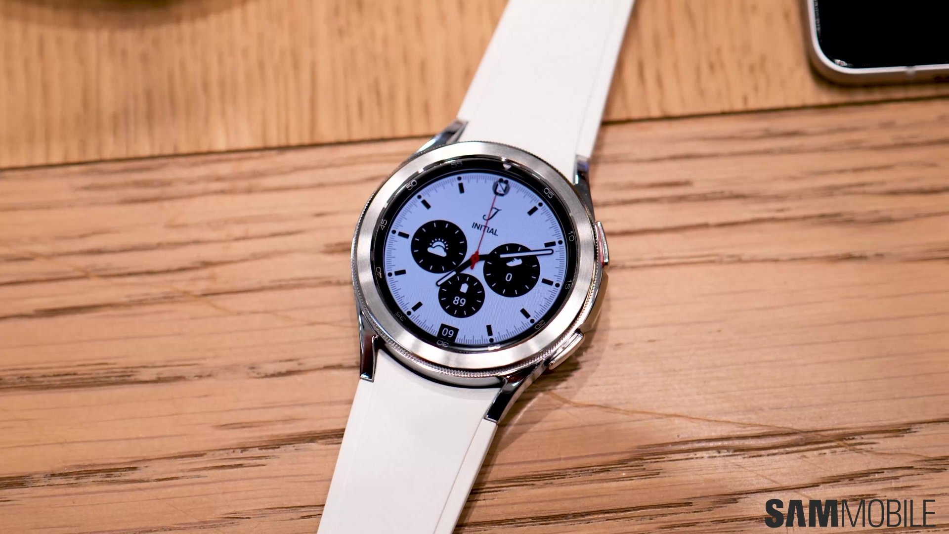
Among the numerous changes One UI Watch 5 introduces are the new vertical browsers for tiles and watch faces. Samsung's changelog wasn't very clear about how they work, so here's a more in-depth overview of these changes.
Story continues after the video
How do these vertically-oriented menus work?
Samsung doesn't offer many details about what One UI Watch 5 has changed in regard to these new vertically-oriented menus. The changelog might give you the impression that tiles themselves are scrolling vertically now, but that's not the case.
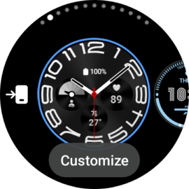
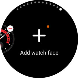
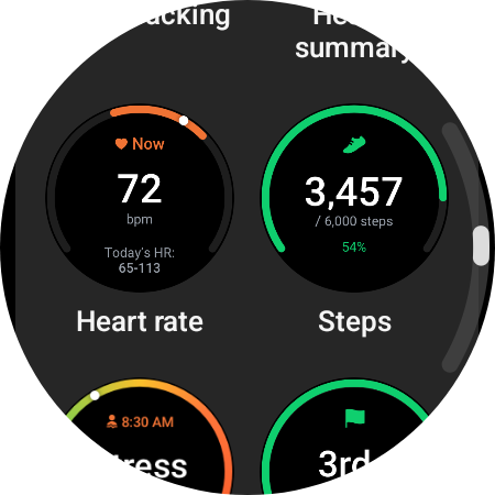
What has changed are the editing menus, i.e., the tile and watch face browsers that pertain to the editing screens. For example, if you tap and hold the watch face, you'll notice that the watch face selector still has a horizontal layout in One UI Watch 5. However, if you scroll all the way to the right and tap the “Add watch face” button, that's when you'll encounter the new vertically-oriented watch face browser.
The same is true for tiles. In One UI Watch 5, you scroll through tiles as usual by rotating the bezel or virtual bezel or swiping left or right on the screen. The tiles menu in One UI Watch 5 is horizontal, just as it was in One UI Watch 4.5. However, if you scroll all the way to the right and tap “Add tile,” you'll notice that the tile editor browser has a vertical orientation.
In other words, switching to a different watch face or going through your tiles works as it used to. The only time you'll encounter these new vertical layouts in One UI Watch 5 is when you enter editing menus, so it's not going to be a daily occurrence.
As far as we can tell, these vertical layouts are not optional, even though you could argue that the information Samsung shared pre-release may have given that impression. In practice, the editing menus for watch faces and tiles are now vertical, and there doesn't seem to be a way to change this. Not that you'd necessarily want to. The vertical lists seemingly offer better visibility and speed up the editing process, so they're not a bad change.


