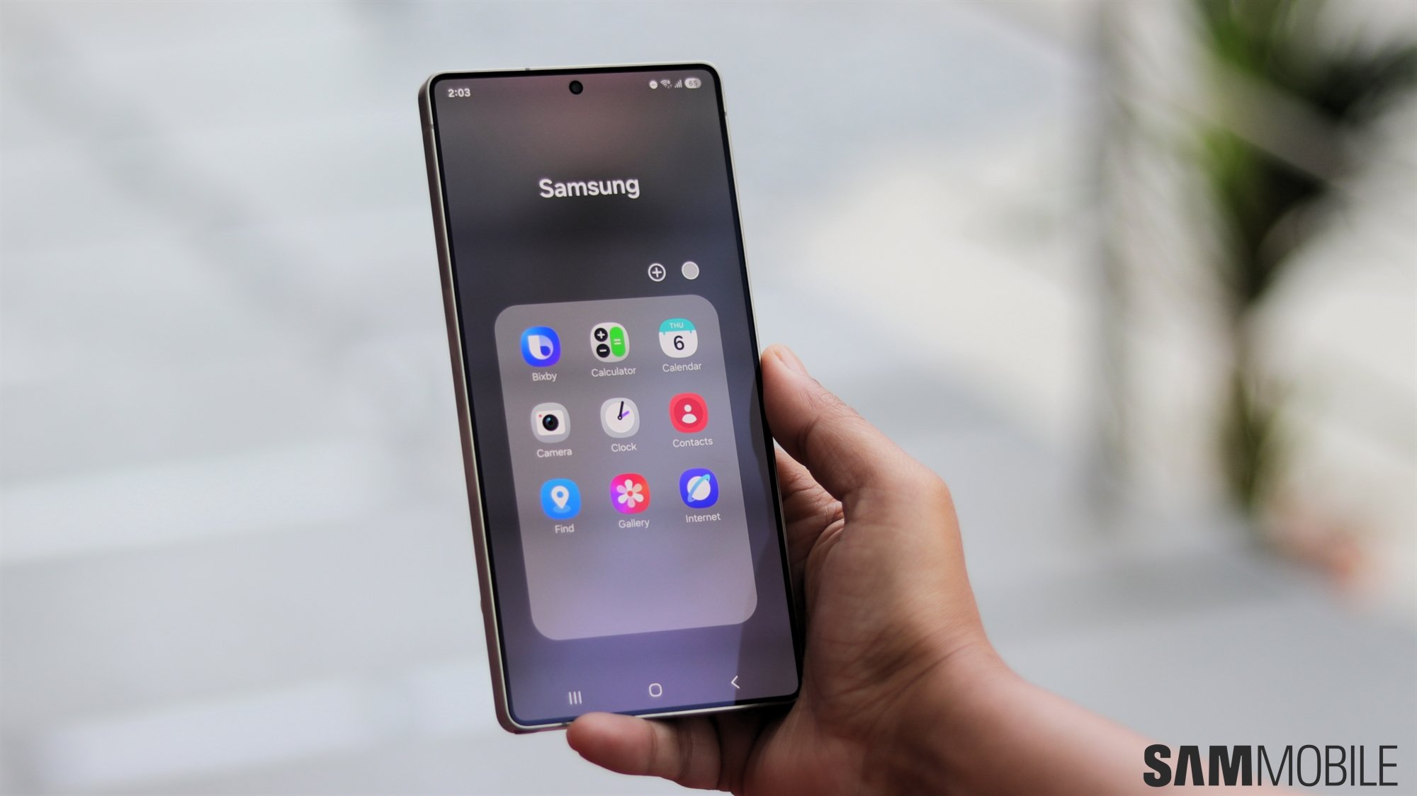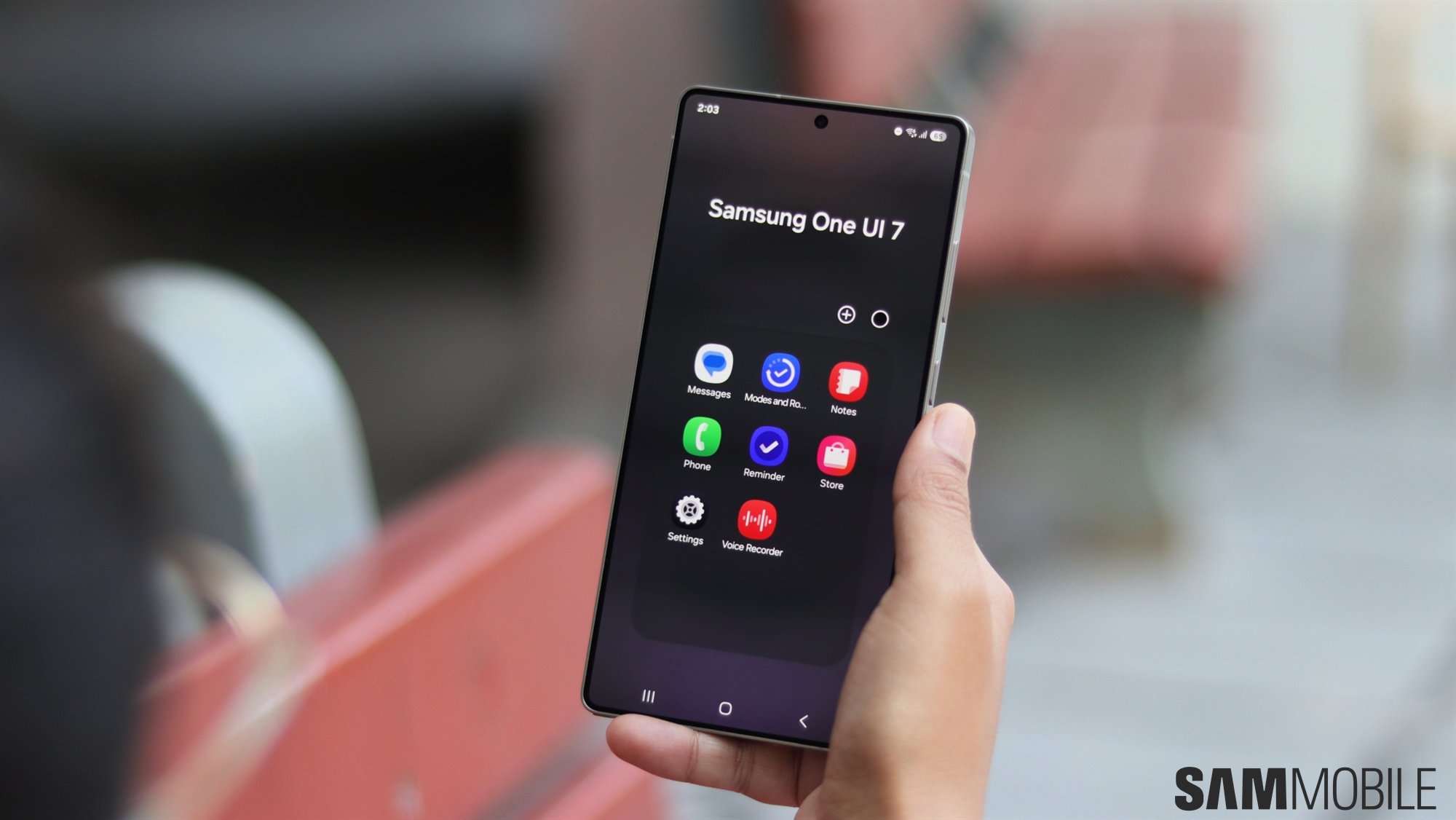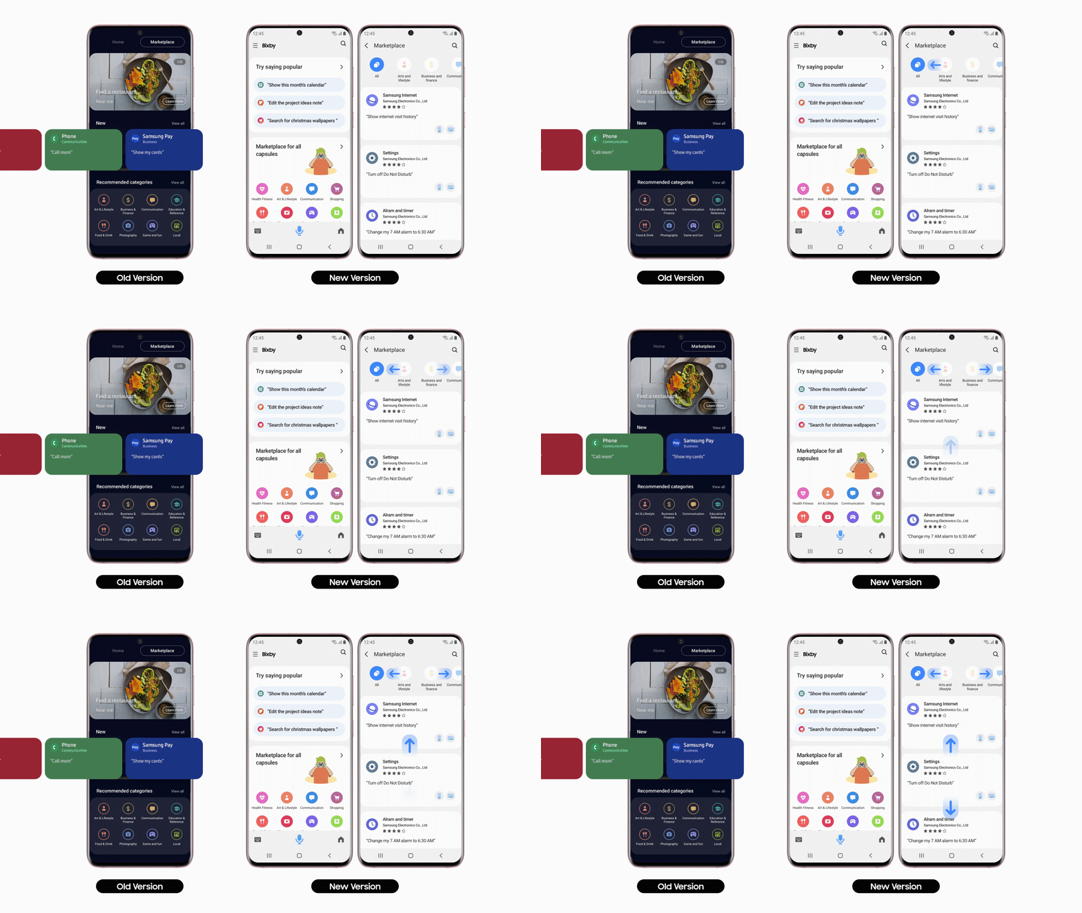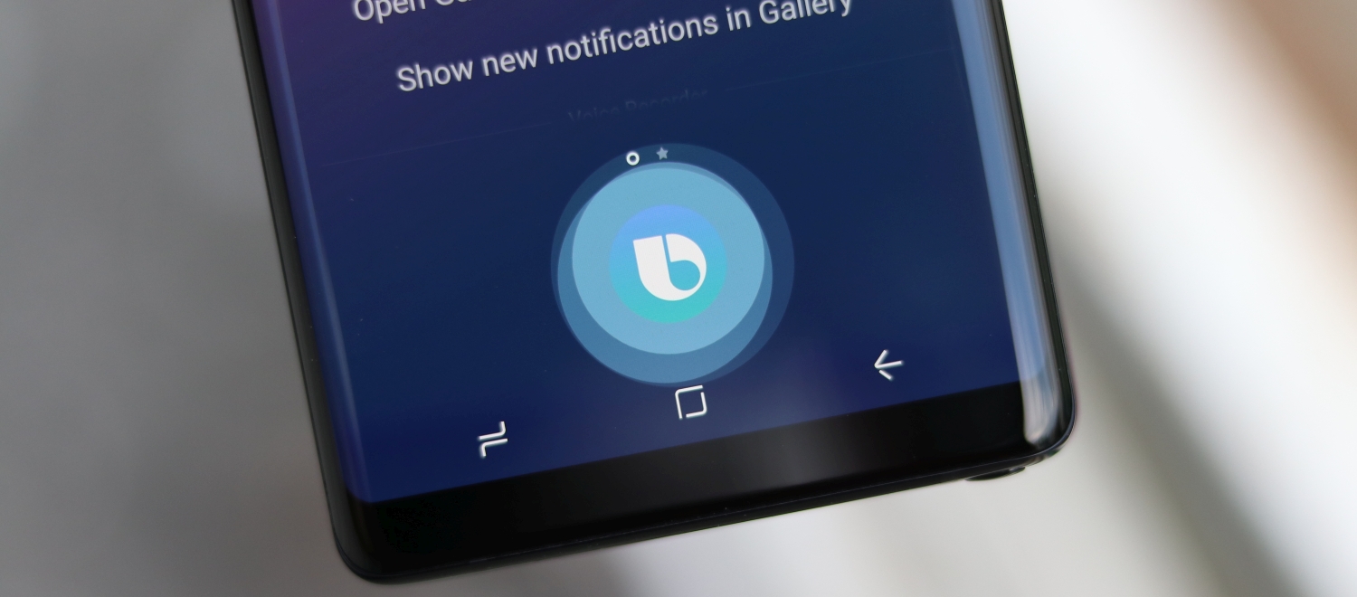
First of all, the entire Bixby Home UI was completely redone, from the color of the background to the location of Bixby Capsules and everything in-between. Bixby Home is no longer split between two main Home and All Capsules categories but instead every bit of information related to Bixby is centralized in a single home screen.
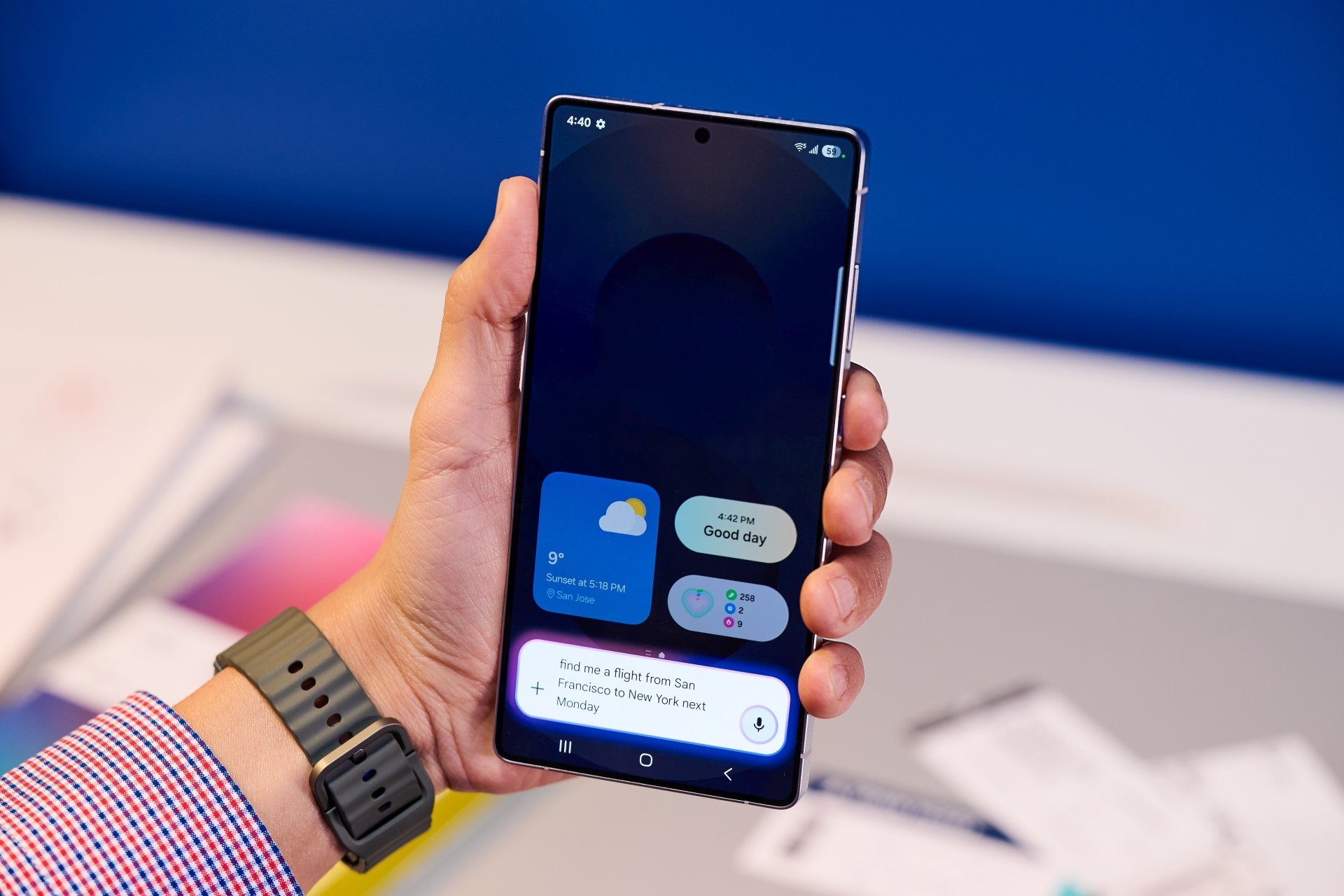
Bixby Voice also got a significant UI change with a focus on occupying less screen real estate when active. This was a major gripe for Bixby users but Samsung is now taking a first step into addressing it. When summoning Bixby Voice while using an app such as Maps, for example, the assistant will no longer go full screen but it will occupy only a small portion instead.
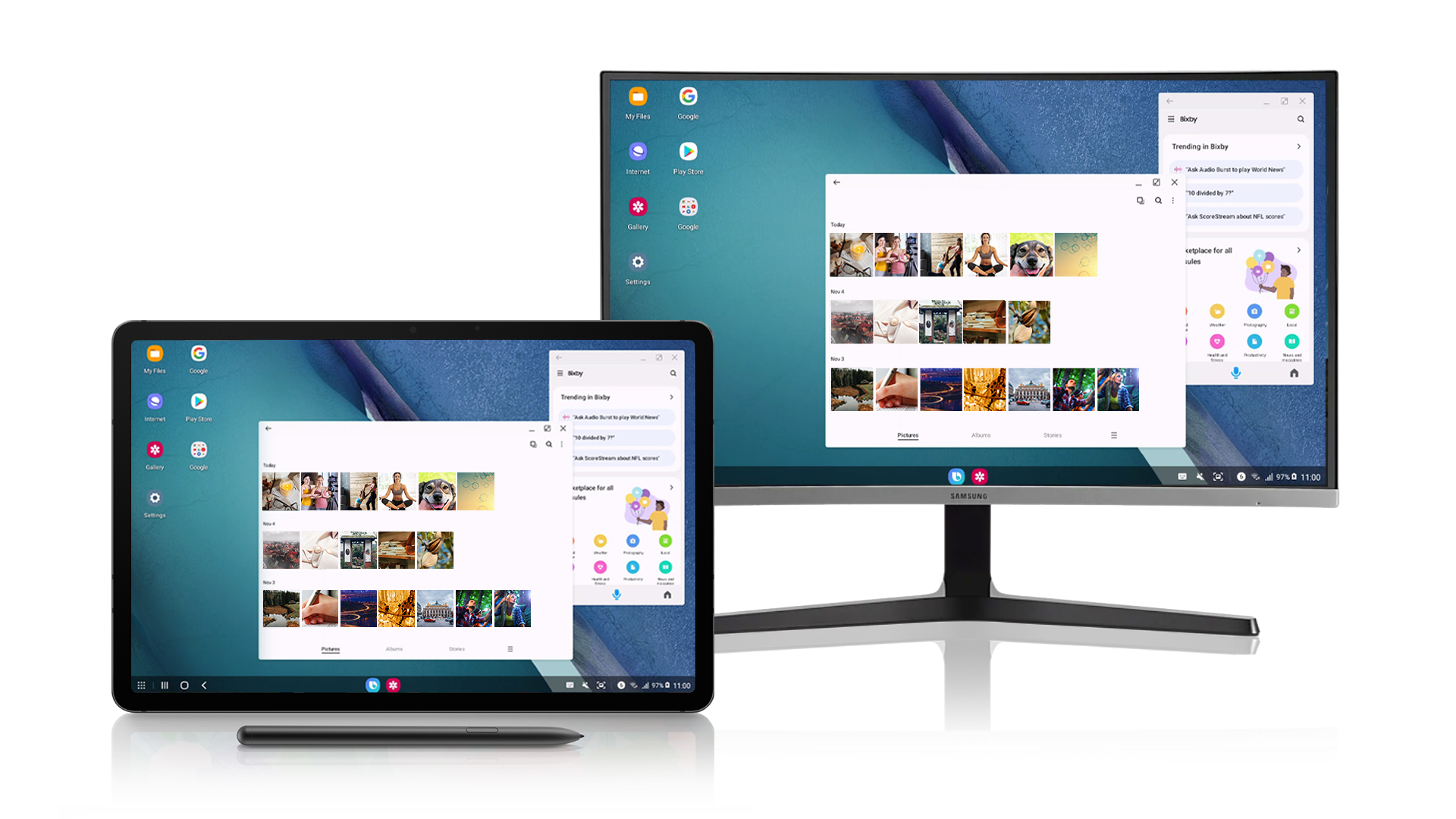
Bixby is now available on Samsung DeX
Aside from attempting to streamline the Bixby user experience with a modernized UI, Samsung has also been working on expanding the Bixby virtual assistant across its entire ecosystem. Last month the company launched a new update that brought better integration between smartphones and smart TVs, and now Samsung is bringing Bixby to DeX.
Samsung DeX users can now finally issue voice commands to control various aspects of the UI. In theory, this should help with productivity or it could at least bring a bit more convenience to the DeX user experience as a whole.
Have you been using the new version of Bixby on your smartphone or are you waiting for the update to arrive? What are your thoughts on the latest features and UI changes, and is there something you wish Samsung had done differently with the new update? Share your thoughts below.
