A few days ago, Meta started rolling out an update to WhatsApp for Android which brought a completely new user interface to the messaging platform that’s more convenient to use, offers new features, and looks cleaner and more modern. However, the company hadn’t made any announcement regarding it back then, most likely because it hadn’t made the redesigned UI available to everyone. Well, the brand seems to have completed releasing the app’s new design to everyone, and with that, Meta has made an announcement about it.
In a new post on X (previously known as Twitter) and Meta’s official website, Meta announced that it is “rolling out design updates to give WhatsApp a fresh new look, while keeping it familiar + easy to use.” The new design brings quite a few changes.
The story continues after the video…
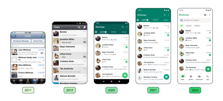
First, it has tabs at the bottom of the screen instead of at the top, and now there are four tabs instead of three (Meta has replaced the Status tab with Updates and Communities tabs). Second, it offers chat filters right above the chats list, which makes it easier for you to find unread and group chats. Third, you now have a search bar instead of a search button. Fourth, you get a new color palette and new icons, all of which make the app look much better. You can check out the difference between the old and the new design in the image below.
To get the new design in WhatsApp on your Galaxy smartphone or tablet, update the app to the latest version from the Google Play Store. The redesigned UI is live in version 2.224.9.78 of the app on our Galaxy S23 in India. The new UI is also live on iOS.
