This is only natural, as rival companies will always try to stay ahead of each other even at the cost of originality. Besides, the three tech giants including Apple, Google, and Samsung have been tinkering with mobile software for the past decade, and some ideas were bound to overlap over this long period of constant optimization.
We recently discussed what we think Samsung and the One UI team could learn from Apple's WWDC 2020 and iOS 14, but now we decided to have a bit of fun and take a closer look at the latest iOS 14 features that have undoubtedly been inspired by Samsung's One UI and Google's mobile operating system.
Home screen widgets and an app drawer
Home screen widgets and the app drawer have been a part of Samsung's proprietary software since forever, but were you aware that these simple features we take for granted have been missing from iOS all this time?
Apple's new iOS 14 took a page straight from Google's book with the addition of home screen widgets and the so-called App Library. Granted, Apple's widgets and app drawer are not exactly identical to Google's, but they serve the same purpose.
Emoji search and the ability to change the default email/browser apps
Up until iOS 14, iPhone users have been unable to search for emojis through the default keyboard, believe it or not. This function that had already existed on Samsung Keyboard for some time has now finally been added to iPhones.
More so, it's been roughly a decade since the first version of iOS was introduced, but it's only now in the year 2020 when iPhone users can finally change their default mailing and internet browser apps. Before iOS 14, iPhone owners were forced to use Apple's first-party browser and mailing apps as the default choice.
More compact UI elements, inspired by One UI
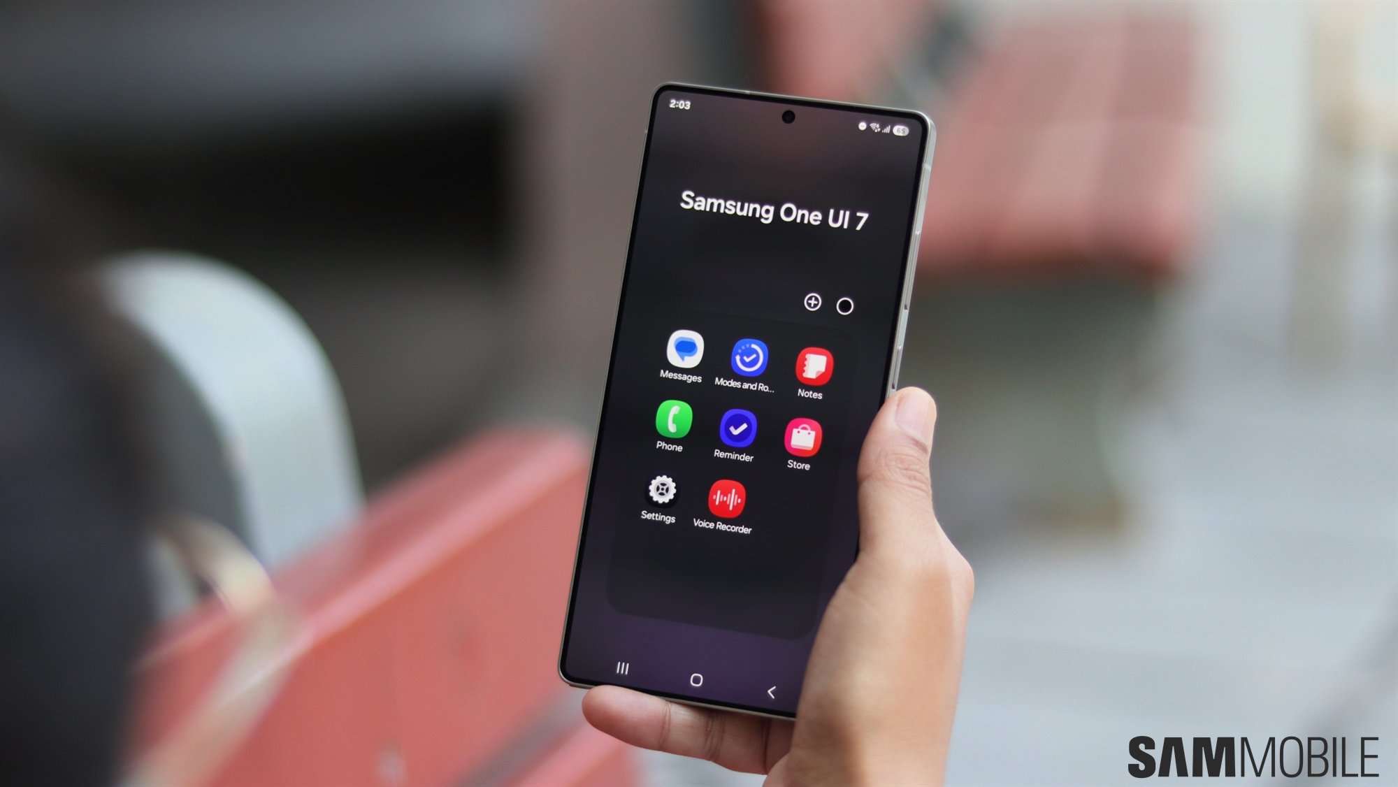
One UI represented a big step forward in the evolution of Samsung's proprietary software, as it cleaned up, streamlined, and modernized the user interface in a more cohesive manner. With One UI, Samsung focused on bringing more relevant information to the forefront while minimizing other elements.
An example of this is the incoming call screen. It no longer occupies the entire display in One UI (although it can still be set to full-screen if so desired); instead, it appears in a pop-up window with discrete ‘accept' and ‘reject call' buttons. One UI 2 made the pop-up even less intrusive.
Some iOS 14 design elements seem to have been directly inspired by One UI. Similar to Samsung's software, Apple's latest mobile OS version ditches the full-screen call screen design in favor of a pop-up.
Apple Pen can now draw shapes automatically
Similar to Samsung's hidden Neat Shapes feature in Samsung Notes, iOS 14 adds a new Apple Pen function that lets users draw perfect shapes.
Granted, Apple's implementation looks a bit more intuitive, but even so, it's not an original idea. And since Apple seemingly took inspiration from Samsung, perhaps the Korean tech giant can learn something from Apple's Neat Shapes equivalent as well to further improve its implementation.
Picture-in-picture video
Another feature Samsung users are very well used to is picture-in-picture for videos. It has been previously included in iOS for iPads, but up until now, it was not something that iPhone owners could take advantage of, for whatever reasons. A few years later and Apple is finally adding picture-in-picture video support to iOS for iPhones.
Even more features inspired by Android OS
There are a handful of other iOS 14 features that could be described as love letters to Google's Android OS. To begin with, Apple's mobile OS now finally ships with an onboard translate app.
Then there's what Apple calls App Clips. It's essentially an equivalent to App Slices in Android OS, meaning that iOS 14 users can now find various app components when using the search function.
Last but not least, Apple hasn't given up on competing with Google Maps, and iOS 14 has finally added directions for cyclists in Apple Maps, once again playing catch-up with the Mountain View tech giant.
It's incredible to think that some of these basic Android / One UI features have been missing in iOS throughout all this time, but there you have it. Should we be mad at Apple for getting inspiration from Samsung and Google? I don't think so, at least not as long as certain differentiating factors exist. Some ideas are simply too good to be ignored and this is why we see many similar features across different operating systems and apps. Do you agree, or do you think developers should never imitate one another?
